I need a guidance on graphic design

Hello, I’m still a student, and this is my last year studying, so I just need to get my portfolio ready, BUT, all of my design looks like shit, smells like shit too, so I’m in a really bad spot. All of my classmates have a really good design, they’re being praise, even their work on Instagram got a recognition either from a competition that they get in, a company that are hiring them for freelance, and their friends.

I don’t get any freelance work, I get in a competition and don’t even get into top 10, I can’t even draw. Well a competition is a competition, you either lose or win, so I’m actually okay with it (but still, shit hurts). And I’ve looked everywhere, do my own research, all of them says that I need to have a niche, well I really like BRANDING, the overall process from start to finish in branding have really fascinated me to go into this “sub-category” in graphic design.

It just that, whenever I show someone my work, be it my family, or even my close friends, there’s only 1 phrase that I’ve ever heard, “It’S LooK So gOoD”, and my lecturer doesn’t really help too, he keeps on rejecting my work, whenever I ask why, he just pointed out one or two problems, then when I send the work back, suddenly there’s another problem, it’s been 2 years he act like that towards me and a couple of my friend, so I’ve stop asking him for a guidance, I just accept what he teach, and be done with it.

There’s also no criticism, there’s no one saying, “hey how about you change this and that”. I don’t need a praise, I just wanna know what can I do to better my design, and to be a good designer.

Any tips from you guys would really help me big time, and maybe a little bit of your experience that I can learn from. I’ve attach below some of my work. Thanks guys !

2019 WORK (Poster)
POSTER

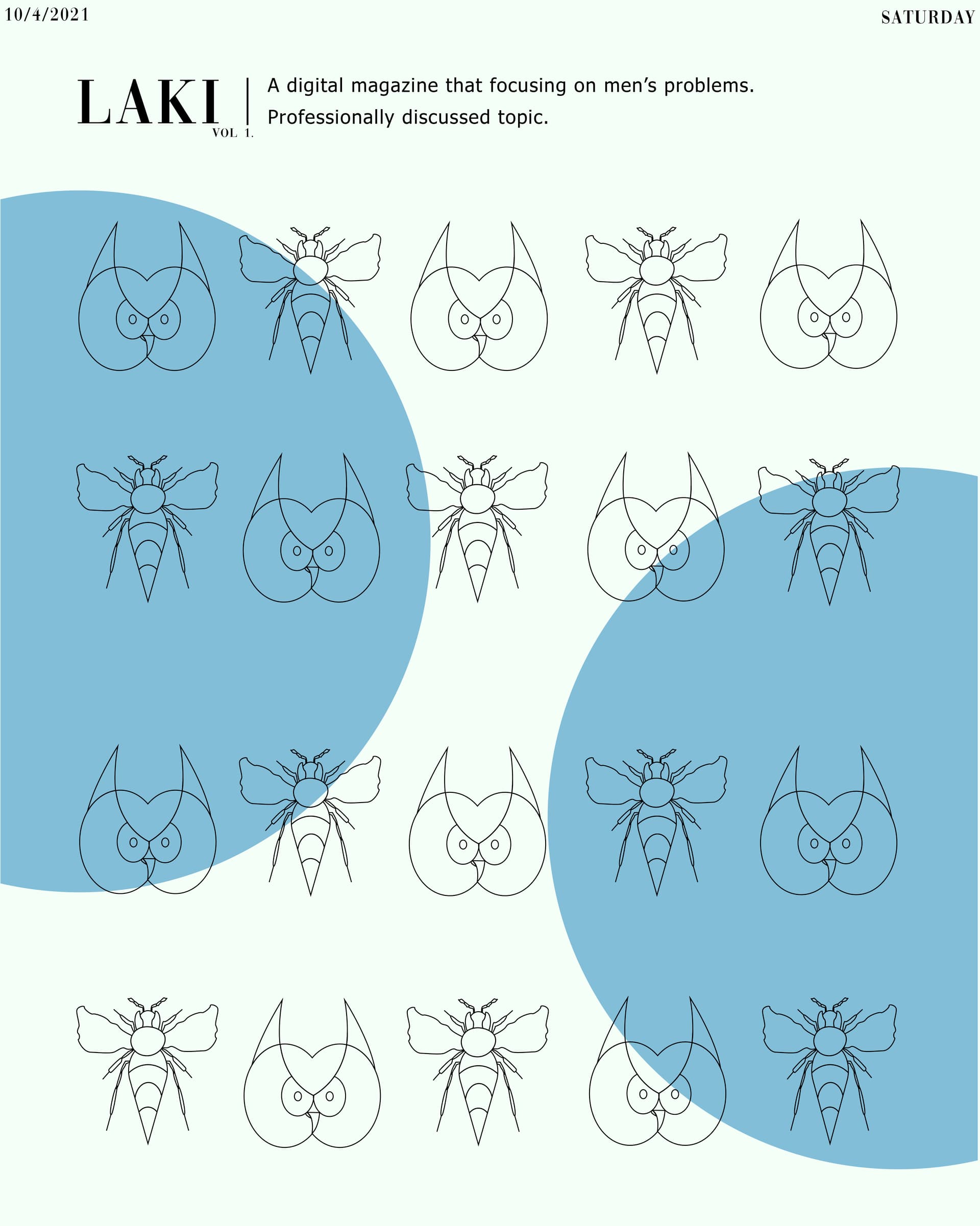
2020 WORKS (MAGAZINE FRONTCOVER)

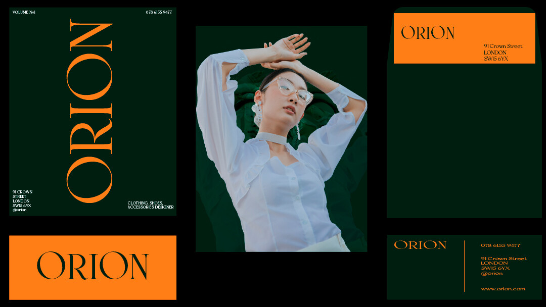
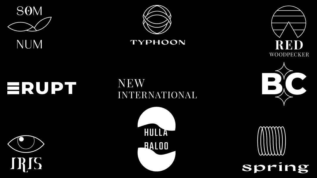
2021 WORKS (branding and logo)


The Magnificent 7 poster has so many issues that kill it right off the bat. Now that you have another couple years under your belt (you say it was done in 2019,) you should be able to see what’s wrong with it and do it over better.

  • title - just do better.
  • lazy bullet holes, you didn’t even bother rotating them (no, that wouldn’t help, they should all be different.)
  • very bad isolation masking on the figures leaving white in some places, losing image in others. And you cut off their feet. The feet may have not been there, but don’t accentuate that by leaving a red bottom border.
  • background - just do better
  • name list at the bottom you need separators between the names
  • this film was released by MGM, not Universal. In 2016, not 2020.

Men’s issues? Birds and bees maybe? I dunno. Need more info.

The rest of it, same. Without info it’s impossible to know whether you’ve fulfilled the brief. Logos out of context are just pretty pictures.

To be a good graphic designer you need to be able to communicate the message in a visual way
Your job is to tell a story/sell something/explain something.

Go back, look at these examples you posted and ask yourself what are you trying to “say”?

  • What is the movie “Magnificent Seven” about? I see 7 and bullet holes and a few cowboys but have NO idea what this means or why I should go see it.

  • I have ZERO idea what the “professionally discussed topic” could be. Look at other magazines… They showcase their feature story on the cover. In that case, this could be a story about owls and wasps…?

  • What kind of films does Flat Films make? From the photo could it be adult movies…? If it’s flat films, why is the text running vertically on some pieces? For that matter, other than the envelope, what are these pieces? What is it about Flat Films that you are trying to tell me?

  • Orion… ok I’ll give you fashion, but what kind of fashion? What exactly are they selling? Clothing? Glasses? Jewelry? What are these pieces you’ve made… Ads? Flyers? Why have you squished the logo only on the business card?

  • Logos (but I’m guessing they are logos) I have no idea what company(s) they represent. Som Num… is that a plant/floral company? Typhoon… looks like it could be a superhero chest symbol…? What does an upside down pacmac symbol have to do with red woodpecker… for that matter what IS red Woodpecker?

Anyway I hope you get where I’m going with this. You have to communicate something, and sorry I don’t understand what you’re trying to say at all.

Thank you for the tips ! That magazine was the first design that I started to really think about color scheme, composition and layout, before that I never took into account any of this things, just winged it haha. And all of this are a fictional company, and now I realise how important a context should be, so thank you again.

Hahahaha thank you. I don’t even know what to say, but that’s actually a good point, and here I thought I’ve did everything right. So what I’ve gather, I really lack in sending out a visual message on what my work are supposed to tell, I just thought about making sure my work looks good and be done. Thank you !

I mean no snarkiness, but in all seriousness, if that’s news to you and if you’ve finally realized that good looks are secondary and in support of functionality, you’ve just learned the most important lesson of your entire career.

The whole point of most graphic design is communication with the target audience to achieve a predetermined objective for a client.

For example, if you’ve been hired or assigned to create an ad promoting a movie, you need to design an ad specifically intended to entice people to watch the movie — that is the whole point of the ad’s existence and it’s your job to figure out how to make it happen.

Doing that involves research into who the likely movie-goers are, what movies they like, how and where the ad(s) will run, for how long, and in what context. You need to research the movie itself, as in the movie’s larger branding (if it exists), reading the script or watching it to get a grasp of the movie’s personality and appeal. You would need to talk to the people working for the movie company to get and consider their ideas and other collateral materials that might be relevant. You would need to analyze and consider every possible factor that might be used to entice the most people to watch the movie. And this almost always needs to be done within the context of whatever time period and budget you have to work with.

All this must be done before you even begin thinking about what the ad should look like. The look of the ad should be entirely dependent on what you’ve learned in your research and how to use your experience, education, and talent to design an ad so compelling that people flock to the movie. Good looks almost always help with this goal, but looks, as important as they are, should always be approached from the viewpoint of those looks being a device used to communicate and achieve client objectives.

If they haven’t taught you this in school, you will be in for a very rude awakening once you graduate and find yourself in a real job. Your instructors likely stress aesthetics, creativity, and looks over everything else. However, once you’re in a real job situation, you’ll soon find that making cool-looking stuff is not at the top of the list for either employers or clients. I’m not for a second saying that good looks aren’t important. I’m just saying that they’re only part of the puzzle.

2 Likes

Ouh, yeah, they never taught me about this, I don’t really know why, most of my seniors that don’t do well often end up in a printing company, well its not bad, but there’s little to no growth if you get a job at printing company in my country.

I wanna work with a design agency, I really love looking at Pentagram, Stefan Sagmeister, Paul Rand and &Walsh works. Their works have really inspired me to be better, and because I don’t really have any creative mind in my circle, that’s why I started to look for forum or a community and I’ve found you guys, so thank you. Any criticism or tips be it harsh or not, I’ll take it.

1 Like

The date on the poster is 2019. The date on the magazine is 2021. So you’re telling us you’ve been winging it for at least two years, yet you wonder why all of your design looks like shit? Your words, not mine. Time to grow up and start putting some effort into your life.

Hahahahaha yeah, I do think it’s time to change, just need a little guidance :joy:

Take what you’ve worked on in the past and redo them today the way you visualise them today.

Your magnificent 7 poster isn’t great.
But your progression from 2019 onwards shows gradual improvements.

What would you do differently to improve each of these.

And ‘branding’ is not a niche.

A niche is filling a gap somewhere that someone else isn’t really doing.
So you might see a store being fitted out with graphics - has the store got branding for their clothes, for their cups, for their plates etc.
This is where you can fill a gap - the store fitout will put in all the tables, chairs, lighting, some graphics, etc. but are they lacking a providing of other services that the store also needs.

Maybe you could approach them about a partnership - they do the store fitout and you do the other stuff - or perhaps they outsource their graphics - and you could be their outsource partner.

Finding a niche is far more difficult than you might think.

Best bet is to approach businesses and ask them where they need graphic design services - what you can offer and see if you an make a business deal.

But I know something for sure, it doesn’t come to you - you have to go to them.