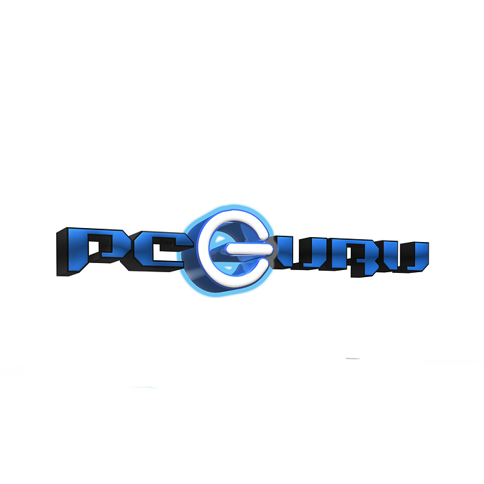
I’ve been working on this logo for a company called PC Guru that does computer repair etc.
This is what I have so far but i feel like its missing something… ideas?
Wouldn’t it be funny if the company name were Logo Guru?
As it is, I read PCeIJAIJ. I think what’s missing are pencil and paper.
It isn’t missing something.
It needs less.
It needs much less, not more.
Remove the various 3d effects, gradients and outlines.
Logos need to be simple, which makes them suitable for use in as many instances as possible. For example, what will your logo look like when printed in black and white (no grays)? How would you cut it out of vinyl or pad print it on the barrel of a promotional pen? What if the company wanted to screen print it on a t-shirt?
It’s fine to add bling to logos in those situations where bling is needed, but the basic logo itself needs to be simple, legible and adaptable.
completely agree
Yout should think simple or i can help you
There are several basic requirements in order to make your logo great.
1. Simplicity
A good logo is one that looks clear and easy to read. Your audience will only notice the logo for a split second, so you need to embed the brand into their minds within that timeframe. Simple fonts, minimalistic shapes and less colors are advised. You also have to make sure the logo looks clear in different sizes and colors.
2. Adaptivity
Your logo should be suitable for different mediums, both printed and digital. If your logo will look muddled if it’s carved on wood, for example, that probably means it doesn’t have a simple enough shape. If your logo consists of a long word that cannot be shrunk into a simple icon for an app, then it’s generally unqualified.
3. Brand Awareness
Your logo should represent the brand image of the company, so people can grasp an idea of what the company does and its brand personality just by looking at the logo.
4. Uniqueness
Avoid using shapes that are commonly used to represent other things, such as a simple triangle or a location pin. The shape should represent the company, and the company alone.
Hope that helps ![]()
Post your single-color version so we can see the actual design rather than a bunch of heavy-handed Photoshop layer styles.
Try to make it more simple and remove shadows, as shadows are old school now a days.
Nothing is “old school” if it’s appropriate to the logo. That type of extruded, rimmed lettering is still very popular in racing and boating circles.
Know your client.
Know their audience.
take away the glow effect and then just make the switch icon look more like a “G”
just because everyone is doing simple logos coz they lazy does not mean the general public does not appreciate cool creative logos that dont look like what they are seeing every day (simple,boring)
Keeping a brand basis simple has nothing to do with what “everyone is doing” or laziness, unless maybe you’re too lazy to type “because”.
You can’t cut layers upon layers of raster effects into vinyl, or Styrofoam, or metal, or a single ink color, or embroidery thread, or flexographic plates, or…
Laziness has nothing to do with it. Simple logos work better in many (most instances) because they’re reproducible over a larger range of instances from size to how they will be printed. This makes them more practical and less expensive over the long run. Simplicity also ensure optimum legibility, which makes them more effective. As for the amount of work needed to research, conceptualize and design logos, a good simple design is considerably more difficult than one decorated up with various effects.
Hi,
Just turn into 2d and check result.
Adding a 3D effect happens with just one mouse click, so the word LAZY is misplaced here, all the previous designers who commented before me just stated facts about branding and logos, i believe i have nothing else to add as i agree to everything they said.
