I’d like to hear opinions.
This one seems like it has copied the type choice of dominos pizza but without the well made graphic to go along with it it just ends up looking bland what do the rest of you think?
This is for an assignment so all I need are a few examples.
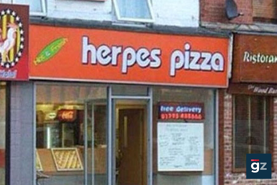
Herpes means something else entirely…
that it is very true too. Definetly where you should think twice before naming anything It almost looks like someone made the worst kind of typo.
Looks like someone was messing with it
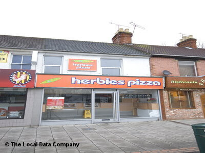
It’s located in Swindon - and it’s called Herbies - but it’s since been rebranded.
(shocked something on the internet wasn’t real)
gasp. My bad still the conversation based on the type still stands but regardless that brings up a good point. Obviously people are gonna be immature but you should probably try and be careful of how you choose to name just about anything.
It’s not the same typeface that Domino’s uses. Herbies Pizza uses a typeface called Bauhaus. I’d be willing to bet that Domino’s type is custom designed.
As for the Bauhaus typeface, I’ve always disliked it. It also has the dated look of the early 1970s. For some reason, they left the possessive apostrophe out of the name. Aside from that, it just isn’t very inviting and doesn’t really suggest good pizza. However, it is readable from a distance. I don’t understand the purpose of the green shape on the left side.
Bottom line, it’s uninspired, but I’ve seen much worse.
1 Like
I think it is meant to be a herb but it wasn’t very well made. It’s ironic you mentioned how the type is easy to read from a distance but their logo or whatever it is meant to be is hard to make out.
I always thought the Dominos font was Futura??? I never really looked that hard. It looks like it. Never bothered looking more into it.
1 Like
I’m glad to know that was “shopped” LOL
I don’t think I would enjoy a Herpes Pizza very much ![]()
![]()
![]()
The green thing says “Hot and Fresh”
It isn’t the “logo”
I’m kinda already over this “respond for discussion” thing. This is the second one I’ve seen. Pretty ballsy of a professor to have a bunch of onliners who give their time freely running his class discussions for him/her.
Nope.
1 Like
You got me wondering about that, so I just checked.
I wouldn’t be surprised if it’s based on Futura Bold, but the D is a bit wider and the o’s are slightly more circular. There are so many versions of Futura, though, that it’s hard to tell. The apostrophe, however, is completely different.
1 Like
Fireguy, at what school are the studying design?
I’m not a fan of it either but thank you for responding regardless this was all I needed.
Thank you all for giving up your time for this no one else needs to respond.
I’m not gona give out that information online sorry.
I’ll assume you are not from LAFS.
1 Like
No decent designer would ever create a logo that is “hard to make out.” The primary goal of all graphic design is communication and the number one consideration is always to make designs “easy” to make out.
1 Like