It’s supposed to be interactive so not everything will be on like this while using it.
Every comment is appreciated I’m just a begginer! Thank you very much
It’s supposed to be interactive so not everything will be on like this while using it.
Every comment is appreciated I’m just a begginer! Thank you very much
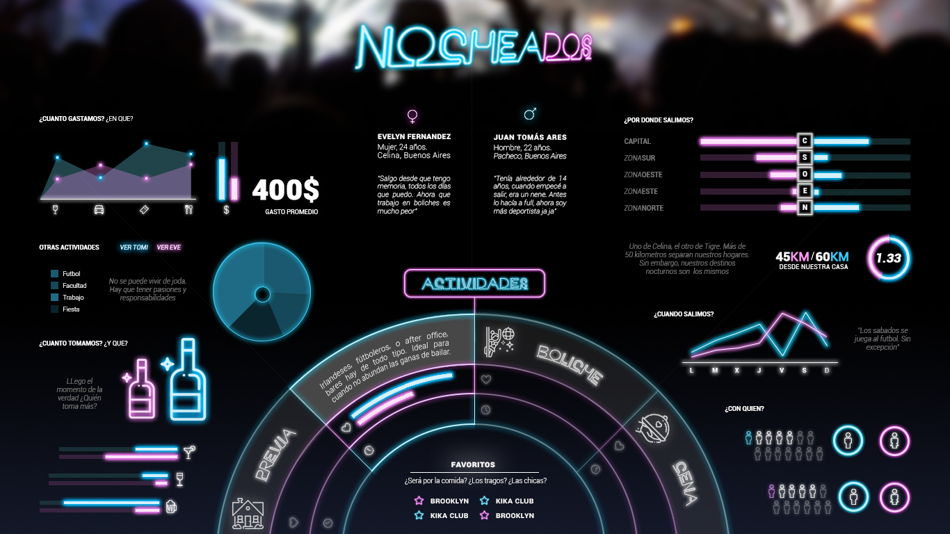
What is this — a dating match-up graphic comparing Evelyn and Juan?
Anyway, I like the looks, despite me not knowing for sure what it will be used for. It’s nice. You seem to be more than “a beginner.”
I don’t know if I like the neon type at the top, though — especially the receding angle of it. It sort of seems like a headline ought to be more like a headline. Maybe, as you mentioned, the interactive aspect we’re not seeing would address this problem.
Yeah it’s comparing his night stadistitics with mines (expenses, drinking, companions, zones, etc). Thank you. I will look into the title.
The white seems a bit too sharp especially 400$
Hello there ![]()
as Mr just-B said, you are definitely more than a beginner, I liked the neon effect, escpecially in the graphs,
however there are some issues i want to mention