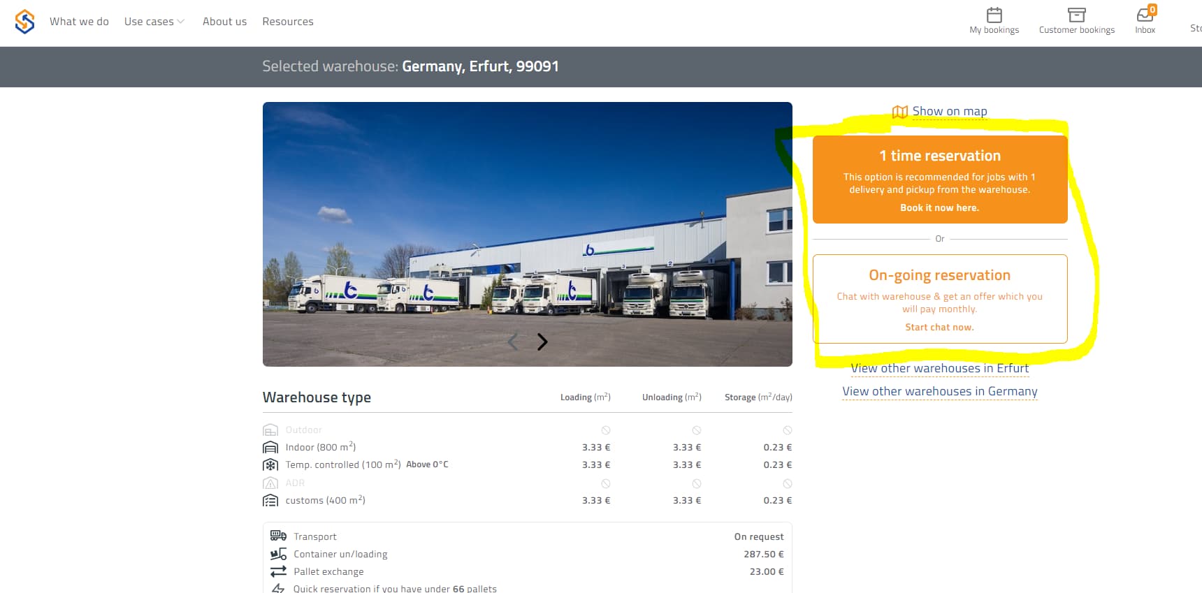
Hi everyone! We just launched a new design on our website, but we figured out that some things are just not as clear as we would like to our customers. We have problems with these 2 buttons (1-time reservation and on-going reservation) because our visitors don’t know what to select. So here is my question: does maybe anyone know how to redesign it so it would be easy peasy to understand??
Make it a Drop Down Button with 2 options.
It’s an OR situation. So it should be clear they have an option.
A drop down Menu would suffice - pick one or the other.
You could put a ‘i’ symbol beside the options as a pop out note to explain difference.
1 Like
Great idea! Maybe we just need to make more clearly that right side is where customers make decision what too choose ![]()
I’m confused by who your customers might be, what your products are services are, and what those customers would be reserving.
Then again, I’m not one of your customers, so perhaps, my confusion is due to my unfamiliarity with what you’re selling. Maybe, those questions are answered in the “What we do” and “About us” sections, but until I understand myself, I’m a little hesitant to make specific suggestions.
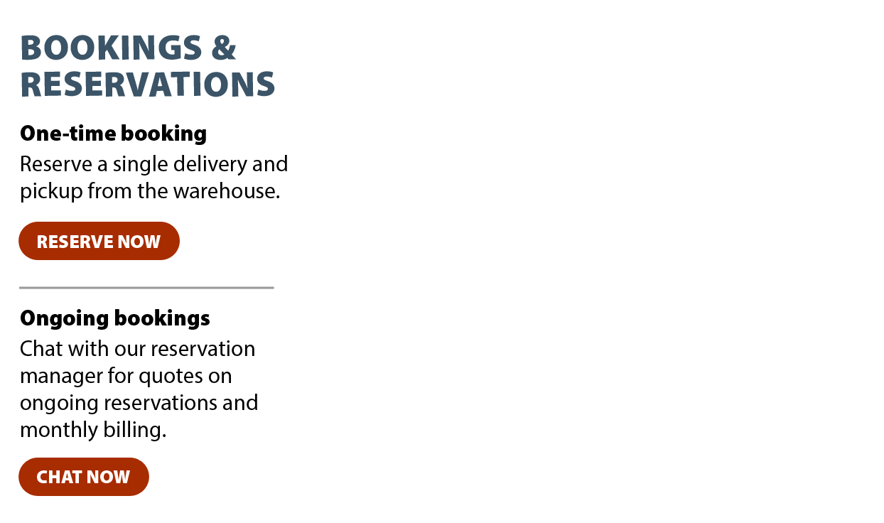
As for the buttons you mentioned, I assume there’s a German version. However, the English version is awkwardly worded. You might also make the button look more like clickable buttons.
For example, something similar to this might help clarify things.
In addition, why is the name of your company not on the web page? There’s a logo, but a logo is no substitute for a name — both for the sake of clarity and SEO purposes.
What is the difference between “My bookings” and “Customer bookings”?
First of all, thank you so much for your comment:) Our customers are everyone that are searching for available warehouse space all over the world and also people who have free warehouse space and they would like to earn with it - so we are like AIRBNB but just for warehousing.
Great, thanks for this design I think its pretty much what are we looking for:)
Oh and the difference between “My Bookings” and “Customer booking” is that even warehouse can reserve a warehouse space in other country so they have separated bookings for their own purpose and booking for their clients, that have cargo in that warehouse. I hope you can understands what I’m saying haha ![]()
May be a little update on the button and changing the wording that can easily be understood by your customers can help. Also, you can add a sidenote in the button heading on what is this button about.