Hey, guys,
I need a really honest review of my graphic design, which is mainly around youtube x tiktok. A friend of mine, is looking for someone to edit vlogs, do reels etc nonsense for them, only occasionally as a side job and something like this would be quite handy for me at the moment on a nightly basis as well. But, I don’t know how to price my own work. So I’m attaching some thumbnails and TT videos (This is football content, hopefully you’ll forgive me and I understand that it’s not everyone’s cup of coffee)
It’s OK, but pretty bland and forgettable, but then again, it doesn’t need a shelf-life, I suppose. It does, however look incredibly derivative and like a thousand others I’ve seen before but perhaps without the polish of many of its predecessors. Your typography and hierarchy leave a lot of room for improvement.it just feels like everything is almost arbitrarily thrown into the frame. What do you want me to see first?
As well as designing for the site, I’m guessing you learned design from YouTube too? You could do with doing an actual design course (not from a suspect online ‘university’). It’s a long way from the worst thing I’ve seen and you have some ability in that genre, but it feels like you need some more formal education, or on the job training.
I used to work with guys who did those Panini football sticker books and cards. They just added the excitement, vivacity and energy needed – exactly what seems to be lacking in yours.
I also feel like a few years ago, your cut-outs would have let you down, but the tech is so good at it these days that the skills required are no longer as pertinent as they were. However, there are still a few lack-of-attention-to-detail giveaways.
Overall, as I say, I’ve seen a lot worse, but it all just lacks refinement and polish.
You asked for an honest review!! It is meant to be helpful though – honestly!
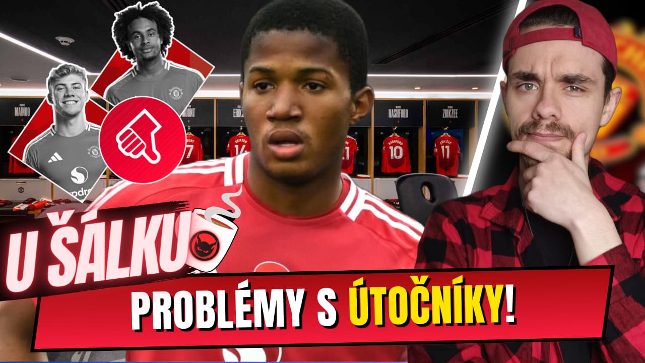
So this is where these annoying graphics come from
Nothing worse than a youtube video in my opinion, avoid them like the plague. I do enjoy ‘The Overlap’ though, but Roy Keane is comedy gold.
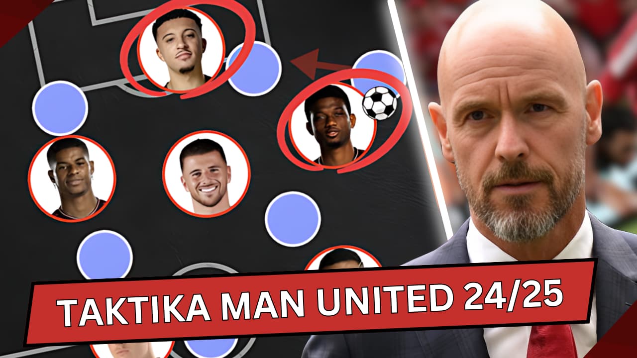
I know who all the players are in the photos, there’s no need to add player names, it’s evident for fans, even not of United (Liverpool fan here) who the players are.
No idea why there’s a football beside Diallos head is that necessary graphic? Does it add complication and clutter? It doesn’t do anything.
And the transfers in an out arrows are pointing in the same direction - surely it would better if they pointed in opposite directions?
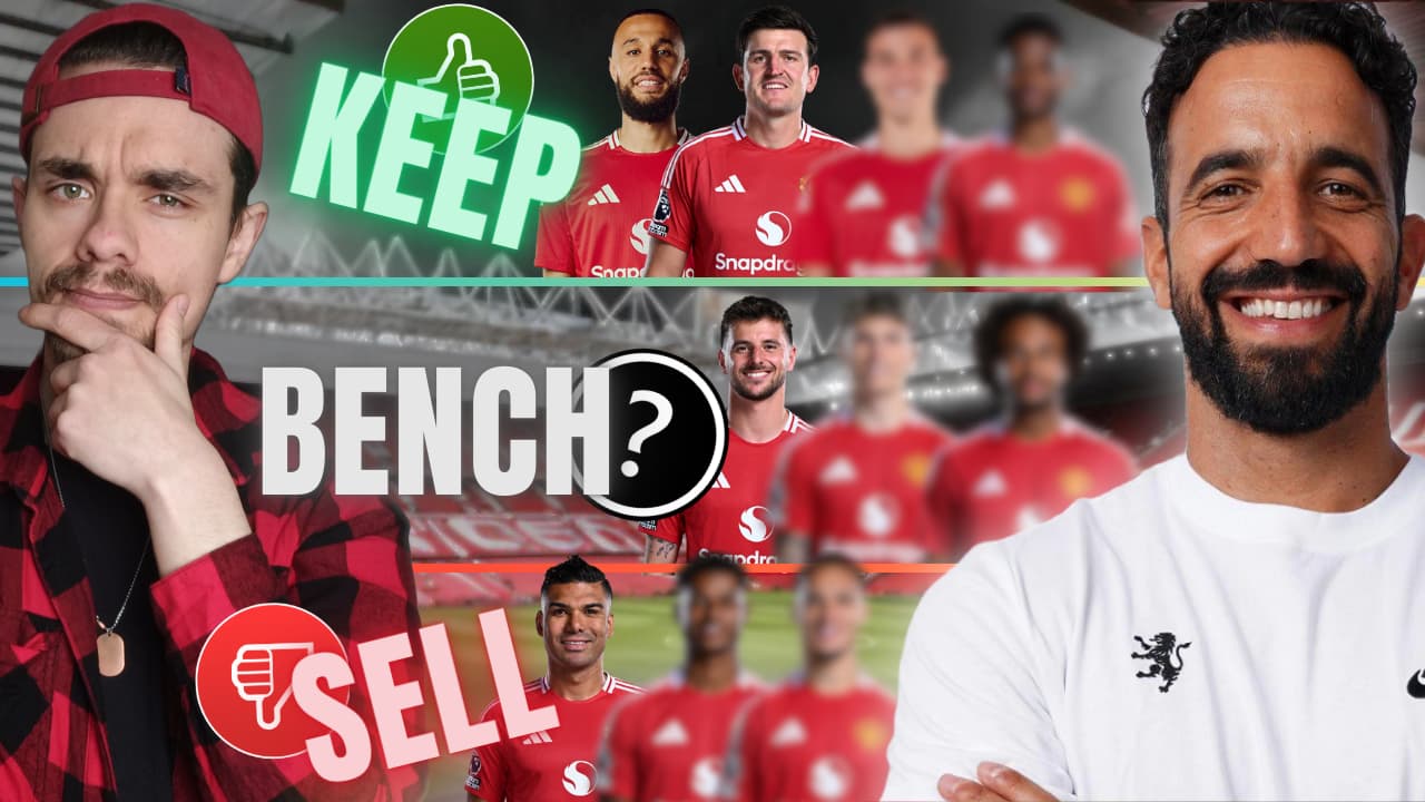
Why is Maguire in the ‘Keep’
All in all - it’s not bad - it’s in keeping with Man Utd, pretty rubbish (
For youtube or tiktok or whatever it’s for - if it’s in keeping with the theme and things like that - don’t deviate too much from the style, people who follow the video will probably want consistency from the designs and the style.
I refuse to click the link, no idea who the guy is, what his point of view is nothing I’m concerned with, I hate all the amateur tiktok/youtube armchair analysis.