I really need to understand branding better

Alright, so long story short, I had a teacher I think I could safely say was bad - especially at communication - and Branding is something that I was supposed to be taught in their class. I think it’s sort of a skill by itself, failing to communicate at this level. Kind of like those movies that are so bad, they border on being good. This isn’t the first time i’ve encountered such a teacher. They stand, talk, and I can’t seem to recall the last 2-5 minutes of what was said. Or what is trying to be conveyed. I’m not sure how that’s possible, but it is. I think it’s mainly what is referred to as “fluff”. But anyway, enough foreword.

I would really like to share the branding guideline book I created as part of the branding project while during my time in college studying graphic design. Thankfully, to my satisfaction I basically understand everything from Typography to infographics to theory in illustration. It’s just this damn branding - specifically the VISUAL element of branding which makes no sense to me.

My thought process is simple. You’re a designer. You have a goal and your goal happens to be a specific design asset. Whether it’s a logo, an illustration, perhaps you’re a 3D modeller (I do that, too). A goal, is a goal, is a goal. An objective. I can watch video after video and interestingly I keep hearing the same thing about branding. “Feel”. “Mood”. Those types of words. Believe me. I understand it in CONTEXT. But for me as the DESIGNER. This means NOTHING. If any of you fine folks could please help me understand these mysterious, mythical design assets to me, that would be greatly appreciated.

And if it helps solidify where I stand on branding. Yes, part of a corporate identity is of course a logo. Typography is another. Colour. It’s kind of common sense. But what else am I missing? Which tangible design assets am I actually creating here?

Sorry about the long post, and if it may give off a rant-like feel. But “theory” doesn’t reciprocate well with me if it’s seemingly exaggerated and unnecessarily complicated purposefully. I like clear, to-the-point communication. And it’s a quality i’m willing to admit about myself; I’m extremely hesitant and nearly have a mental-block about showing or giving initiative into trying to understand someone I initially didn’t understand. If the circumstances are reversed, I would absolutely not end communication between myself and another person without them understanding what I am trying to communicate. Some people don’t believe in Big Foot. I don’t believe in two people speaking the same language and not being able to understand each other. :joy:

My guideline book can’t be shared on the forum in its full PDF goodness. Plus edit time expired. Very soon, too. :slightly_frowning_face:

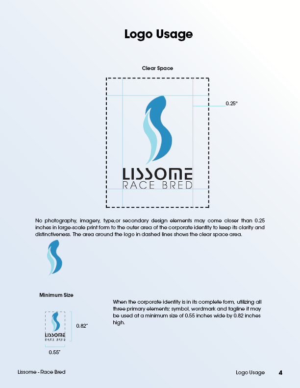
So i’ve included images of my guideline book.

LissomeGuidelineBook

LissomeGuidelineBook3 LissomeGuidelineBook4 LissomeGuidelineBook5 LissomeGuidelineBook6

Okay well, me just offer a couple nuggets on which you may chew:

The “feel” or “mood” of a brand visual is the emotional element you aim to induce in the audience. (As you said, it’s a goal.) I ususually think of it was a question: "When I look at this, what does it suggest? As the designer, it’s up to you to suggest what I should feel about the product, and then project that suggestion on me through the visual nature of your brand design.

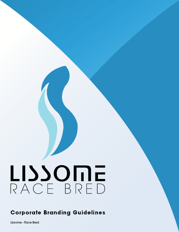
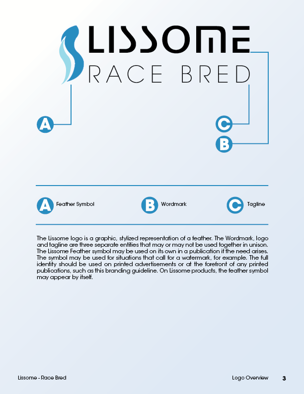
So your brand here; what does it suggest? Frankly, without the assistance of the style guide, (which the audience won’t see), I’d have failed to identify the feather . . . as a feather. So it’s intended suggestion — lightweight — didn’t make it through to me. The “race bred” tag got me to the product category, but without that, the visuals would have put me in the pharmaceuticals or feminine hair care products aisles. The vertical, hanging orientation of the feather is static, and falls short of suggesting anything nimble, fast moving, high tech, or high performance. Motor racing “heritage,” especially the European, is front-loaded with visions of simple but hard, glinty surfaces. Quickness, finesse, and light weight are counterbalanced by bravery, friction, and brake horsepower, whereas the organic limpitude of your feather evokes the stuff of a gradeschoolgirl’s ponytail flowing down the back of a cardigan over a plaid jumper. Don’t take that as a critique of your work as much as an example of the kind of mental exercise that goes into finding the “feel” and the “mood” appropriate for a given brand. I hope that helps you understand better.

I’m not quite understanding what you’re not understanding. The whole concept of branding is simple — it’s the research, conceptualization an implementation that’s difficult.

Let’s say there’s a neighborhood bakery in town. For the sake of the example, let’s say you assembled about 50 people (possible customers) and asked them various questions regarding how they felt about the bakery. The results of this survey could provide a good basis for determining what the actual brand (as opposed to the desired brand) identity of the shop is.

The results of that survey would, of course, be mixed, but patterns would emerge. Maybe too few people had even noticed the shop. Maybe many had heard bad things about it. Maybe a significant number had formed superficial negative or positive impressions based on external appearances. Whatever emerged from the survey would provide direction on what needed to be tackled with a branding redo.

A brand is much bigger than a logo redo and nice signage. A brand is the essence or consensus of what people think about a business, organization or product. Improving the brand of a business might not involve much graphic design. It might be focused more around customer service or location or reputation. For a graphic designer, however, we tend to get called into projects when the brand of a business can be improved through better visual appeal.

So back to the bakery… Let’s say the survey showed that many potential customers hadn’t even noticed the bakery or had a mistaken idea about what the bakery sold. Okay, this sounds like something a graphic designer could help with in terms of a visual identity redo. This might involve a better or more visible storefront sign. It might involve some targeted advertising or promotions. It might involve a new logo and menus for new items that might be sold. Whatever it might be, these items should be strategically planned and designed to counteract any negatives about the business while accentuating the positives.

Doing this successfully and consistently involves a complex interplay of taking just about everything into consideration before developing a strategy based around how best to influence people’s impressions and understandings in a way that achieves the desired results.

For the bakery, this would likely be a combination of the obvious and the subliminal. For example, the storefront sign might need to be larger to catch people’s attention (practical), but that sign might also need to tap into the emotions of those driving by (subliminal). For example, if the designer came up with a sign that caused those passing by to imagine the smell of hot french bread coming out of the oven, those people will likely, at some point, give into their emotions and stop in to buy a loaf of that bread. If the expectations inferred from the sign were met consistently by enough people, the brand of the bakery will have improved.

The essence of branding is conveying meaning, which is to communicate the unique value of something (a product, service, company, organization, political movement, or whatever) to those who might value that unique value. For instance, if there were 10 bakeries in Just-B’s neighborhood, a new baker might conclude that the market was saturated. But they need not fear, branding is here! The way to success is easy as pie, simply find a niche and market to it.

After a little research, it may turn out that none of the ten bakeries in Just-B’s neighborhood offer much in the way of pies. Coincidentally, the new baker loves making pies and is exceptional at making them. Out of all the bakeries in the neighborhood, this new bakery will be the go-to place for excellent pies. Having established a unique value position in the neighborhood baking market, the new baker can now set out to advertise this value to those who might value it, or rather, convey something meaningful to those who find it meaningful, and target pie lovers.

This new baker truly loves making quality pies, and this is a desirable quality to pie lovers. People often tell the new baker that “you can taste the love.” So even in a saturated market this new baker has a powerful organic brand. She just needs others to know it.

The logo for such a brand might try to somehow combine the concept of love and pie. But regardless of the logo, every touchpoint with customers should have this basic or essential meaning in mind in order to maintain a consistent brand and fulfill the promise of the brand. What’s the promise? Even if it’s never explicitly stated, it’s that you can taste the love in every bite.

I understand all of that quite easily. It’s simple, really. It’s basically like art direction. No different. However, a lot of words are just words. The philosophy of it all doesn’t help in the one thing that matters most, execution.

I’m also getting some mixed signals from you.

Those two are very polarizing. Just saying.

Which visuals exactly? Just the logo?

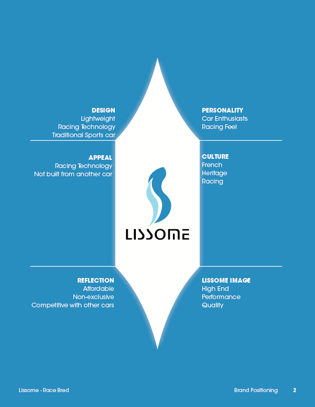
That helps. Could you show any examples? What about page 2 of my branding guideline? The white graphics? Is what you’re thinking of? Sharp surfaces?

You see, I love marine biology and would think it’s fun to create another brand for a NASA-like deep sea research corporation and show that off. But then I think to myself: who is realistically going to see such a corporation’s branding? Who sees anything from NASA other than their logo? No one, really. They don’t MAKE things for PEOPLE. So, eh. I don’t know. All of it might be a waste of time. And then there’s the matter of finding the right placeholder images for “products” they make.