Just-B
March 14, 2023, 2:32pm
21
I sometimes shy away from offering subjective opinions unless I’m a little more sure of myself than I am here. But since you’re asking…
I tried to describe this on the first go-round, but it isn’t easy without pictures. Have you considered this for the R and K?
Are the figures proportional or tabular? The 4 looks a bit narrow, which might be unavoidable with tabular figures.
I’m unsure if the commas and apostrophes should have a sharp point. Have you tried squaring off their tails?
The C still looks a little bit wide to me.
1 Like
OK this is probably the last iteration unless serious concerns are expressed.
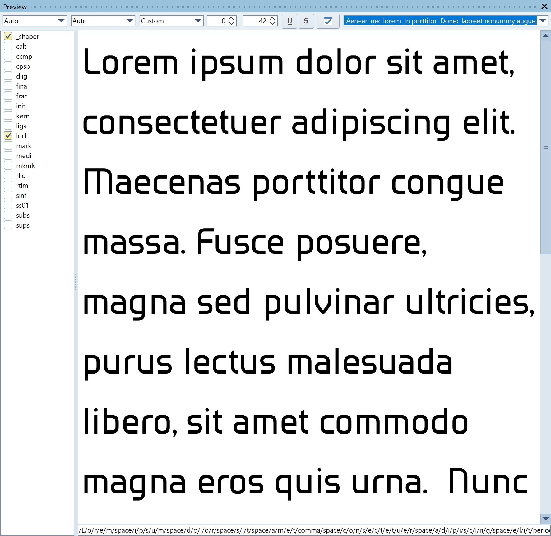
Standard filler text.
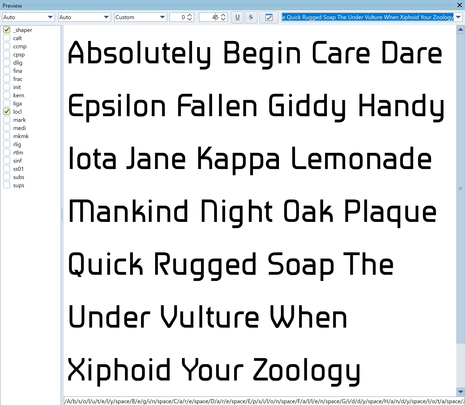
All capitals with lower case.
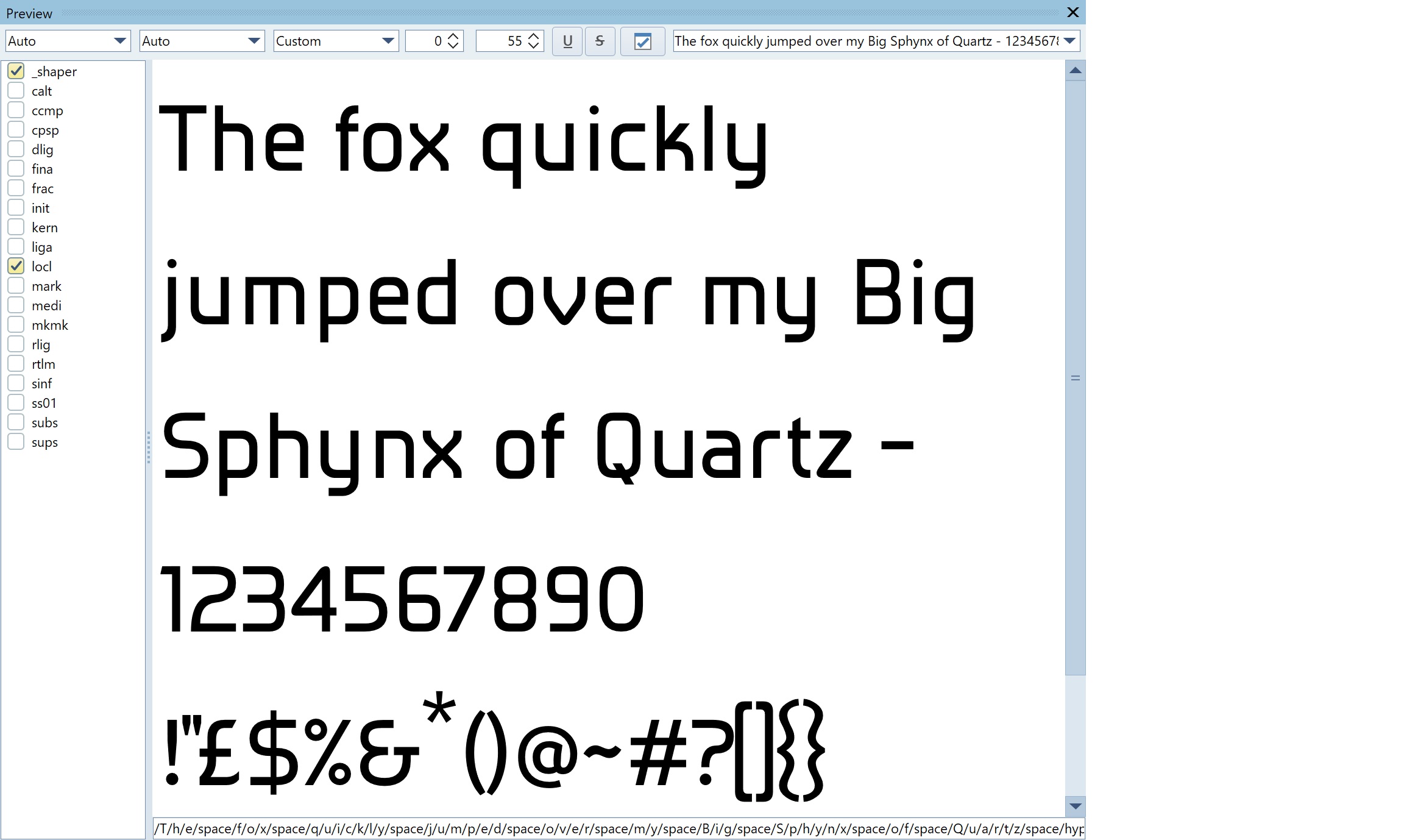
Numbers and symbols.
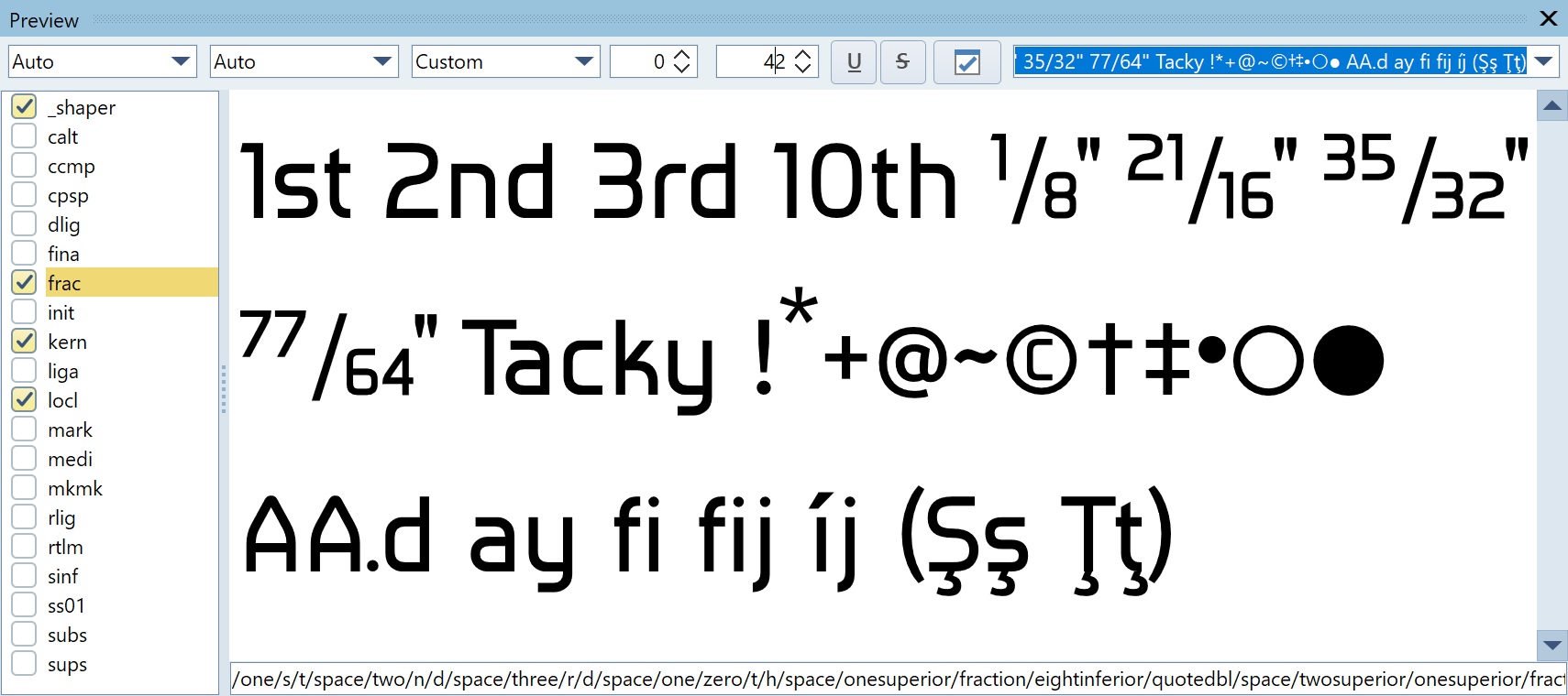
Intelligent Fractions.
The numbers are proportional. ‘4’ has been widened. Capital ‘K’ has been altered. Capital ‘C’ narrowed although it was already narrower than the ‘D’ and ‘O’ (but looked wider). Kerning completed. ‘R’ was altered to match the curves on the ‘Z’, perhaps the bowl should be slimmed down a bit.
1 Like
This font will be made available for free download shortly. Watch this space.
2 Likes
The Font is now called ‘Lanyon’ and will be available on fontspace as soon as they actually put it on the website (it has already been uploaded).
Meanwhile you can download it (and many other fonts) from my personal archive at :-
They are all free under the SIL Open Font License.
2 Likes
system
March 17, 2024, 3:29pm
25
This topic was automatically closed 365 days after the last reply. New replies are no longer allowed.