I don’t know what it is, but I hope someone else does. That looks like a font I could use at some point.
Sorry .. not finding anything. There are fonts with similarities, but none are really close. Several letters are too unique.
Where did you find this one? Did it come packaged with something you are working on? I only ask because it may be something proprietary to what you are working on.
Otherwise it’s out there somewhere … I just have no idea where lol ![]()
The typeface reminds me of old dot-matrix printer fonts but without the dots. I don’t have a clue what typeface it is, though.
Closest I have is Snasm Book.
I found several similar ones:
But nothing that is a precise match.
Sorry, this was a trick question. It is a typeface I am in the process of designing. ![]()
When it is ready it will be released under the SIL Open Font License.
Meanwhile any suggestions anyone has to make it better would be most welcome.
I don’t even have a name for it yet. At some point it will need a meaningful name, it can’t be released as ‘G2’.
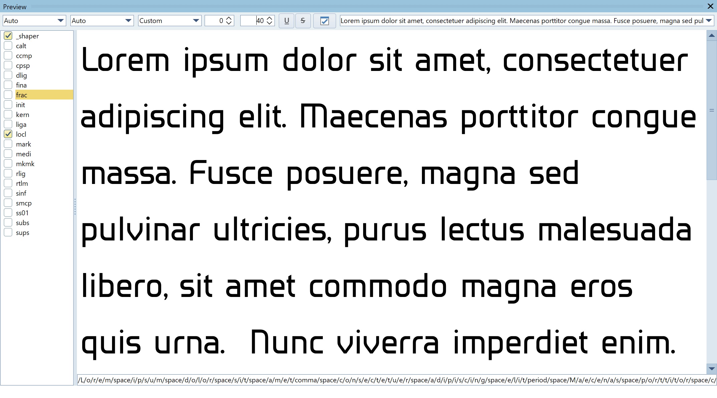
Without seeing clearer images and commenting on individual glyph design, the two things that jumped out at me straight away, affecting it as a font in general, when I first saw it were; the optical compensation for horizontals vs verticals feels off, in that the latter is visually heavier than the former. Secondly the lower case s feels equally inverted. The relative size of the top vs bottom of the glyph makes it feel unbalanced and almost upside down.
As well as the horizontal vs vertical issue of the glyphs affecting the overall ‘colour’/evenness of the text, there is a mismatch between the side bearing / letter pair kerning and the word spacing, which upsets the flow. The word spacing feels a little too open. I think it needs reducing slightly, but also overall letter spacing needs opening up a tiny bit too. Currently, the general feel is of a series of individual words, rather than a body of text.
Finally, kerning pairs need looking at too.
Hope this helps a little.
1 Like
")
I guess I was on the right track when I asked if it was something you were working on ![]()
1 Like
Whoa, blast from the past!
1 Like
Noted. Thanks.
The kerning has not been done yet there is an Open Type feature but at the moment it is empty.
I will look at the horizontal/vertical compensation. I will reduce the width of the space character slightly.
Also the line spacing is a bit wide, this is because it has to accommodate Arabic characters, I am working with a friend in Baghdad, he is working on the Arabic characters and I am working on the Latin characters.
I would point out that I did threaten to do this in one of my previous posts ! ![]()
I would point out that the in Microsoft font Arial the horizontals are 11% narrower than the verticals.
Arial, Helvetica, Fruitger, and similar typefaces are a bit more organic. They incorporate lots of subtle stroke width differences that seamlessly flow into one another to offset optical illusions and soften their appearance.
Your typeface is a very different sort of design that depends more on adherence to a mechanical consistency, which makes the width differences between the horizontal and vertical elements more obvious — especially in the curved transition areas, with the s being a good example.
I still think the horizontals need to be a bit narrower than the verticals, but I might be inclined to try scaling back the difference a little bit.
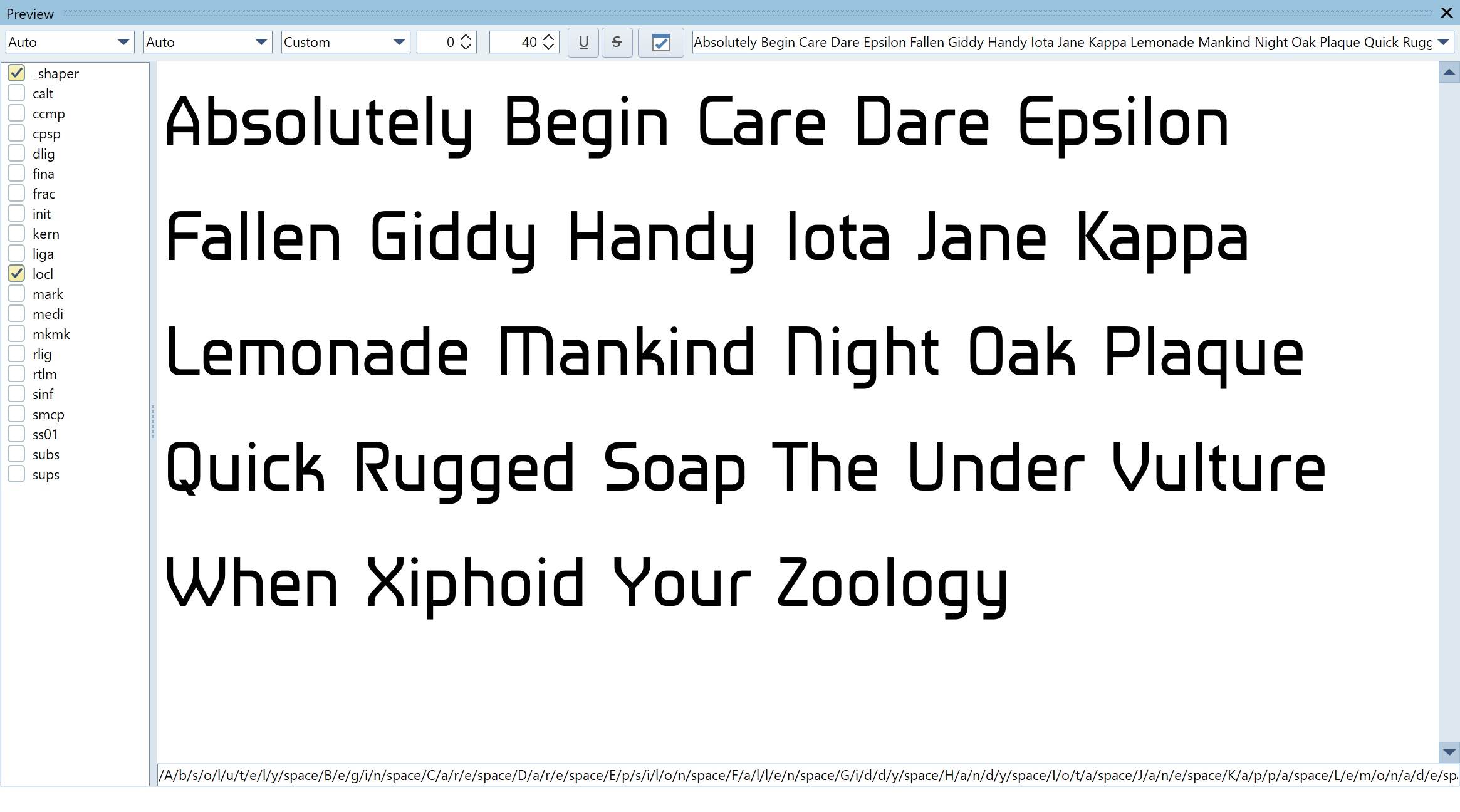
The uppercase glyphs seem a bit more inconsistent than the lowercase.
For example, the Z seems a bit too narrow, whereas the W seems a little too wide. Similarly, the C looks considerably wider than the D and the O.
The sharp point where the leg of the K and R connect with the other strokes seem a bit out of place to me since they don’t appear elsewhere in the font. I’ll also suggest making the leg of the uppercase K match the lowercase k.
There don’t seem to be overshoots on the rounded letters. Was this intentional?
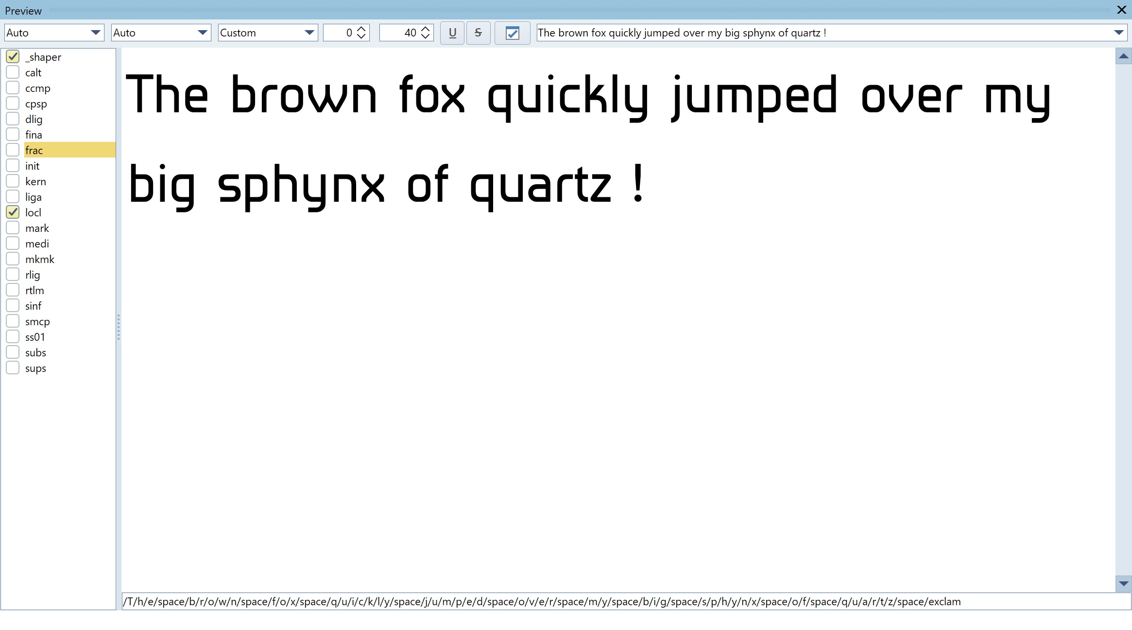
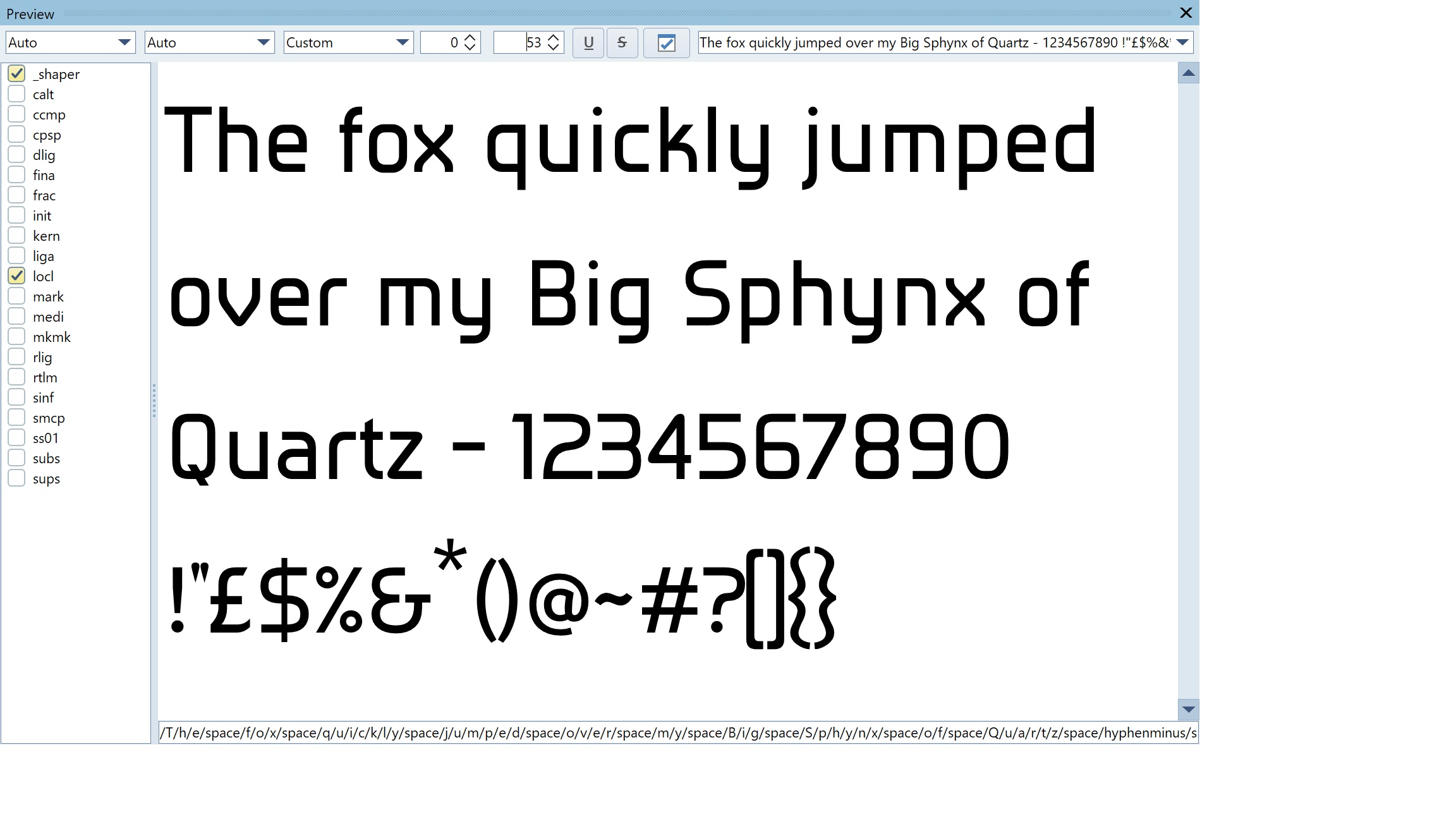
Have you tackled the numerals, symbols, diacritics, and punctuation yet? I’d be eager to see them. For some reason, I always seem to have some difficulty matching the look of the numerals to the letters.
1 Like
I have evened out the upper case glyphs.
I will look at ‘C’, ‘D’ and ‘O’.
My first attempt at doing the upper case ‘K’ like the lower case ‘k’ was a mess I will look at a different solution.
Another set of images is coming soon, watch this space.
Usually I don’t start out with a blank canvas. My first ever font was Kelvinch which was done from scratch and took a long time but since then I have tried to use one of my previous fonts as a starting point for the next one.
This one however was different, I didn’t start out with a blank canvas but it wasn’t one of my fonts. A friend of mine called Husham was developing an Arabic font, he needed something in the Latin characters so he used an open source bland generic sans as a starting point. I made a few comments about it and he invited me to improve upon it.
The bland sans was just a placeholder but it does contain all the punctuation and symbols needed. However many of them are inappropriate for the character of the font which is emerging. They will be modified in due course.
I am currently trying to decide if it is more appropriate to have a round full stop, a square full stop or a diamond. Of course it will not just be the full stop but the comma and the ‘i’ tittle as well as the exclamation and question mark and many others which will be affected by this decision.
Group Sans
Latest Iteration.
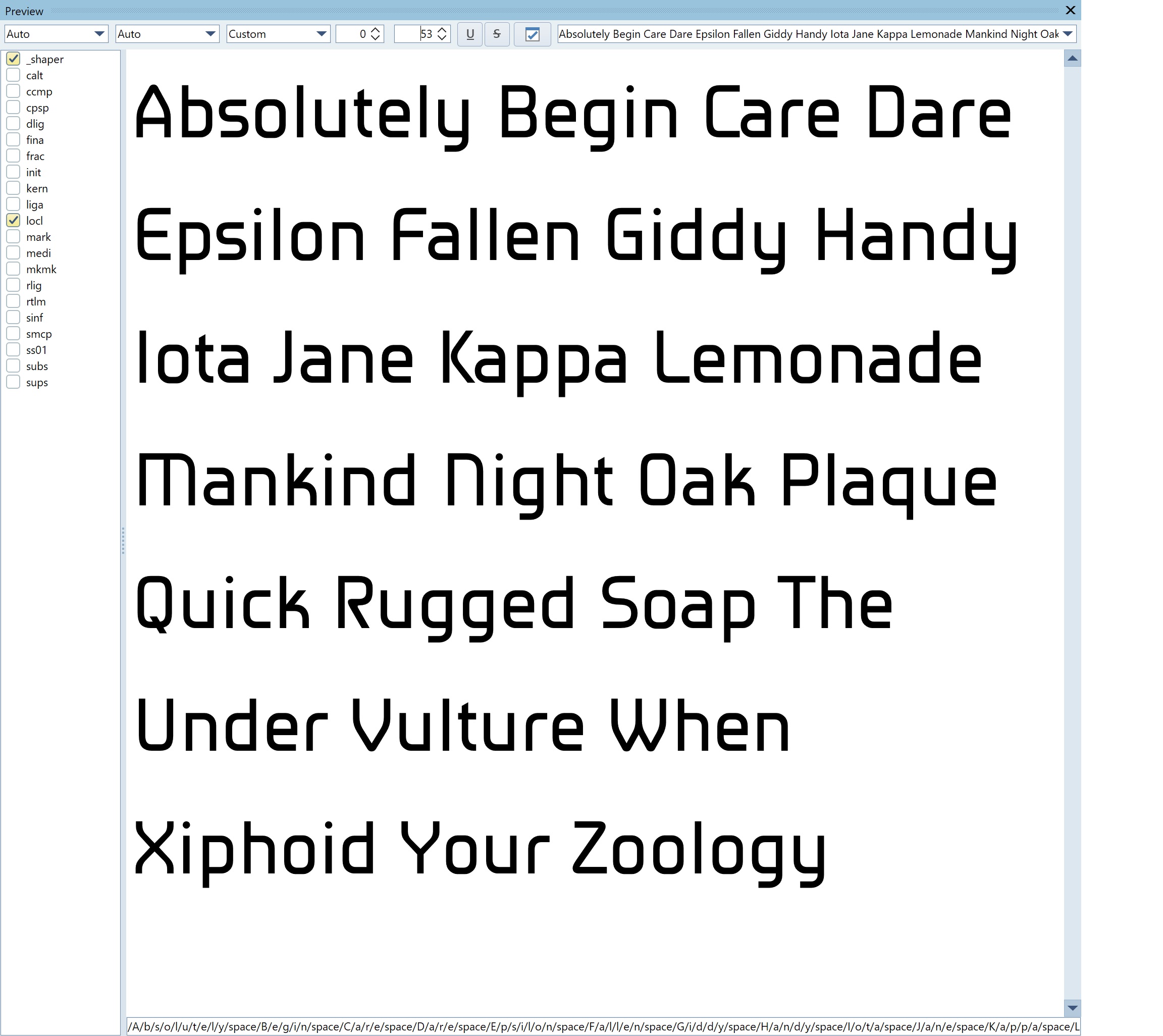
Letter spacing loosened, space reduced, width of W reduced, width of C reduced slightly, ‘K’, ‘R’, ‘V’, ‘v’, ‘W’, ‘w’ and ‘A’ modified. Many other changes.
I take it that the lack of responses is due to the fact that the current iteration has solved all the problems and is now perfect. ![]()
![]()