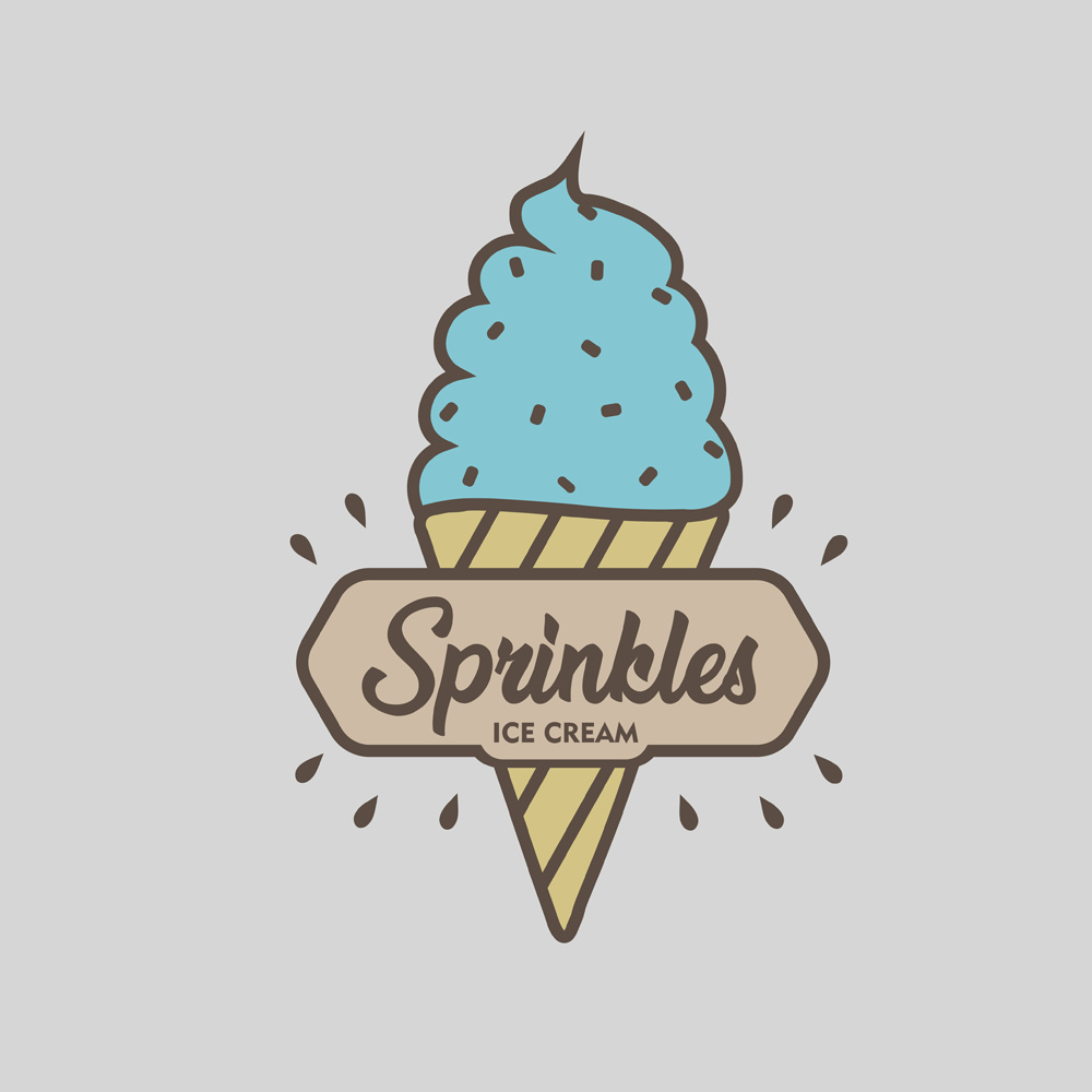
Hello peeps. I have a lot of free time so I decided to a make logo for ice cream company. I tried to make something simple, modern, little bit colorful and vintage, something that represents tradition and quality of their products. I’d like to hear your opinions and ideas what to change.
1 Like
A quick Google search for “ice cream logo” will show you a plethora of logos that are very similar to this: an ice cream cone with words in front of it. This is to say that you don’t have anything original here. Push the concept beyond the obvious and see what you can come up with. Aside from that, I don’t find the colors very appetizing, and the gray background isn’t helping.
1 Like
I agree with Steve_O.
And would add that “Sprinkles” doesn’t suggest ice cream. Isn’t that something you sprinkle ON ice cream, or cupcakes? You buy it at the store in a little bottle?
If this is a fictional project, try a more on-target name.
I do like the reversed-out effect.
In addition to the above .. the font isn’t working for me. When first looked it read as Sprinlcles ![]()
2 Likes
That top sprinkle seems to get lost…especially on the outlined version of the logo.
Scoops of ice cream might work better than the soft-serve stuff (unless, of course, they only sell soft-serve). Blue might not be the best color for ice cream. Why are there drops of fluid spraying out from the cone?
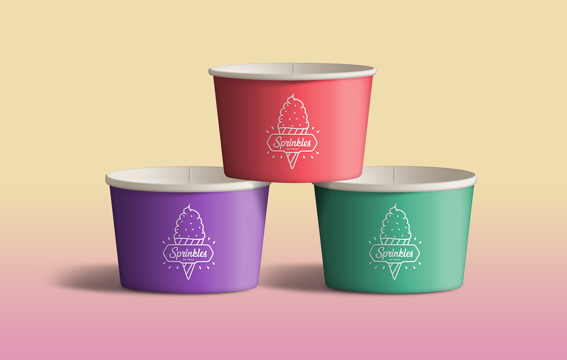
I really like the use of colour in this logo design ![]()
I Love the use of the colour and the font
1 Like
One word : FREEPIK
Is your one word saying this was lifted from Freepik?
Or to go to Freepik for something better?
Stock images/logos = bad idea either way.
I think the only problem is that, it is not as unique as it should be… And also scoops need changing