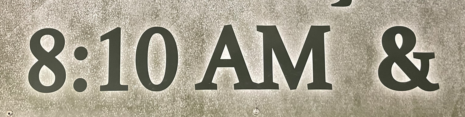
I’ve been tasked with updating the start times on a local church’s sign. Original signmaker has passed away. I thought I knew what this was, but I was mistaken. All the fonts I have do not make that sharp of an angle on the serif.
I’ve been looking for a font like that. The closest match I found is called Melancholy Serif. Anyway, there is a website with a font identifier tool you can check out here:

Thanks. I did run it through many font matching sites - whatthefont, whatfontis, fontspring matcherator, adobe fonts, fontsquirrel - nothing close was coming up. In my arsenal I found PT Serif, so I’m going to go with that. The ampersand isn’t quite the same, but the new working doesn’t include that. Thanks for you help though.
1 Like
Professional sign makers often use fonts and software packages tailored to their specific needs and equipment. Many of those fonts are unavailable elsewhere. I’m not saying this is one of them, but it could be.
Clarendon would probably work.
Joanna is close
Another vote for Clarendon here. The sharp pointed apex on the A and the bracketed slab serifs on the M are textbook Clarendon DNA, and that distinctive ampersand shape lines up with the family too. Joanna feels a bit too soft and humanist for this one — the angles on your sign are noticeably sharper than Joanna’s. If a straight Clarendon doesn’t match exactly, check the bold or condensed cuts as well, since sign shops tend to favor those for channel letters.
I think Clarendon is my most used font!
It is very flexible in fancy design stuffs. If plain old kerning and leading and such don’t make it fit where you want it, it is extremely forgiving when using free transform. A lot of fonts end up looking wrong if using free transform, especially if styles are applied. Clarendon handles it very well, and it does look like a good choice for your project - especially if the client is not insisting you match the font exactly.