Hey there,
Having trouble finding this font:
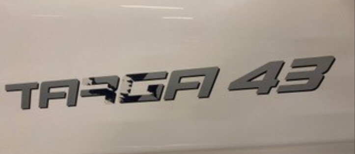
Allrdy tried all the identifiers I know of ![]() .
.
Hope someone who knows!
Greetings
Hey there,
Having trouble finding this font:
Allrdy tried all the identifiers I know of ![]() .
.
Hope someone who knows!
Greetings
That one doesn’t look like a typeface. At least not one that hasn’t been heavily modified.
It’s a boat LOGO, and was probably conceived as such on the drawing board.
If you need it for a legit reason, contact the company (Fairline.)
If you need it to spoof your buddy’s little bass boat, the answer is obvious, and would take about 10 minutes.
Thank you,
It’s for a client.
I had no idea that there are special boat fonts ![]() .
.
Not all logos are fonts
That logo looks custom designed.
At the risk of derailing things off onto a tangent, I belong to a logo design Facebook group. It baffles me how many people there (mostly newer designers) assume that all word marks and logotypes come from downloading a font and typing it in.
They typically get the whole idea of kerning, but when the notion of reworking the letterforms themselves is mentioned, it elicits bafflingly naive responses along the lines of, isn’t that a copyright violation, where did you learn that, or where do a find a font where that’s already been done. It’s as though they use type, but really don’t know anything about it. My entire first year of design school was spent studying type. Is that not a thing anymore?
Even though the boat word mark in question isn’t an especially good example, good word marks are rarely just letters typed out from a font. That approach is on the same level as buying a generic logo from a stock company. Word marks typically come about in a couple of different ways. They’re either drawn from scratch or they’re glyphs from a typeface that have been modified to make them work and fit together better as a unit in a way that’s distinctive and meets the requirements of the job at hand.
When designing all the glyphs in a complete typeface, almost everything is a giant compromise. Every single glyph in the font needs to look good when positioned next to every other glyph in the font. This necessity imposes severe constraints on how each of the glyphs are designed. In a word mark, these constraints do not exist, so every glyph in the word mark can be designed in a way that only considers the glyphs next to it and how they all fit together into a unified composition.
ooooh, I had misread ur first commen sorry ![]() . I know that
. I know that ![]() .
.
Im very typographic orientated.
At first I thought it was a mix of 2 types, but now we just reconstructed it with an other font.
It is mostly to renew a sign when we get these kind of requests.
thnx!
For things like boat numbers, I will admit I assume there’s a font that’s been used as a basis but only because typically they’ll have the same font for each boat model in it’s own variation for that year/years of production.
To answer your design school question, no. At the Art Institute of Portland, and most likely other AIs, we have 3 typography classes so 9 months since we were in quarters, but the teacher quality at AI was variable depending on what city you’re located in. Needless to say Portland had stronger design teachers than most of the other campus’ due to our design culture in Portland. With the invent of digital typesetting I think the emphasis on learning typography for a year has diminished. What years were you in design school?
I did my undergraduate work before digital type, but I don’t see the kind of differences that would make learning good typography today any less important. For that matter, I think the opposite is true.
Back then, type was sent out to a type house to be set or, for headlines, rubbed down with Letraset or set using a Phototypositor. The ability to work with and modify typography was much less then than it is today now that designers have access to thousands of typefaces and can modify the typography as much or as little as might be needed. Given the extra control designers have today, as opposed to then, it seems more important than ever to learn good typography.
I think typography lies at the very root of graphic design. Not only is type typically used in almost all graphic design, typography is sort of a microcosm of design itself. If one learns good typography, one is most of the way there to gaining the design sensitivity that it takes to be a competent designer.
Then again, I’m sort of fanatical about good typography. In the late '80s I went back to graduate school specifically to study typography and its use in publication design. I suppose I’m a little biased about it, but the ignorance I notice that some designers have regarding typography is, at least to me, astounding.
I agree, but I only mean that it’s perceived to have gotten easier when it went digital so students, most not all, don’t have to learn the intricacies that you learned when you had to interact with the letters by hand.
Have you ever checked out the website Buttericks Practical Typography? If you’re not familiar, it’s an e-book in a different format than you’re used to in that it’s an e-book that’s a website. I’ve been meaning to read through that book but haven’t started yet.
The day-to-day interaction was basically specing the type, sending the instructions to the type house, getting it back and pasting it into place. There really was very little chance to really interact with the type in ways that are possible now.
The most interaction with letterforms themselves was what that first year of school was about. In addition to other assignments, for example, we needed to fill up an entire sheet of 19"x24" layout paper with traced letters from magazines and newspapers. We needed to turn in a new one of those every week. By the end of the year, most of us could draw a good facsimile of Helvetica from memory.
No, this is the first I’ve heard of it. Thanks for pointing it out. I’ve just bookmarked it and will read through it all when I get a chance. ![]()