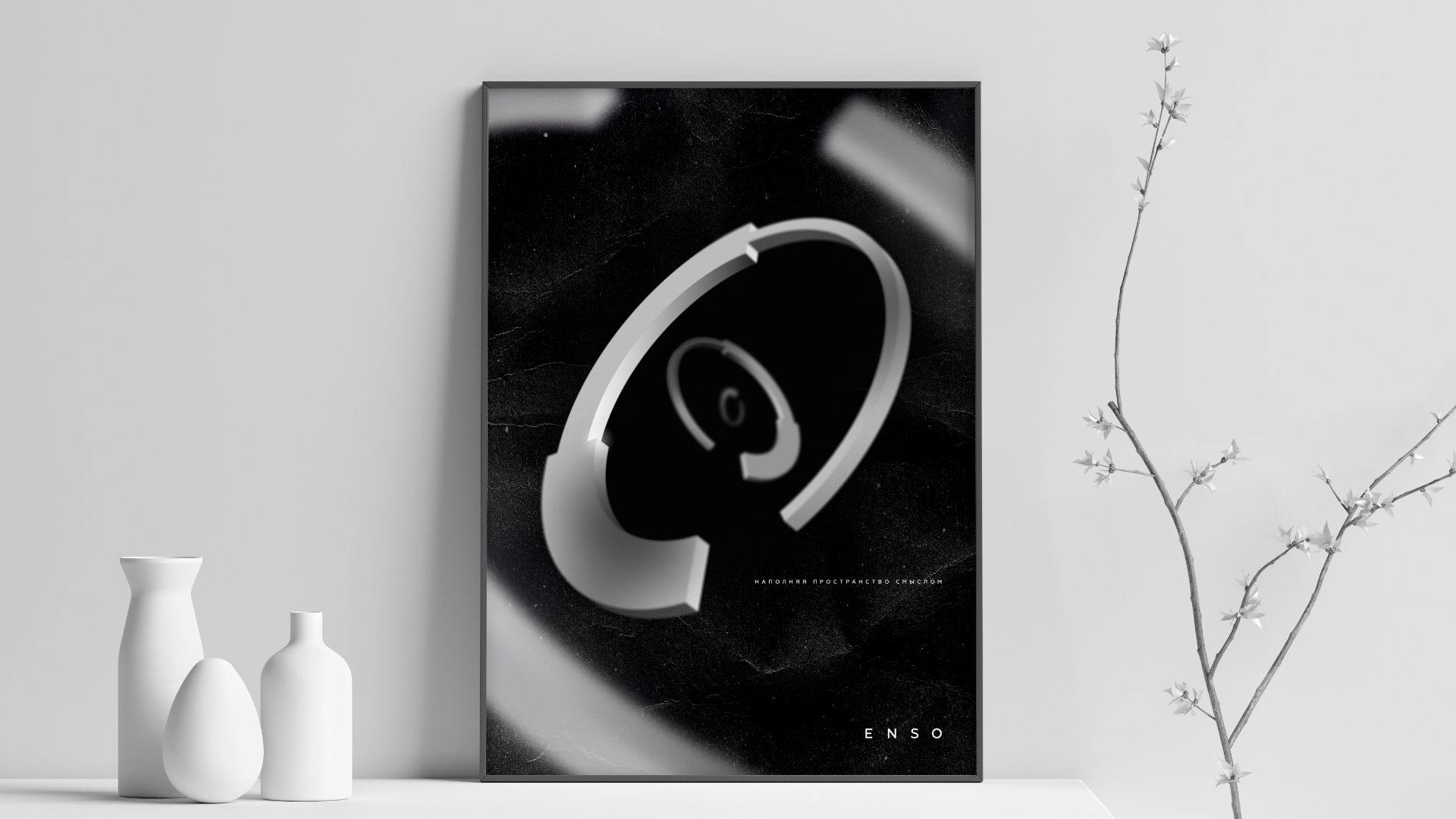
Concept. There are many variants of ENSO logo, hence our task was inventing a new style for it. We have preserved the significance of a circle, while adding precise engineering style to it. As a result, we have received a simple and recognizable logo with new approach to visualization of ENSO based on “ENSO way”.
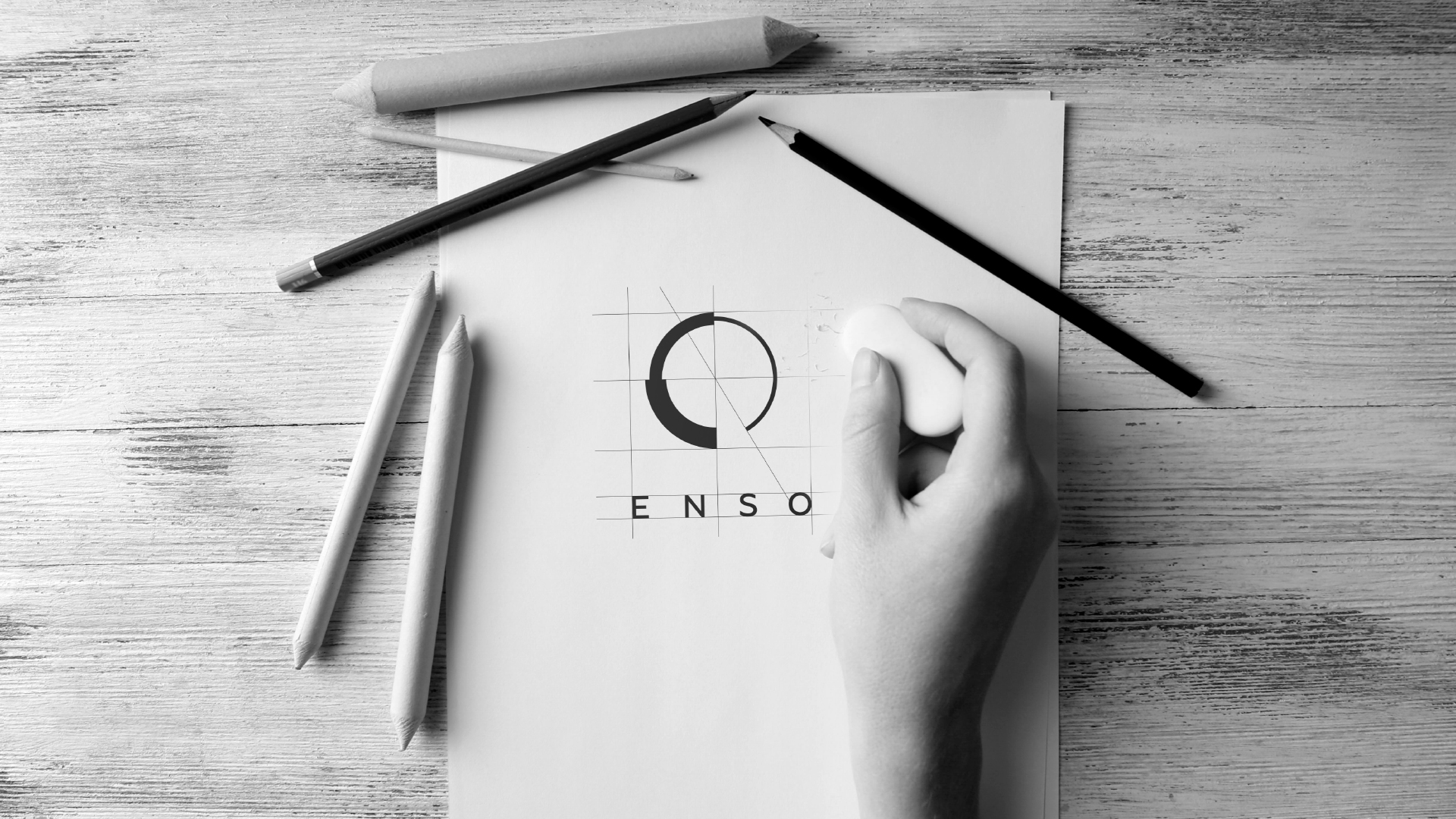
Philosophical element and pencraft were replaced with new meaning and style. Three segments, different stroke widths and a cut-out circle sector all have defined properties and relationships.
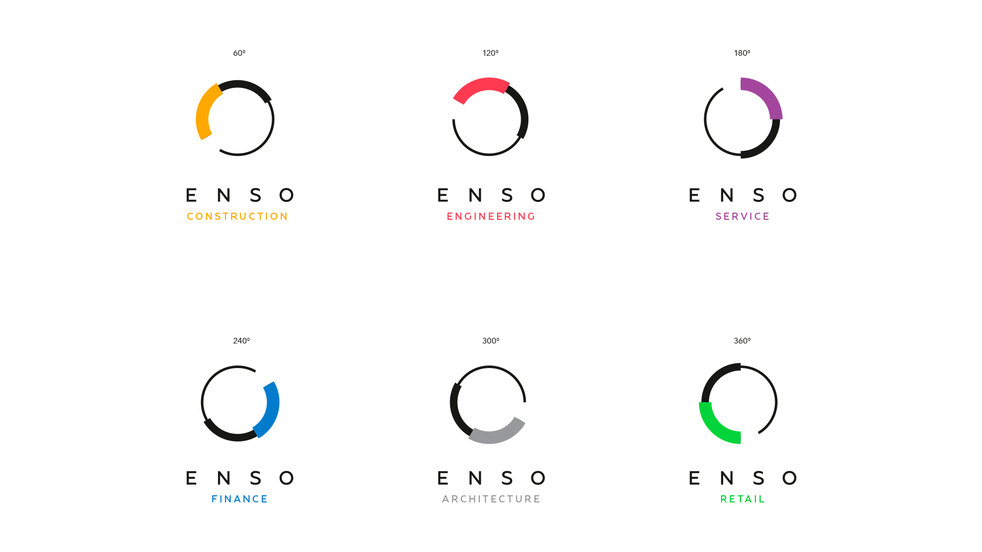
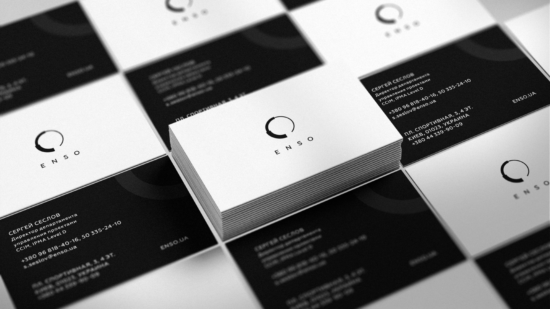
Black and white have become the main brand and logo colors. Department logos are created based on the main ENSO logo by turning the graphical element 60 degrees clockwise. Each department has its own unique color.
Two logo versions were created: vertical (main) and a horisontal one.
Fonts. Working on fonts, we have purposely selected a grotesque style, that goes along well with the logo and minimalist graphics of company style. Geometria font stands out between others with its unusual combination of dynamic and static properties that creates a sense of mobility and confidence at the same time.
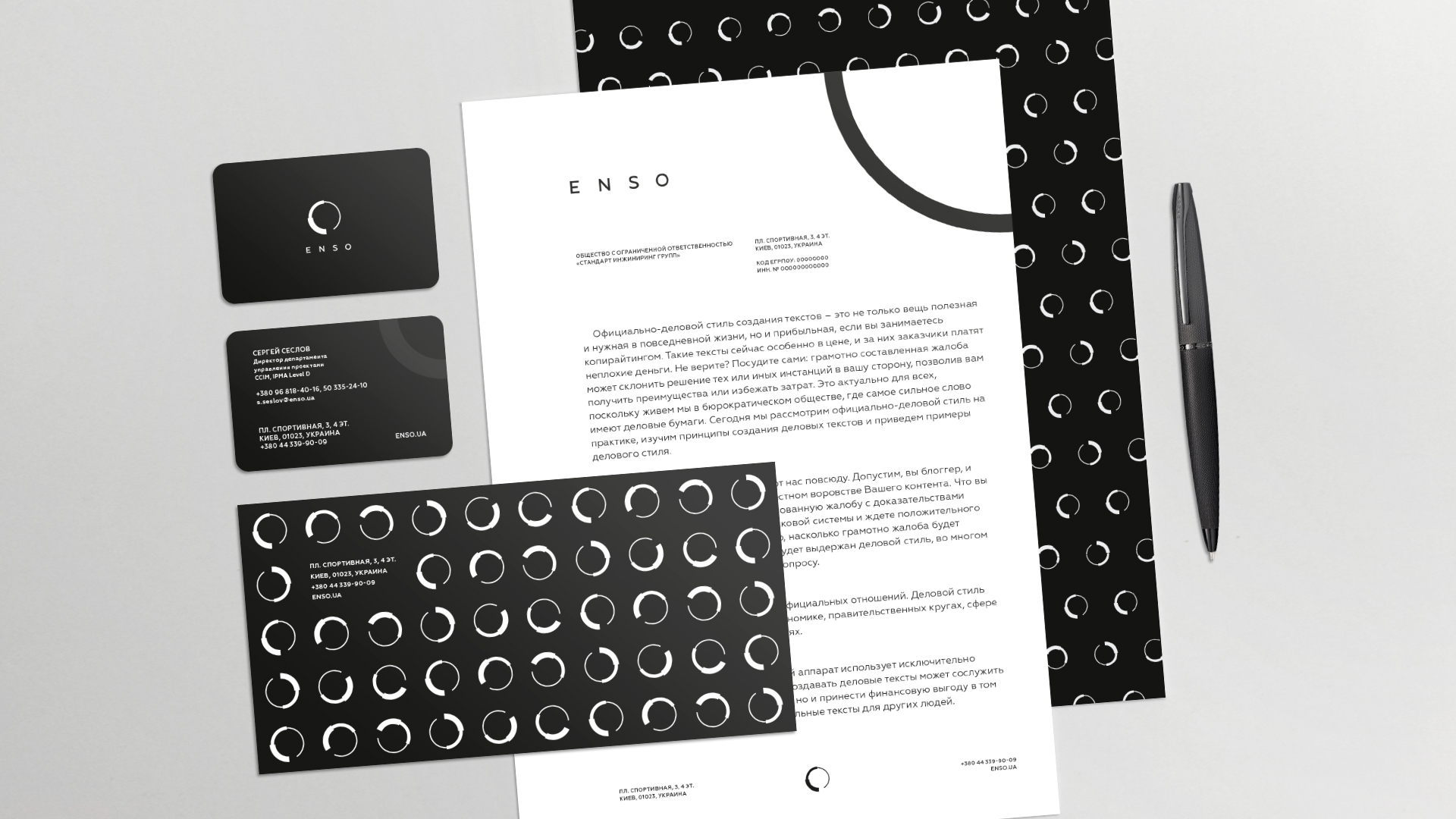
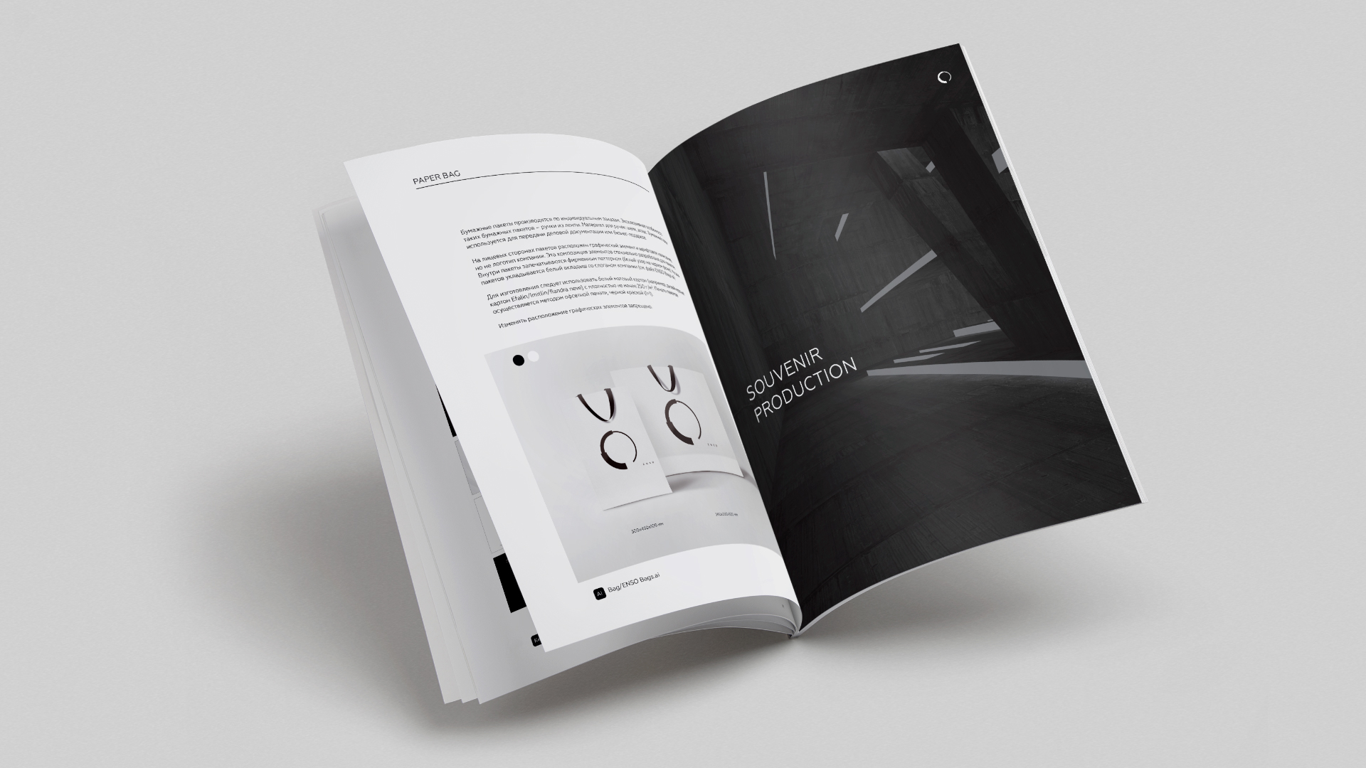
Pattern was designed as an additonal decorative element of company style. It opens up the meaning of the logo and demonstrates its dynamics. Pattern is uses in company documents and promotional merchandise.
