What logo are you referring to? Your two versions of the IKEA logo? If so, why did you post all the other company logos? I’ll ignore the other logos and concentrate on your two IKEA ideas.
Despite students periodically posting this same project on the forum, I think it’s a less-than-great student assignment. IKEA is a huge, worldwide brand with years of brand equity worth billions. Because of this, IKEA would never change its logo without a compelling billion-dollar/euro reason. They might make small refinements to keep it fresh or address specific problems, but the brand’s essence would need to stay the same.
Was this explained in the assignment? Did the instructor explain IKEA’s hypothetical need for a new logo? If not, without understanding the reasons necessitating the change, there’s no way to judge whether the new logo design successfully met those challenges.
If IKEA were a blank slate and starting up from scratch, I would avoid anything like their current logo. However, if I were involved in a redesign of the current logo, the brand equity I mentioned would almost certainly cause me to make only those changes to the logo that the problem necessitating the change required.
In other words, a logo redesign or modification for IKEA is a complex problem. Did the instructor explain these and other considerations that would always be paramount in a logo redesign for a company like IKEA? If so, great, but you’ve not supplied us with any of those considerations, so how can we judge the success of your two logos?
You’ve created two variations of IKEA’s logo that adhere to their existing visual brand. This must have been intentional. Was this part of the assignment, or did you have the latitude for a complete redo? Again, you haven’t told us and want us to judge your logo designs in the vacuum of not knowing the parameters of the problem and the reasons necessitating a logo change.
Putting all that aside, there are a few practical issues to consider with your two designs.
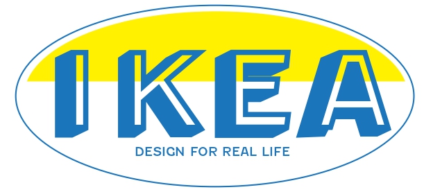
Your first design with the 3D letter looks dated, like something a small company in the 1950s might have. I don’t think the design matches IKEA’s efforts to provide modern product design at affordable prices. Then again, at least to me, IKEA’s existing logo looks a little dated and is a mismatch with its products.
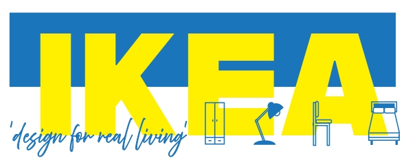
Your second logo has the company name in yellow type on a white background. Yellow on white has insufficient value contrast, which greatly impairs legibility. Exacerbating that problem is the difficult-to-read script tagline and the small product illustrations overlaying the yellow typography. Imagine driving down the highway at 100 kph. Could you easily decipher this logo on a sign, read the tagline, or make any sense of the tiny product illustrations?