Hey guys, i’m a current graphic design student learning about branding and identity at the moment. As part of my assessment i have been commissioned to re brand the identity of IKEA. As for the re branding, a logo is required. I have 2 comprehensives and was wondering if anyone could give me some feedback on some questions relating to the logo designs.
Questions are as follows:
What does the logo represent to you?
Is it legible? Is it easy to read and understand?
What is the core product/service undertaken by the business?
What do you think about the company when you see this? (List a range of key adjectives for them to choose from ie innovative, stylish)
Does it stand out and catch your eye (you may want to include a visual amongst your competitor logos)
Does it feel genuine?
Are there any technical, legal or budgetary issues that need to be considered?
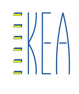
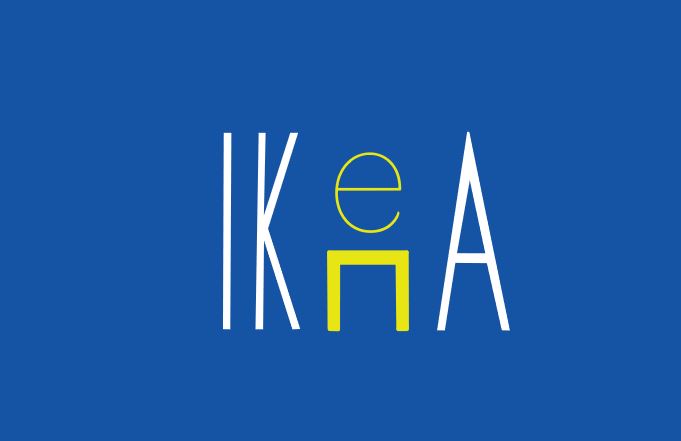
Neither of these options work.
First and foremost, IKEA is a known brand. You do not have to illustrate the concept of their furniture in a logo. That’s kinda like putting a toilet into the logo of a plumber.
Second, your letterforms are too thin, whispy. IKEA is a big huge warehouse building. They put their logo on the outside of those buildings. Those skinny elements cannot be manufactured easily or efficiently into the kind of illuminated signage needed for the side of a building, especially that letter “e” in the second example. While the first example might possibly be made out of some form of neon, that color blue doesn’t exist in any of the gasses available (I’m not so sure about the yellow either.)
1. What does the logo represent to you?
Something skinny, not sturdy, likely to fall apart.
**Is it legible? Is it easy to read and understand?**
Not from a distance. Will not serve well on any kind of collateral. It will be easily overpowered by other elements in a layout.
**What is the core product/service undertaken by the business?**
Based on the brand name, it should be about furniture. While you may have literally translated flat-box furniture, you have taken this concept so far away from the original, highly recognized brand and made it into something unrecognizeable.
**What do you think about the company when you see this? (List a range of key adjectives for them to choose from ie innovative, stylish)**
Flimsy.
**Does it stand out and catch your eye (you may want to include a visual amongst your competitor logos)**
You tell me if it works against competitors’ logos. Show a montage. Pull up an IKEA exterior and shop this in there. Does it work?
**Does it feel genuine?**
No.
**Are there any technical, legal or budgetary issues that need to be considered?**
See note above about skinny letters in signage. On the second logo, is that huge blue field always going to be included? You might want to think about your negative space on that one. The skinny “e” will fill in with blue ink when printed on newsprint for mailers (dot gain is not your friend with this version.) Legal? If this were for real, a legal team doing a trademark search would be part of the exercise. Budgetary? Neon can be expensive these days. Any option that requires de-installation of existing signage, repair of the building facade, and installation of new signage armatures is always a huge budgetary consideration. Especially when spread over several dozen if not hundreds of locations.
In the infamous words of my Graphic Design professor, “Defend or Do Over.”
I don’t know how to answer this. It’s a proposed logo for IKEA, but I doubt that’s the response you were looking for.
The first one reads KEA, but it’s not hard to figure out. Even so, you’ve needlessly obfuscated the word in both ideas in an attempt at cleverness. Clever ideas have their place in graphic design, but when when an idea is forced or intrusive, it gets in the way of communicating the main messages, which in this case should probably be a simple, unique statement that says and identifies IKEA.
I can see what you’re doing in your ideas about trying to convey their furniture and how it all comes in boxes, but I think heading off in that direction is not such a good idea.
Sorry, but I see cheap, flimsy and small.
It might be eye-catching, but possibly for the wrong reasons.
Genuine to IKEA’s image? Sort of, but I think you’ve retained what doesn’t work about their existing visual branding and tended to compromise what does work.
Yes, and PrintDriver spelled them out for you. Quite often school assignments ignore the practical issues associated with design, but that’s not possible once one graduates and starts working on real projects with real money and real consequences at stake.
IKEA is a huge, billion-dollar, multi-national corporation. It’s branding needs to be consistent with that presence — big, bold, stable and forward-looking. Your logos (and the ideas behind them) seem more along the lines of what one might expect from a mom and pop hobby store at a strip mall. IKEA is not a boutique operation, IKEA is BIG.
IKEA, in addition to its bigness, focuses on selling nice-looking, interesting furniture that also happens to be inexpensive. It’s actually fun to go to an IKEA store. It’s fun to look at all the cool stuff there and see that all that coolness doesn’t cost much and can be tossed into your car and set up at your home that evening.
So the challenge becomes how to design a visual brand that simultaneously says big, strong and stable while conveying a sense of coolness, style, innovation, budget consciousness and fun. Maybe you need to concentrate less on logo cleverness and concentrate, instead, on subtly capturing the big personality of the company along with the positive emotional experience of walking into one of their stores.
For what it’s worth, I don’t like IKEA’s current visual branding. The blue and yellow, to me, says cheap and garish. The Verdana typeface they use as a company standard is also ill-suited considering its unrefined nature as a face designed for legibility on low-resolution computer monitors. How IKEA came up with that color combination and why they chose Verdana is anybody’s guess. If I were doing a rebrand of their company, those are the very things I’d considering toning down, if not changing outright.