Hey guys, just joined the forum to seek advice on a problem that has been grinding at me for several days now - I have even taken two days off & returned to it with no luck.
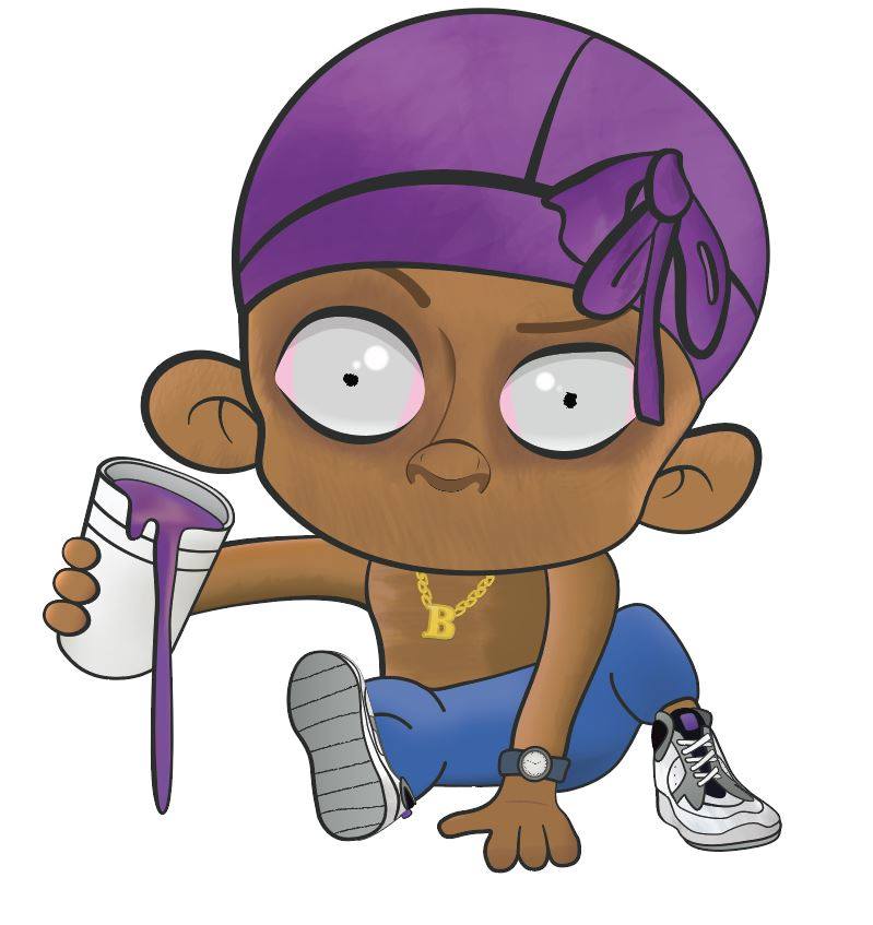
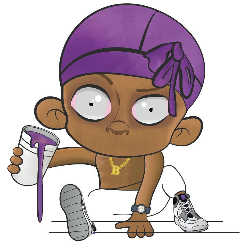
The problem is that I am trying to draw a baby for a client’s logo with one leg up & one leg stretched out. The leg that is up seems fine, but I am struggling very much with the stretched out leg. I just can’t seem to figure out where the definition lines should be & where the shoe should be positioned/and to what scale.
I have even attempted to use an online virtual mannequin for reference but still wasn’t able to reach this goal. Posting on here is a last resort for me and I pray someone can help with some guidance on this!
For this type of art, what you have for line work is pretty much ok for starters, just needs some proportionate thickening as you’ve done with the face.
The problem lies in your shading. I don’t know if you stopped because you were unhappy with the line art, but the shading on the underside of the leg and butt area need to comform to shape, not just straightline across. Fix that and see if it pleases your eye more.
Foreshortened body parts are always the hardest things to draw. That said, the leg in the top illustration looks pretty good to me considering that it’s a cartoon where accuracy isn’t the objective. I think maybe you’ve been looking at it too long. As PrintDriver mentioned, a little bit of selective shading to better define the shapes could improve the illusion of the leg extending outward.
Agreed with adding shading.
At first glance I didn’t see anything out of the ordinary for the leg and foot size but after thinking a little more I would expect the foot to appear a little large because technically it’s the most foreground item. So maybe try increasing the foot size.
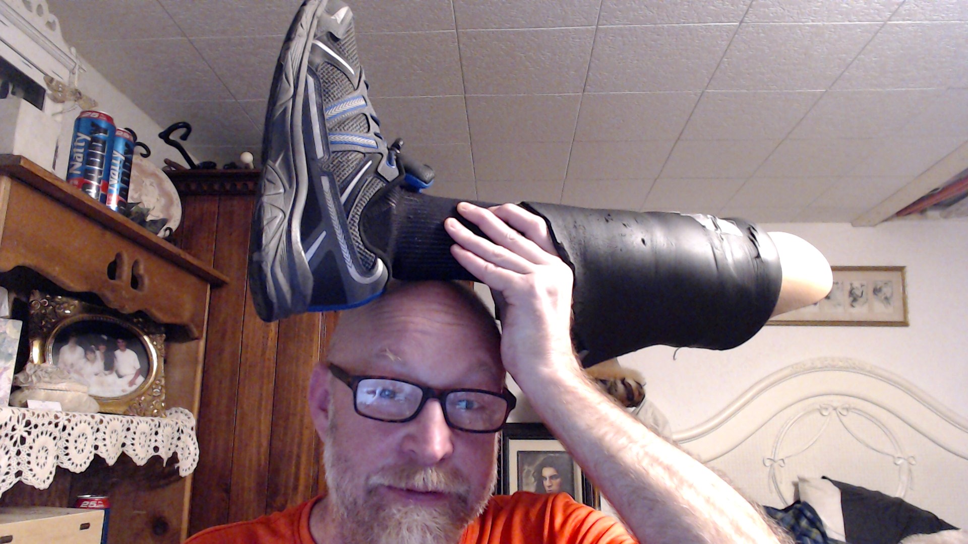
You could even ask a kid or an adult you know to be a modal in this position so you can really see how much larger the foot should be compared to the other foot or another part of the body.
Even though it’s a depiction of a baby, I see a stylized version of a grown human. A baby’s limps should be plump. The eyes should be big as shown, but the pupils should also be proportionately large. Eyebrows should not be well defined, nor should be the nose.
The shoes and the watch look like grown-up proportion; and surely a baby’s grip is not big enough to hold the cup this way.
The fluid inside the cup? Unless it’s a viscous milkshake, the surface should follow the law of physics.
Thanks everyone! It’s for a client & he wants it to be kinda ‘hood’ I guess.. so he wants it looking a bit more like a baby with adult features. The substance in the cup is ‘lean’ too, though I have not questioned this haha.
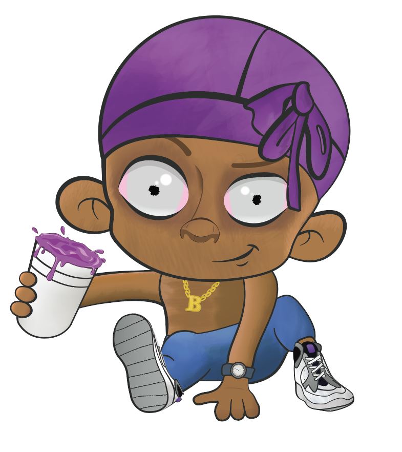
Anyway, here’s the point I’ve reached after heeding all of your advice. Personally, I am quite happy with it now. The shading has done a lot for it imo.