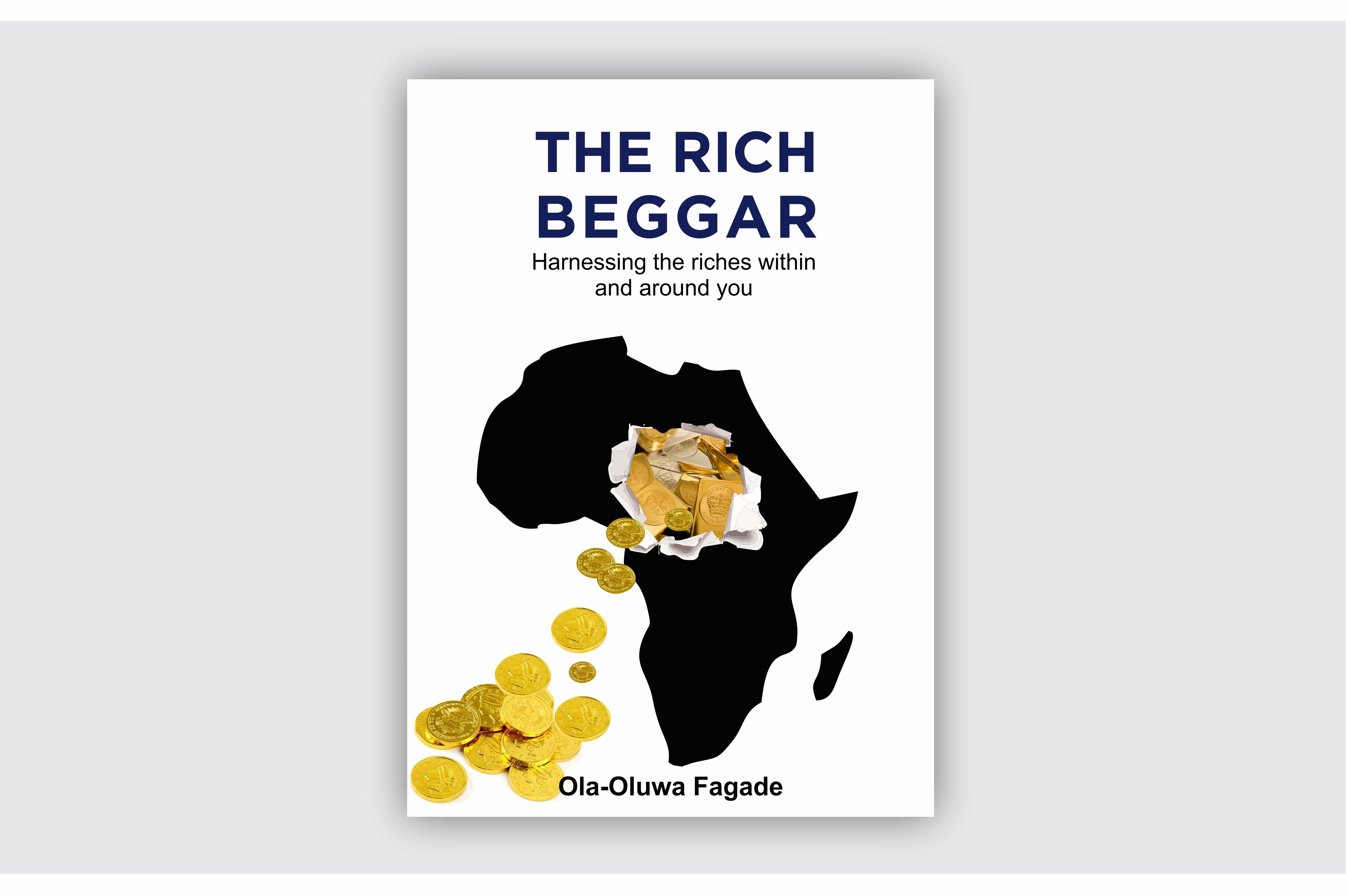
I designed this book cover for a client, but he doesn’t like it. The concept is African with lots of treasure but still majority in poverty. Rising solution for African youths to harness the riches within and around them.
I need this design to be criticized. I will love your opinions. Thank you
I don’t think your train of thought is bad . . . an outline of Africa, black to represent poverty, and riches obscured by the poverty . . . but the execution is a little “cut and paste” looking, for lack of a better term. Spend some time fleshing out what you have. Try to work in some of the rich texture and tapestry of Africa. Pay attention to the type. Mixing sans serif fonts is tough. The combination you have going here doesn’t really work. Also, I think the type could be more expressive.
The first thing I thought of looking/reading the cover was “is it a book on Nigerian scammers”.
I would caution visually tying money to Africa, or at least being cognizant of that relationship (or it may just be me).
To me this speaks less–if nothing about gold or money, but more about resourcefulness.
As for the visual, Steve_O makes a good point about tying in the richness of African [art direction] for lack of a better word. To me the visual communicates a get rich quick scheme–which I don’t believe is the authors intent.
I think the big problem is just that you haven’t done enough research into your topic. This is VERY common. The concept is decent, but needs to incorporate more of what is personal about Africa - what is left out. Ex: the regal and the statuesque - attitudes and authorities of the people of the African Nations.
One thing that always amazes me about African culture and history is the abundance of color in the art and clothing. There is also a massive variance in skin tones. The Massai (sp?) are considered some of the most beautiful people in the world. Their skin is very reddish. Many other tribes traditionally use red clay to mimic that color for instance.
1.You can find some great images of the differing tribes online and pull color and patterns from them.
2. A simple trick is to look at African flags to find some good color combos.
3. The title text isn’t reading well. But I’ll leave that to people with better typographical knowledge than I to help you there.
4. Africa is teaming with resources. Coffee, corn, oil, jewels, medicines… Instead of the gold “falling out” of Africa, maybe a concept of resources being pulled INTO “the reader” somehow? (Like the title says).
Finally, break it. Save it as-is. And go nuts on it. Make some quick clipping paths and place some images underneath to see what happens. Save a bunch of versions. Look at it again later. Turn it upside down. Go for a walk. Get it all out of your head. Then, start researching.
The author seems to be saying "look at all the opportunities in Africa, for Africans, to make money.
This cover looks more like the imperial version squeezing out every cent from the dark heart of blackest Africa.
The other point I have made several times is to sketch before you get to the computer. The computer is a set of tools to create finished art but is not really helpful (for most) at the rough stage. Make about 5 pages of a tiny, to-scale outline of the cover size (- maybe like 4up on an 8 1/2 x 11" -) then start sketching. Don’t “draw”, just get ideas down - don’t worry about the finished look. Work the concept on paper.
Sometimes it’s easy to think a computer is perfect for everything but the simple truth is, art programs are a set of tools that actually limit what you can do. They have tools to build with, but those tools are only as malleable as the amount of time you spend tweaking them.
But you have complete freedom with a pencil.
NOTE: When I say “for most” in the first paragraph, it’s because I know a lot of Illustrators who use a tablet from beginning to end. That is a great way to work because it eliminates the transferring process of the art from hard copy to digital format.
I never design book covers without, first, reading the book. The cover needs to accurately complement the personality of what’s inside, so without that insight most any critique (including my own) will be based on assumptions that might or might not be accurate.
To me, the book cover doesn’t convey a sense of Africa. Yes, the continent of Africa is there, so there’s no mistaking the African connection, but there’s no African personality in it — no color, no vibrancy and none of the diversity that’s associated with Africa. Then again, the original poster’s IP address originates from Nigeria and I’ve never been there, so who am I to say what’s appropriate in Nigeria?
I agree with @Steve_O that there’s a cut-and-paste quality to the cover. There’s a basic, rather stark outline of Africa with cut-and-paste gold coins spilling out of the middle. As Steve said, the train of thought isn’t bad, but the execution is too basic and lacks needed subtlety and finesse.
As other have said, there’s sort of a get-rich-quick look to the cover where accumulating treasure and gold is stressed over economic development, good business principles and general prosperity. Of course, never having read the book, maybe the book really is more of a how-to book about get-rich-quick schemes than one about building lasting wealth.
I think it needs more room around the edges. It looks too cramped and crowded.
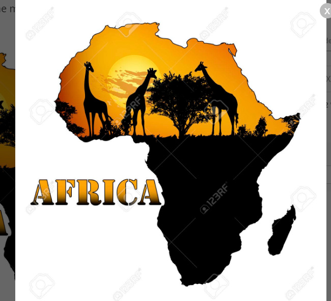
And since Africa is such a colorful culture, if you’re going to use a silhouette-type map, I’d put it on a rich colorful background. Like the below stock image. You might also put a person in it.
you will need some pencils or pens or a computer running something like paint
some paper big enough to cover the book, or just to cover the front of the book
some old magazines (I suggest glossy but any will work) or you could print your favourite font on some glossy photo paper, that will work too (this is to write your name on the front because it would be covered up by the paper)
some scissors
some glue, pritstick, pva etc
(LINK REMOVED)
Moderator edit: Sorry, but advertising within posts violates the forum rules.
Hello! I like the idea to put addition money and the country shape but I would suggest you dig more into what’s possible with those too elements.
For inspiration, I usually go on pinterest. There’s a ton of stuff! You can start by searching each element independently there and create a moodboard and try all the combinaisons you can find and choose the most accurate to highlight the stakes of the book.