I have this image that I want to place in an InDesign document:

But when I place it in an InDesign document, the image darkens:

How can I avoid this?
I have this image that I want to place in an InDesign document:
But when I place it in an InDesign document, the image darkens:
How can I avoid this?
Probably has something to do with your color management settings or document setup.
I’m not an inDesign expert but if it’s anything like Illustrator, the image may visually change appearance in-preview if the document colorspace is CMYK and the RGB image is converted to CMYK upon placing.
That’s what your images above look like to me, anyway.
Building on what @WheresMyCoffee said, your original image is an RGB file that has colors that can’t be printed in CMYK. InDesign is showing you how your image will look when printed in CMYK.
If you want InDesign to display the original RGB file, head up to your main menu and select View. If Proof Colors is checked, uncheck it
Color management in InDesign is sort of a messy thing, and there are gotchas all over the place. For example, you might also have the wrong setting selected in View > Proof Setup. You might also have the wrong settings selected in Edit > Color Settings.
Keep in mind, though, that if you’re preparing your artwork for print, it’s going to dull down when printed to something similar to what InDesign is showing you since that bright green can’t print in straight CMYK. You’ll get slightly better results with CMYK+ digital printing, but that depends on the digital output device.
Proof Colours was already unchecked.
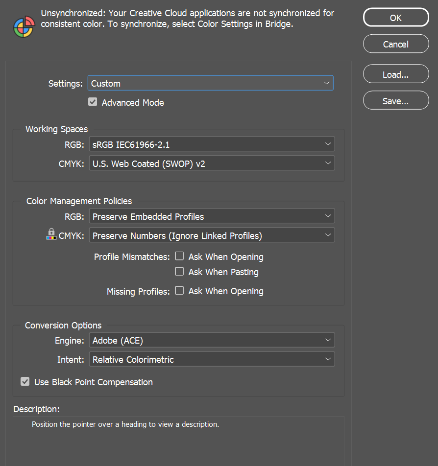
These are the Colour Settings. What do I need to change? Eventually I will need to print.
I wish there was a straightforward answer, but the color settings depend on your monitor, how you intend to print it, what you intend to print it on, and whether you want to maintain the color profiles from your Photoshop images when imported into InDesign, among other thing. And then there’s the whole Bridge thing (mentioned at the top of your image) for synchronizing color across the Creative Cloud application.
Remember me writing that color management is a big mess. Honestly, I don’t think hardly anyone understands it.
The settings in the images you posted, for example, are set to prepare your InDesign file on a big, giant web press using coated stock. I doubt this is what you want unless you’ll be printing a hundred thousand copies on one of the behemoth presses.
I suspect most designers skip the complexity and simply use InDesign’s default settings, then hope for the best. When exporting to PDF to send things to the printer, there’s the option to not incorporate half these settings or incorporate additional settings anyway, which enables the printing company to manage the document in the best way possible for their presses (offset or digital). If you plan to print on a desktop printer in an office, most of this doesn’t matter much anyway.
I typically convert all my photos or images like yours to CMYK in Photoshop unless I’m designing something for a website or a social media post, in which case I’ll leave it in RGB. In Photoshop, I’ll make sure I have the correct output device selected, so instead of Webpress Coated, I’ll typically use Sheetfed Coated (or uncoated if it’ll print on uncoated paper).
I have the proof box checked (that we both mentioned) in InDesign, because I want to have a good idea of what the work will look like when printed. However, since I do my CMYK conversions in Photoshop, In my View > Proof Setup > Custom, I have it set to show “Display,” which shows me what I’m working with rather than InDesign compensating for how it will look when printed. When I export to PDF, I’ll override half these settings anyway and enter setting in Acrobat that are specific for the job and how it will be printed. Half the time, though, I’m working with clients who handle their own printing arrangements, so I typically strip all the settings out in Acrobat and leave it up to the clients’ printers to figure it out. I hate doing this, but if it’s confusing to designers, clients will have utterly no clue.
Yeah, I know I didn’t answer your question, because, again, it’s horrendously complicated. For that matter, even I, a 40-year veteran at this stuff, don’t fully understand Adobe’s all-over-the-place approach to this. Maybe a prepress or production person who deals with this brain-numbing every day will jump in and provide better answers than I’m able to do (and correct me where I’ve made mistakes).
LOL, we actually spec that US Web Coated (SWOP) v2 for one-off large format stuff.
It gives you the best view of what you are going to get too.
But we also spec Adobe RGB (1998). You will get a color shift on output. Depends on which machine and inkset though. Some of the RGVO (red green violet or orange) capable machines have much wider gamuts than a standard CMYK press.
At any setting, etc., always, always, always get a printed color proof before spending a boatload of money on printing the final job. Sure, they can be expensive, but you will be able to show your client the closest representation of how the finished job will look.
And make sure the print proof is on the same paper that you plan to complete the job on.