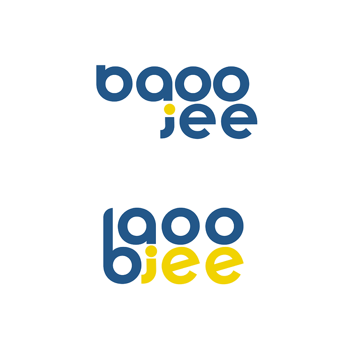
How can i improve it more , this also looks visually unbalanced
bgooee? baoo jee? bgoo jee?
Its Baoo Jee
What CraigB is saying is, maybe you need to start over and make it legible.
i think its baoo jee
The first version is readable, but the b and j draw unwarranted attention to themselves as peculiar and distracting. The second one is just plain illegible, as @CraigB pointed out.
They’re also a bit sloppy. You didn’t even line up the stacked letters or bother to adjust for various letter spacing issues before posting them here. Maybe you’re only posting rough preliminary ideas, so I suppose I might be overly critical, but to me, it still points to problems with craftsmanship and attention to detail.
Yes, it does, but the other issues I mentioned are no less problematic. There are the beginnings of a viable idea in what you’ve posted, but I’m unsure whether it will ultimately work. If it were me, I’d probably be exploring other options at this point instead of trying to force this idea to work.
No Story. No Logo.
Give us the story.
In my experience, you cannot align letters with descenders equally to the baseline of the font. There are many reasons for this, but simply put, it goes against type anatomy and ends up looking wrong.
You’re absolutely right that the logo feels imbalanced. I think it might be because you’re overcomplicating it—maybe unnecessarily?
If I were you, I’d revisit the concept, clarify what you really need to visualize, and consider simplifying. Perhaps putting all the text on one line with a color difference would be enough. Don’t overcomplicate it—sometimes the best solutions are the simplest ones.
Hi, @papauga apauga. Welcome to the forum
We have a forum rule that prohibits redoing other people’s work. You’re new to the forum, so don’t worry about it. We’re pretty forgiving. ![]() It might be a good idea to read through the rules, though.
It might be a good idea to read through the rules, though.
From the forum rules…
Ohh, damn, sorry, I did not find these rules before, will read now! Thanks ![]()
![]()
This topic was automatically closed 365 days after the last reply. New replies are no longer allowed.

