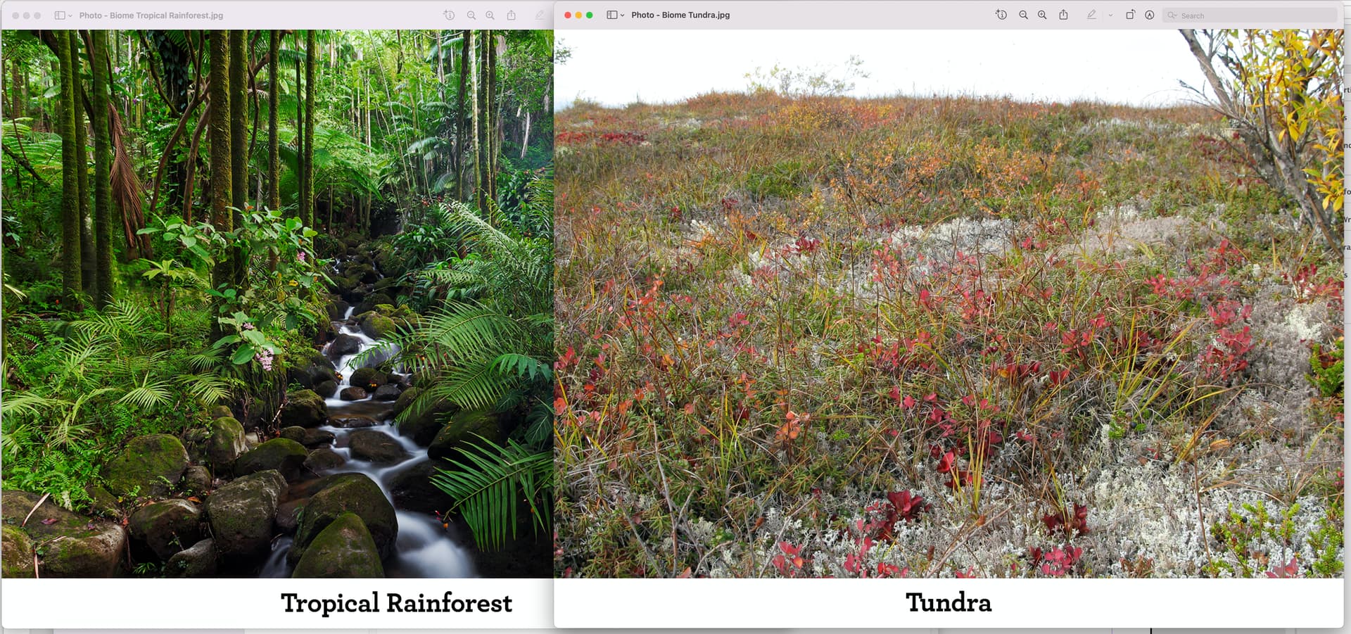
So I’m creating these cards in Photoshop using the same base file (Biomes.psd) in which I simply add a new photo and change the text beneath it. The type is 12pt. You can see that when I pull up the two images in Preview, the type is the same size.
However, when I place them into Indesign – absolutely no manual resizing when placed – the type shows up as different sizes. I’m working in High Quality Display.
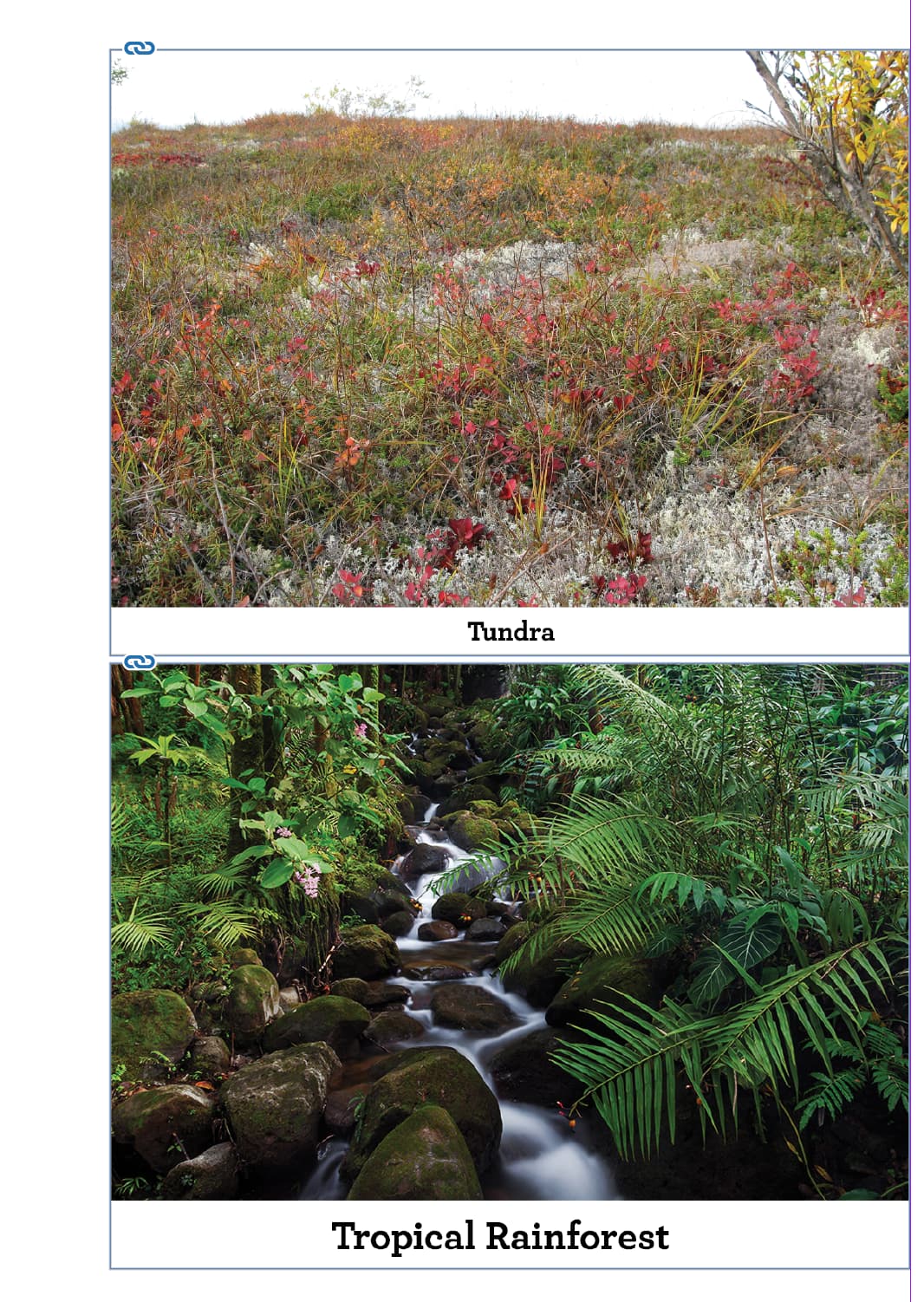
You can see right off that the tropical rainforest is cropped tighter than the tundra.
If that text is part of the photo file, when you enlarge it like that, of course the text gets bigger.
Check your image size on both images in InDesign (not the frames, the images.) You may have a place scaling error going on.
You should of course do the type in InDesign.
But if you can’t then don’t use PSD - use PDF saved from Photoshop and don’t flatten your text layers.
Your image should be CMYK and your black text should be 100% black.
Another reason to add the text to InDesign - if you are converting the image CMYK you are losing colour detail held in the RGB ranges.
So place your RGB images into InDesign - then add 100% black text in Indesign beneath the images.
Then when you make your PDF the images can be converted to CMYK during the PDF creation process.
I often do, because in many cases I need to make image edits that are CMYK specific or I want to be sure of the breakdown results and adjust accordingly – especially when it comes to larger areas of flat (ish) blues.
Horses for courses and all that. I regularly work on a publication where colour is not that exacting and it just needs to look good, so I will do the conversion at pdf stage, but for trade books where colour is something I want a level of control over, I prefer do any major edits in rgb, then convert according to profile provided by the publisher, then make final tweaks to be as sure as you ever can as to what comes back.
I suppose it comes down to experience and knowing what you want to achieve.