InDesign placing a cutout from Photoshop HELP!

I was wondering if anyone would be able to help me with my Indesign dilemma.

Currently working on a magazine for print on InDesign and having a problem pop-up where I’ll go to place a high res image I cutout on Photoshop into InDesign and having bright colours on the page already. As soon as I place the image the colours go dull.

If anyone knows why this keeps happening please help, I still want to have the cutouts there as I’m making a fashion magazine so model cutouts are essential yknow.

Before

After

Hello,

The problem lies in the first screenshot.

The light green (RGB) color is out of gamut for a cmyk workflow.

So it is a color that you can"t print.

InDesign is adjusting your out of gamut color to CMYK values that are printable.

1 Like

I don’t know how you configured your color settings. Perhaps you could turn off View > Overprint Preview. However, you have a more fundamental issue that makes your question moot.

You mentioned this being for a printed magazine. Magazines are printed in CMYK, and as @Carlo pointed out, CMYK has a smaller color gamut than what’s possible in RGB.

The bright greenish-yellow RGB color isn’t printable in CMYK, so InDesign simulates what that out-of-gamut color will look like when converted to and printed in CMYK.

This is a pretty basic RGB (additive color) vs. CMYK (subtractive color) problem that you should have known about if you’re working for a real client on a real project. Are you possibly a student or a beginner (which is fine)? Knowing helps people understand your situation and how to answer your question best.

1 Like

Hi thank you for your reply,

I am a student so pretty new to InDesign. Is there any way I can still get a colour as vivid as that for my print magazine or not?

Thank you!

From the top.menu

Edit
Transparency blend space

Set to RGB.

1 Like

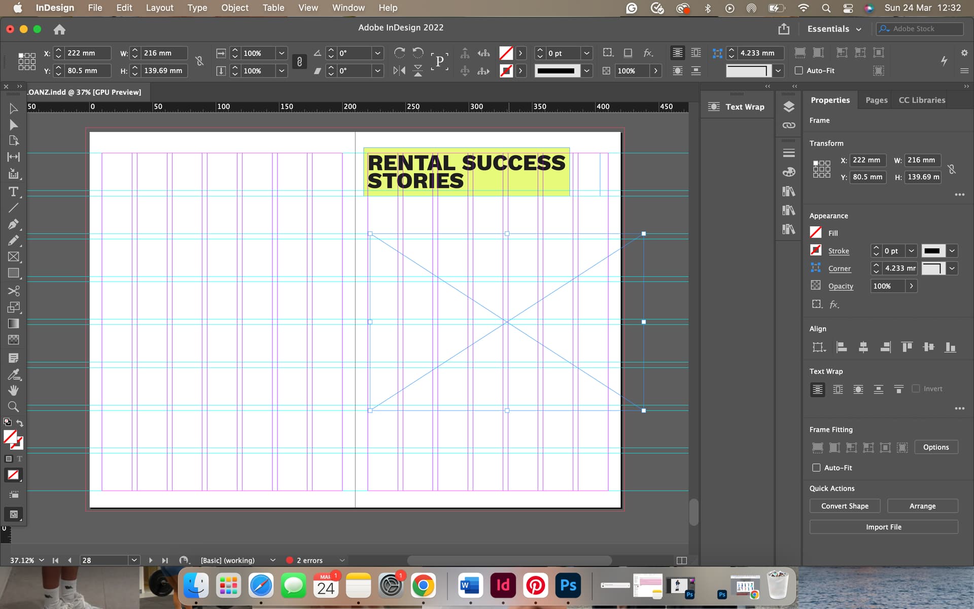
Magazines (and most other printed items) are printed with process color inks ( C = cyan, m = magenta, y = yellow, k = black ) on big, color litho printing presses. The combination of halftone shades of these four inks produces full-color printing. However, the full color is limited to what those ink combinations can produce (the CMYK gamut). There is no way to get CMYK to print something outside its gamut.

However, adding a custom mixed spot color ink to the CMYK inks will enable the printing press to print an extra color. In other words, if you needed your bright greenish-yellow color in the printed magazine, adding an ink mixed to that color would provide you with the capability to print that color. However, that extra spot ink would not enable the press to print other out-of-gamut colors. For example, if you wanted the magazine to also have a fluorescent pink color, you would need another separate spot color. Spot colors increase printing costs for magazines, which operate on thin profit margins, so they only use spot colors in special instances.

Since you said you’re a student working on a beginner’s project, I assume you won’t spend many thousands of dollars, pounds, euros, etc., to print your project on a big offset litho printing press. If you print the magazine, you’ll likely print a few copies on a digital printer, such as an inkjet or laser printer.

Like litho printing presses, color digital printers also print in CMYK using ink or toner. In addition to regular CMYK ink and toner, many digital printers also use additional ink or toner cartridges (for example, an extra bright magenta or cyan) to print in a full color that exceeds the more restrictive CMYK gamut.

There are hundreds of digital printer models, and each has its own capabilities. Depending on the digital printer, you’ll get something closer to the RGB gamut. However, you might not get an ideal match because RGB is an additive color space, fundamentally different from printed colors’ subtractive color space.

1 Like

B didn’t mention that if you want a spot color, you have to specify it in some fashion.
In the US, Pantone Coated and Uncoated colors are the go-to. Bear in mind that those two books use the same ink formula and are just showing you what the ink mix looks like on coated (glossy) and uncoated (matte) paper. They are NOT two separate color systems.

Even in digital print there IS A CHARGE to match a spot color if you want something with a tight delta-e. But even with Pantone, digital presses, including the super-wide ones with OGV inksets (Orange/Green/Violet) can only hit about 80-85% of the colors in the swatch deck.

Fluorescents are definitely not matchable. Even blues approaching Reflex Blue and some of the hot reds and oranges aren’t achievable. Some machines do get closer than others though, but not likely on a machine that prints magazines. I’m not sure there is an OGV press for digital magazine runs…but there probably is…somewhere.

1 Like

That all said, there is nothing jumping out at me about that color in your top piece as being unprintable.
Indesign doesn’t usually automatically adjust your existing output to match anything it hasn’t been told to match.

As for why adding an image changes the color,
Does the image or any other element on the page contain transparency?
Do you actually have Overprint Preview turned on?

(And please tell me you are going to isolate your image better… :scream:)

1 Like