Hi there,
Have a look at our infographic please. Would like to receive some thoughts/comments. Does it look good? Our site - cbdhow.
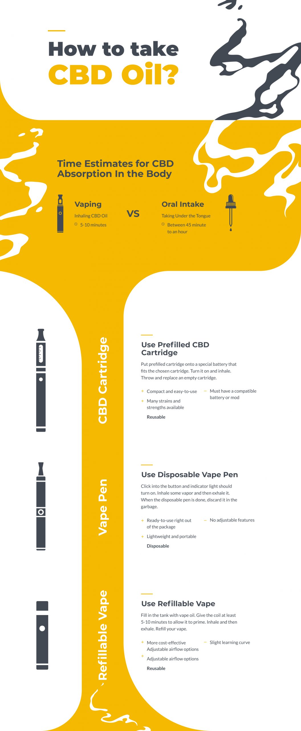
Check your grammar.
“Throw and replace an empty catridge.”?
Not sure this is classified as an infographic…
1 Like
too much white space on the bottom.
the Reusable is lost
my first impress was car oil maybe swap the colors of the text on top?
there are other aspects of the graphic other shere will critique.
The main problem I see is the key information is hidden within blocks of text, and the graphics you are using aren’t informative enough. Infographics typically are used to describe concepts quickly by using visual graphics instead of words.
You have a lot of good information here, however its crammed into only 2 sections. I’d suggest reflowing all of your information into more sections and try to better represent what is being said as visual graphics.
For example, “Time Estimates for CBD Absorption” should only contain the time estimates alone and as for graphics, try using two clock graphics, with color filled in on the clock face corresponding to each time estimate. Also, instead of typing out ‘vaping = inhaling CBD Oil’ and ‘Oral Intake = placing liquid on the tongue’ make a section called “absorption methods”, have a visual graphic that better represents “someone inhaling” and a graphic that represents “someone placing something under their tongue”. If there are any other Pros/Cons of Vaping vs Oral Intake, maybe turn that into a section too.
Another good thing to consider when making infographics is the fact that the average person retains information the best when its combined into groups of Threes and Fours. So if you are crafting sections, maybe have 4 sections total, all with 3 instances of visual graphics within them…
1 Like