Hi there! Check out this infographic, please. We are working on new infographics to add to our page
The infographic
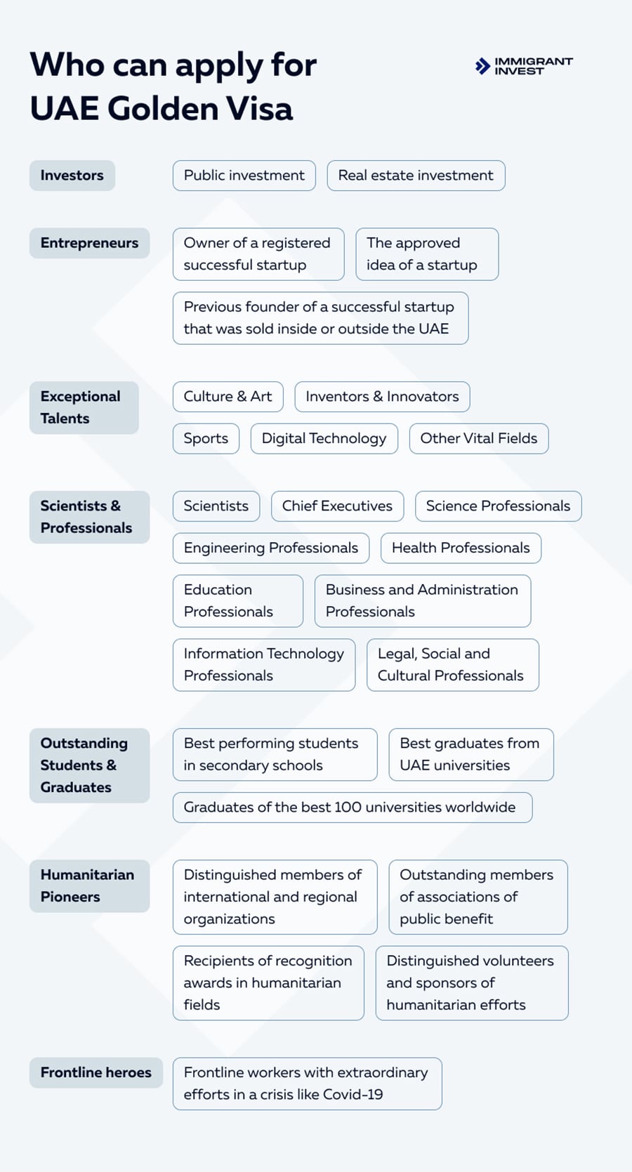
is about “Who can apply for UAE Golden Visa” which includes 7 categories of people/ I have doubts regarding the visual? Would it be better to list them in numbered list?
Categories of Individuals Eligible for UAE Golden Visa
- Investors: Individuals who invest at least AED 10 million in the UAE can apply for a 10-year Golden Visa. The investment can be in the form of a public investment, a real estate investment, or an investment in a company.
- Entrepreneurs: Entrepreneurs who establish a business in the UAE can apply for a 5-year Golden Visa. The business must be approved by an authorized incubator or accelerator in the UAE.
- Scientists: Scientists with a PhD or Master’s degree in engineering, technology, life sciences, or natural sciences from a top-ranked university can apply for a 5-year Golden Visa.
- Outstanding Students: Students with exceptional academic records can apply for a 5-year Golden Visa. This includes students who have graduated from a top-ranked university or have achieved a high GPA in their studies.
- Humanitarian Pioneers: Individuals who have made significant contributions to humanitarian work can apply for a 10-year Golden Visa. This includes individuals who have worked for international or regional organizations for a minimum of five years.
- Frontline Heroes: Individuals who have worked in critical sectors during the COVID-19 pandemic, such as healthcare workers, can apply for a 10-year Golden Visa.
- Other Exceptional Individuals: Individuals with exceptional skills or talents in areas such as art, athletics, or innovation may also be eligible for the Golden Visa.