Hello, I have to prepare a vinyl record cover for print.
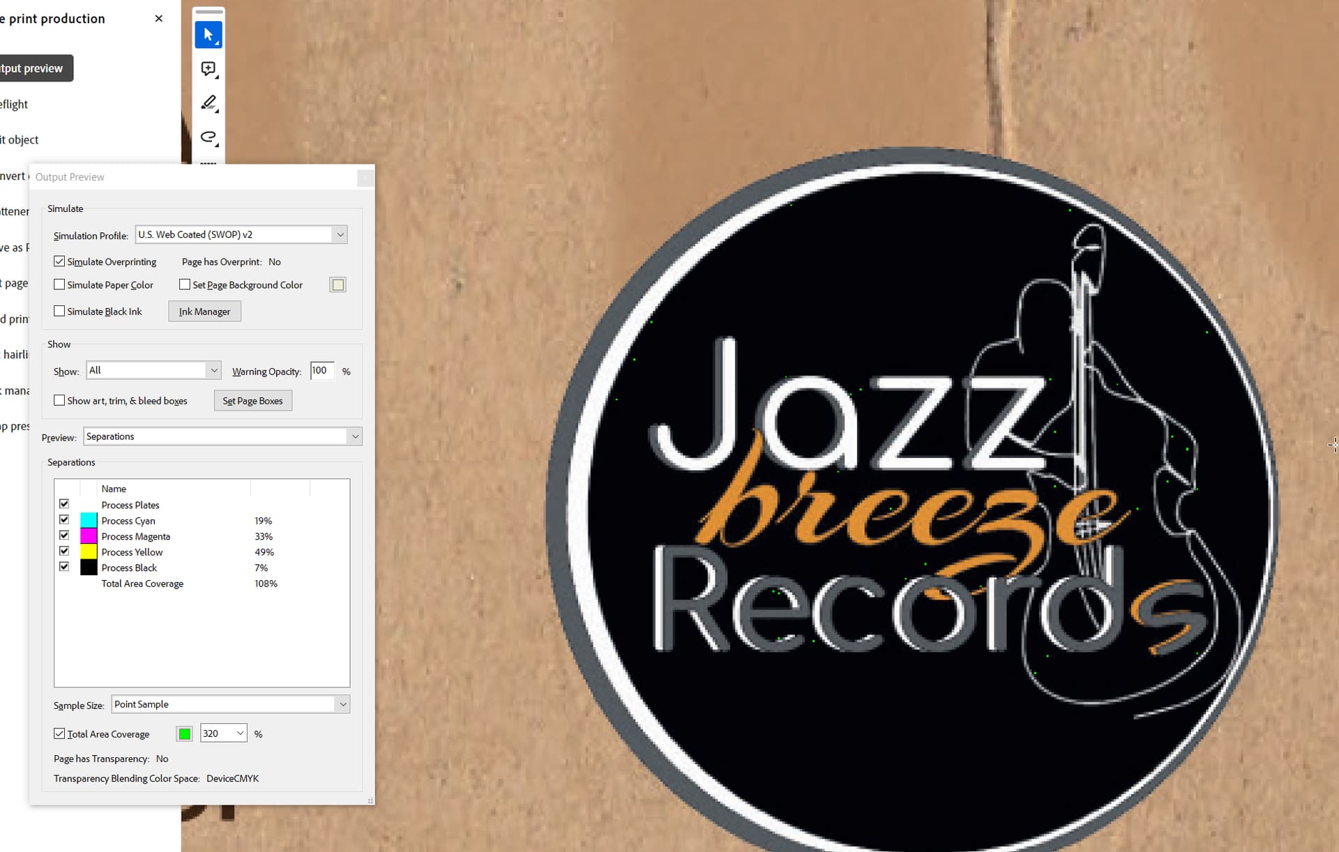
The printer told me that the maximum ink coverage should be 320%.
The original file had many areas that exceeded the 320%.
After a lot of tweaks in photoshop I managed to eliminate them without destroying the image.
But I noticed that some pixels are stil over 320% . How important is this? It’s only some pixels in a very small area. (A png logo).
I did the exact same proccess, but the logo was a late addition and had this issue.
Nevermind I did it again, so it’s ok now.
I wonder thought what would happen if i did not fix that?
The ink won’t dry and it could smudge. Ink coverage is about about the absorption of the paper, the max ink coverage of CMYK typically 320% - that’s a total of C+M+Y+K channels combined.
For black solids rich black is preferred, C50% + 100% Black or any combination. As your background is yellow I’d have gone Y50% and K100% for the black solid.
This also limits registration issues.
Actually I am impressed that many designers do not know how to add trim marks.
I think that a basic preparation (cmyk, 300dpi, trimarks, outlined text) is the bare minimum for a professional designer.
Also, what’s the WYSIWYG thing?
Who’s still outlining text in magazines and brochures? Terrible practice.
Signage, yeh ok I can see benefits for one off custom words/brands or other things.
But outline text… for publications… nope.
And there’s the right way - which is with an Acrobat preflight. Never in InDesign (too many things go missing and you’re left with uneditable files).
I’ve worked with printers (good magazine offset sheetfed printers) that asked me to leave off the trim marks since their equipment automatically trims 1/8" when I include a 1/8" bleed. They said that when I included them, they needed to remove them. That’s not true for all printers, though.
What really annoys me are InDesign’s presets that place part of the trim marks within the bleed, which makes no sense. Many designers don’t seem to know enough to move them.
About outlined text I refer to illustrator based projects. Like labels, logos, business cards, small brochures, bifolds maybe.Not very text heavy projects in general.
Also here in greece fonts and typeface are not properly owned by everyone, or sometimes printer opens the file with corel etc. So outlines is the safest way. I know that makes the file heavier, the text bolder, and it’s uneditable ( I always keep an non-outlined backup file), but for me (i m not very experienced as you ofcourse) is the “safest” practice.
I once hired a designer who tried making black from 100% of all the process colors. The offset printer caught it. I needed give that designer (who should have known better) a remedial lesson on why those ink densities are never necessary and will result in smeared, muddy printing that will often set off the ink onto the sheet in the stack that lies above it when coming off the press — especially on coated stock where the ink doesn’t soak into the paper.
If I recall correctly, you can resolve this issue in Acrobat, but it’s better to prevent it from happening in the first place. A few tiny areas here and there that exceed 300% make little difference, though. Generally, I’ve tried to keep these combined densities to no higher than 270%, as it’s rarely (if ever) necessary to go higher than that.
One way to more easily deal with coverage issues would be to construct the file in Indesign, with the image of the shoe and brown paper built in photoshop and serving as the background. Then everything else gets added on top of that in ID. And you’d be using a vector version of the logo, rather than a bitmap. I assume the green specs on the toc preview are because the logo is a bitmap, maybe even a jpeg at some point which would add noise, or the entire design is a bitmap. If the logo is a vector it would be much easier to correct the coverage in it.
Converting to outlines in InDesign doesn’t convert strikethrough, underlines, or other things - some elements are lost.
Plus the file is completely uneditable after converting to outlines - meaning you’ve to keep a duplicate of the live text along with the file.
Export to PDF (inDesign or Illustrator) and then use Acrobat Preflight to convert to outlines. Means that the file is still managable your end - and you supply the outlined PDF to the vendor.