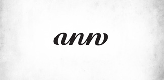
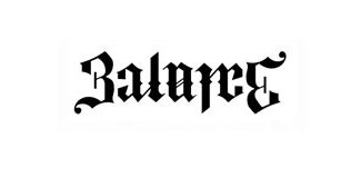
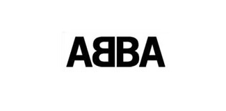
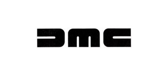
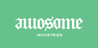
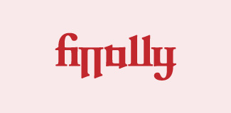
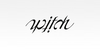
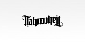
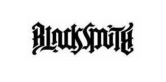
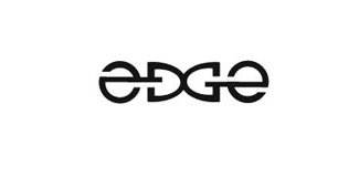
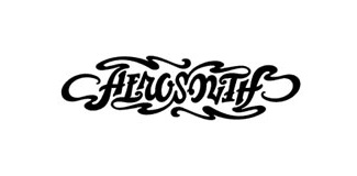
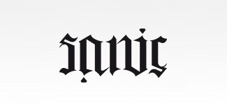
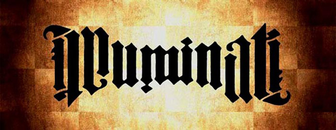
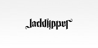
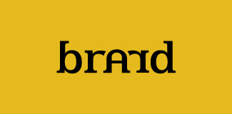
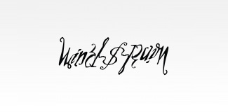
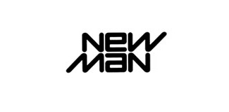
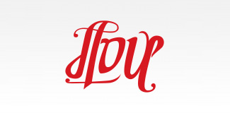
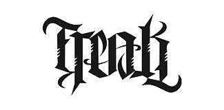
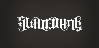
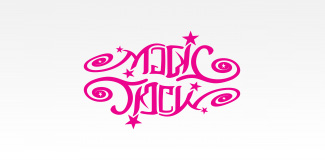
According to Wikipedia an ambigram is a typographical design or art form that may be read as one or more words not only in its form as presented, but also from another viewpoint, direction, or orientation. The words readable in the other viewpoint, direction or orientation may be the same or different from the original words. Here are some great example of ambigram logos.
Ambigrams became more popular as a result of Dan Brown incorporating John Langdon’s designs into the plot of his bestseller, Angels & Demons, and the DVD release of the Angels & Demons movie even includes a bonus chapter called “This is an Ambigram”. Langdon also produced the ambigram that was used for some versions of the book’s cover. Brown used the name Robert Langdon for the hero in his novels as an homage to John Langdon.
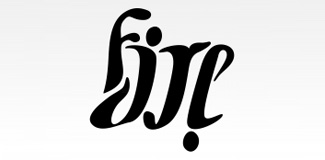
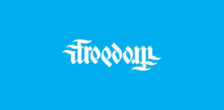
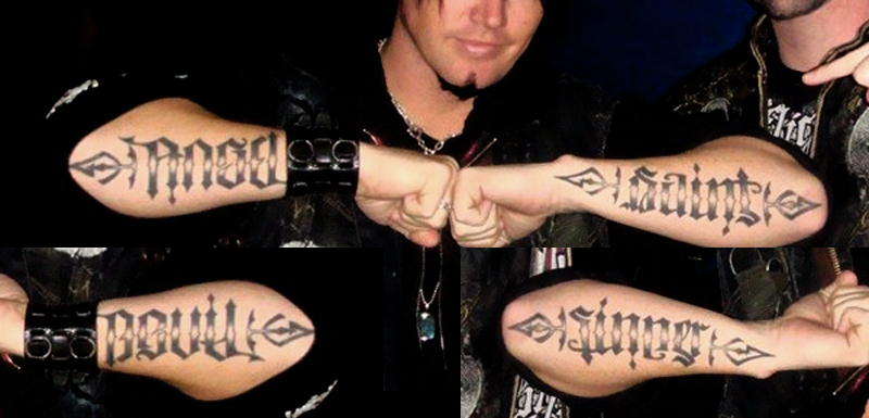
I love me some ambigrams. A few of those are a specific type of ambigram. I can’t remember the term, but when you rotate them 180 degrees they reveal a different word. So, above there is “fire and ice” and “love and hate” for example.
technically, with the right words, it’s a good exercise or test @Buda. you can sketch out a word simply, flip it and see how you can modify it to make it read like an ambigram. Then flip it back and forth, tweaking as you go. Getting it stylized to look “nice” is the challenge.
This is awesome! I was privileged to have John Langdon as my Typography Professor at Drexel. He is so incredibly talented and such a wonderful teacher/person!