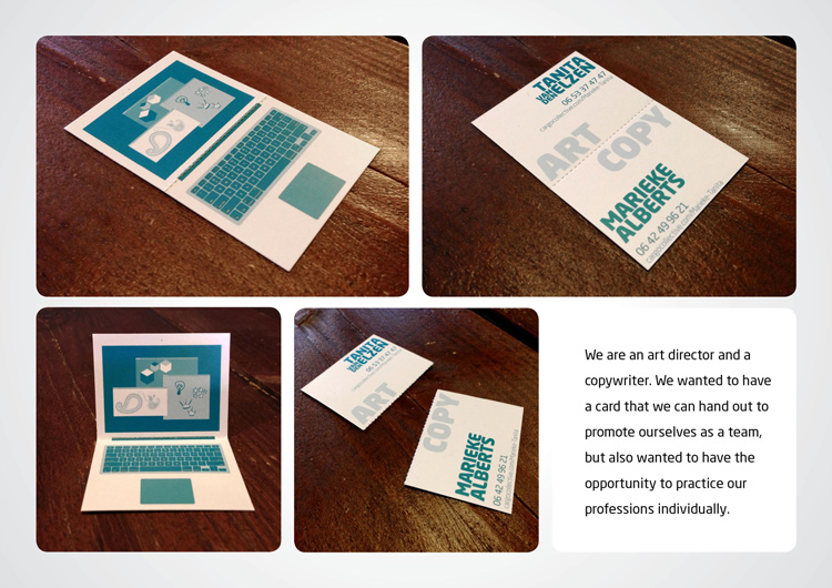
Copywriter and Art director duo wanted to have a card that they can hand out to promote themselves as a team, but also wanted to have opportunity to practice their professions individually.
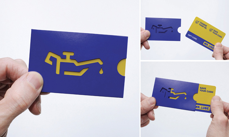
Rethink Canada designed this Mr. Lube gift and business card that demonstrates what the service is all about. Getting rid of that annoying “change oil” sign.
This is the second ad for EximousSoft.
Just sayin’
I can guarantee you these were done in a professional software, most probably InDesign or Illustrator, or in the case of the cheese grater, the layout software for the laser engraver.
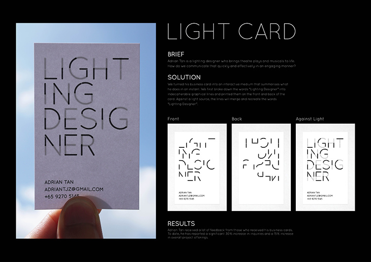
As for the designs…That Lighting designer card is pretty ineffective. Not only is it illegible until held up to the light (would you think to do that?) the split after the g in Desig ner is a typo. If it was intentional, it still looks like a typo.
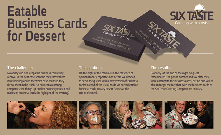
Edible business cards? Not after it’s been your your pocket all day, thanks.
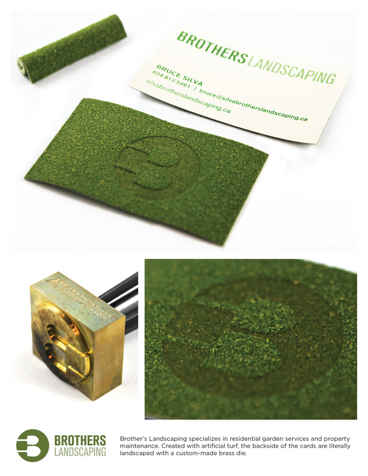
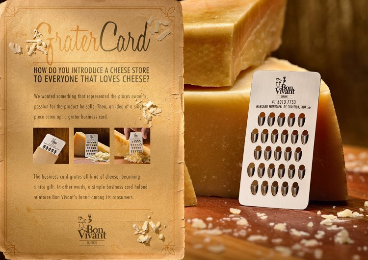
Definitely digging the cheese grater and the landscaper. LOL.
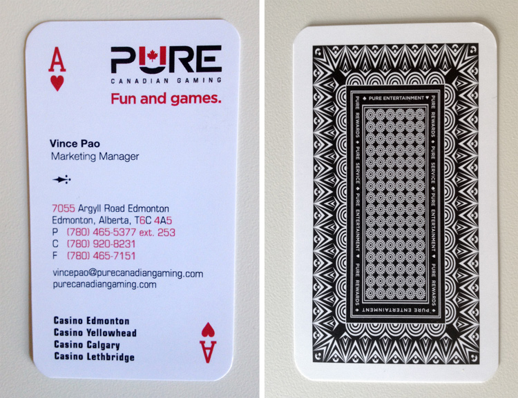
That’s the card that caught my eye the most. Not because of the solution, but because it would have required totally perfect registration of the printing on the back to that on the front. I can just imagine the pressmen grimacing over that requirement.
Aside from that problem, though, it could be printed on a slightly translucent stock that would eliminate the need to hold it up to the light before noticing the effect.