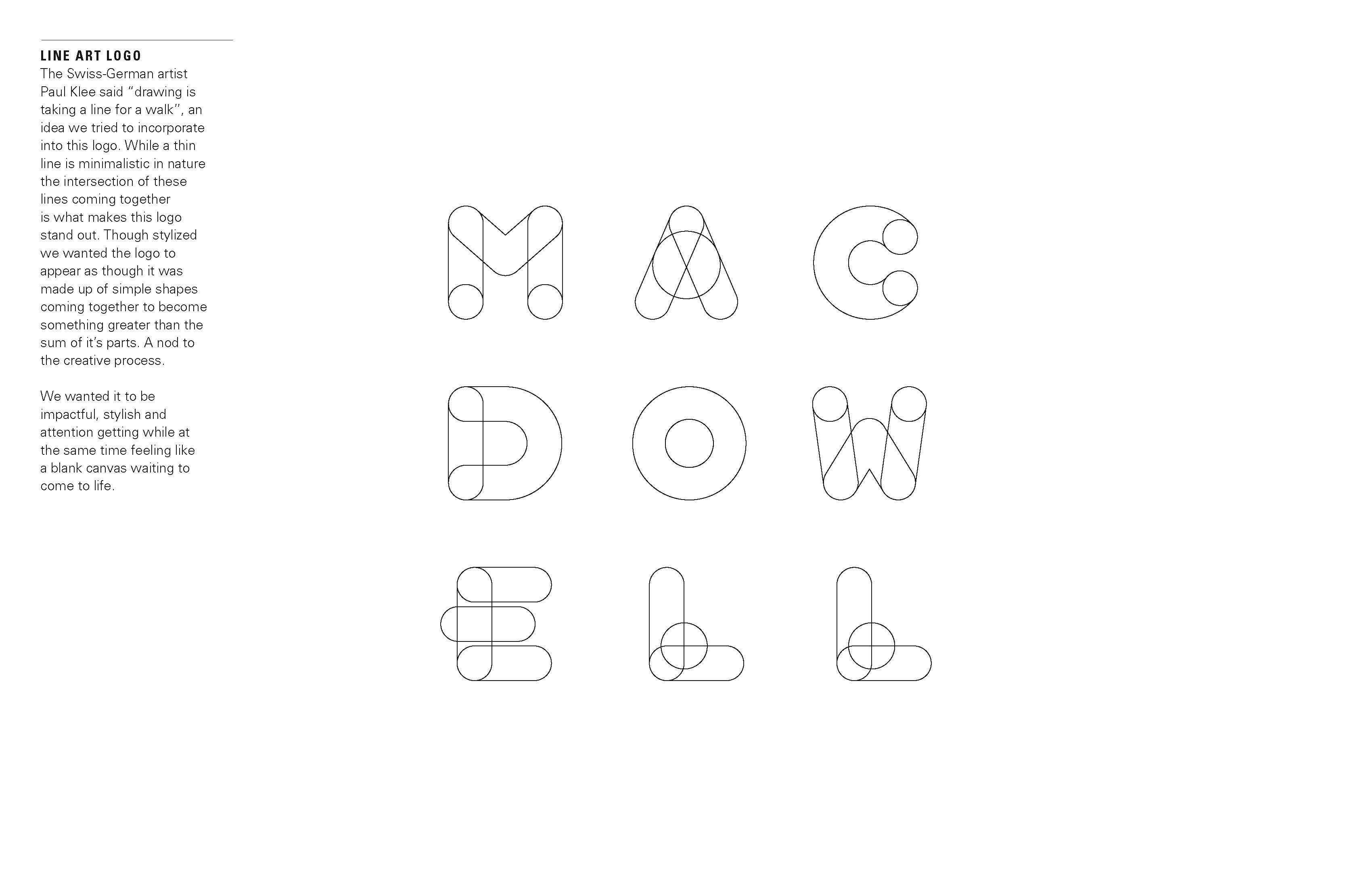
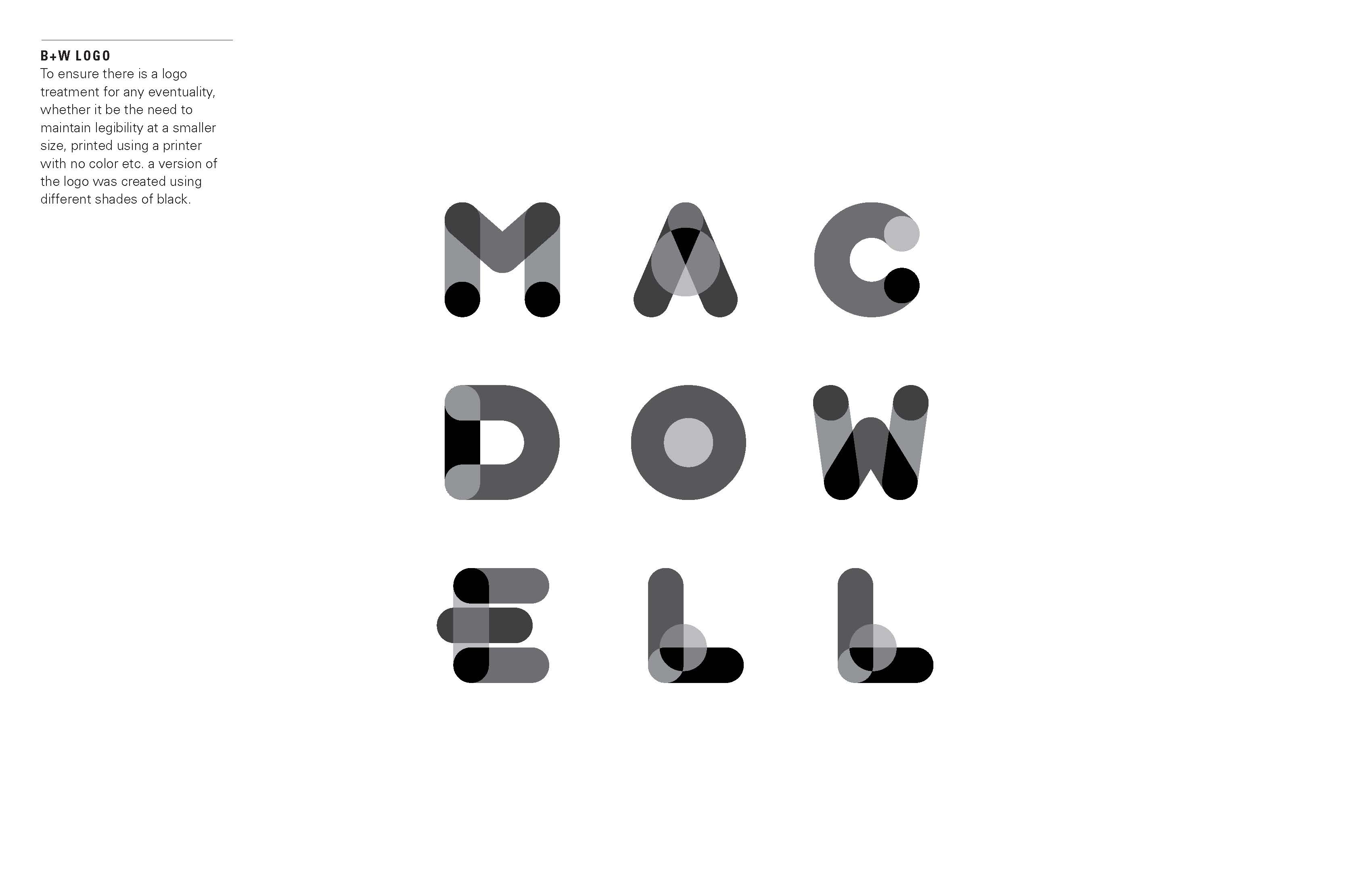
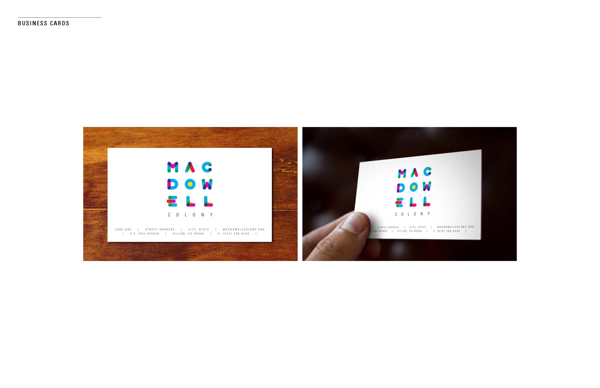
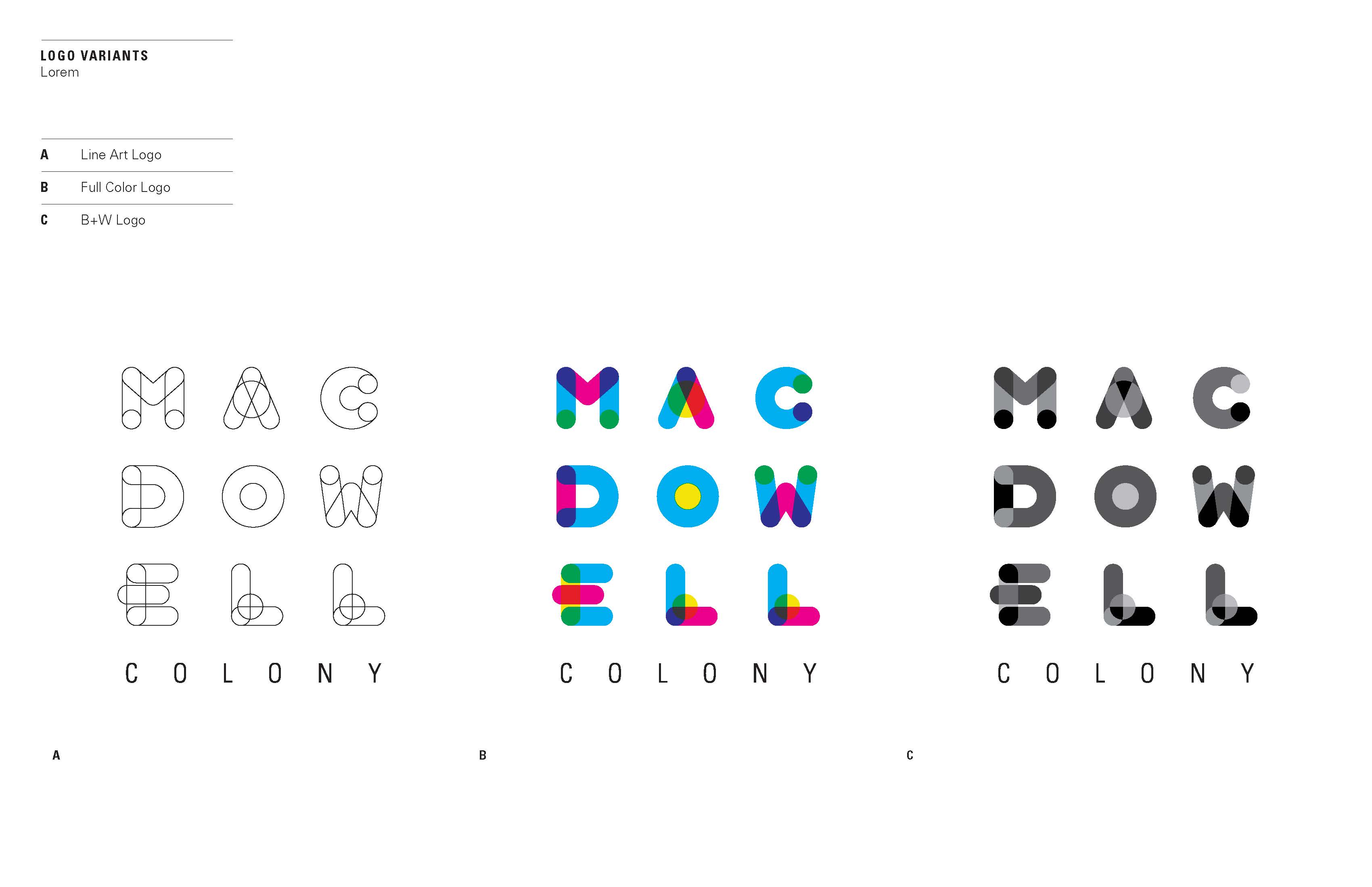
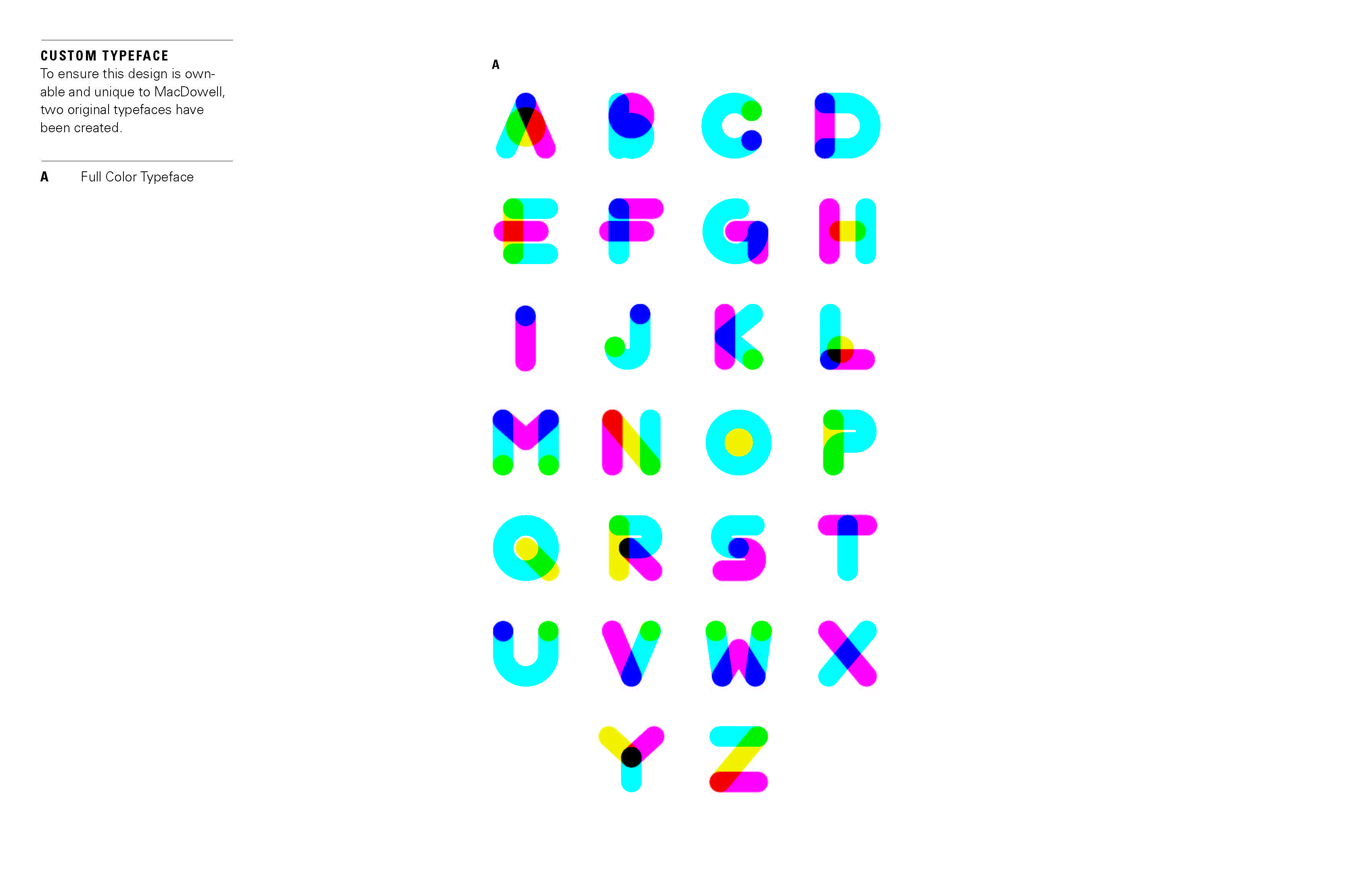
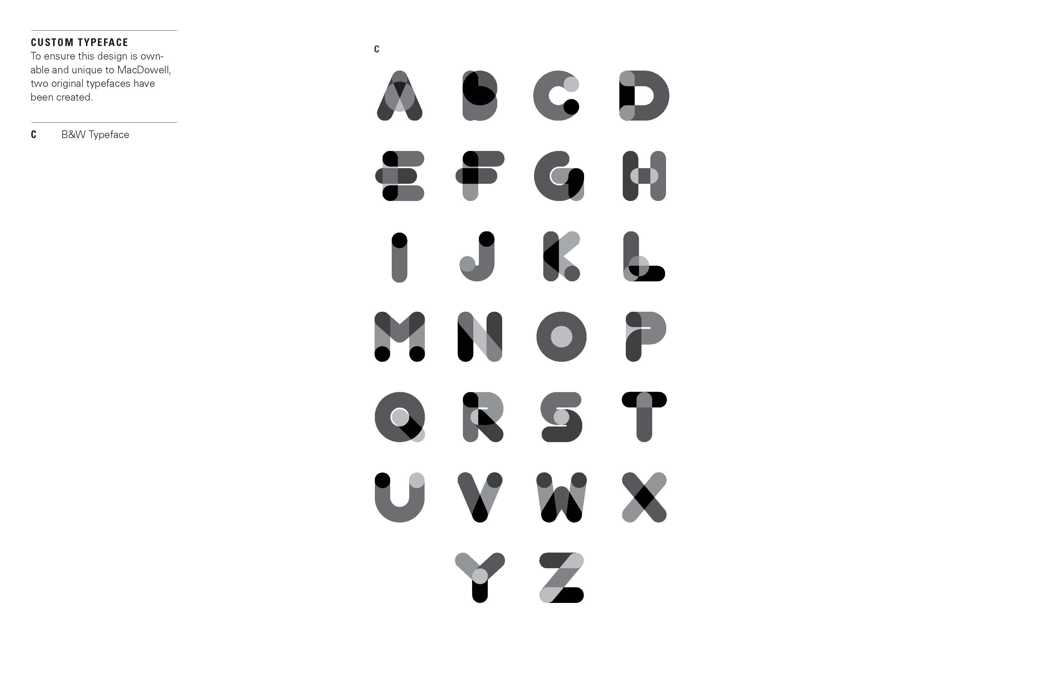
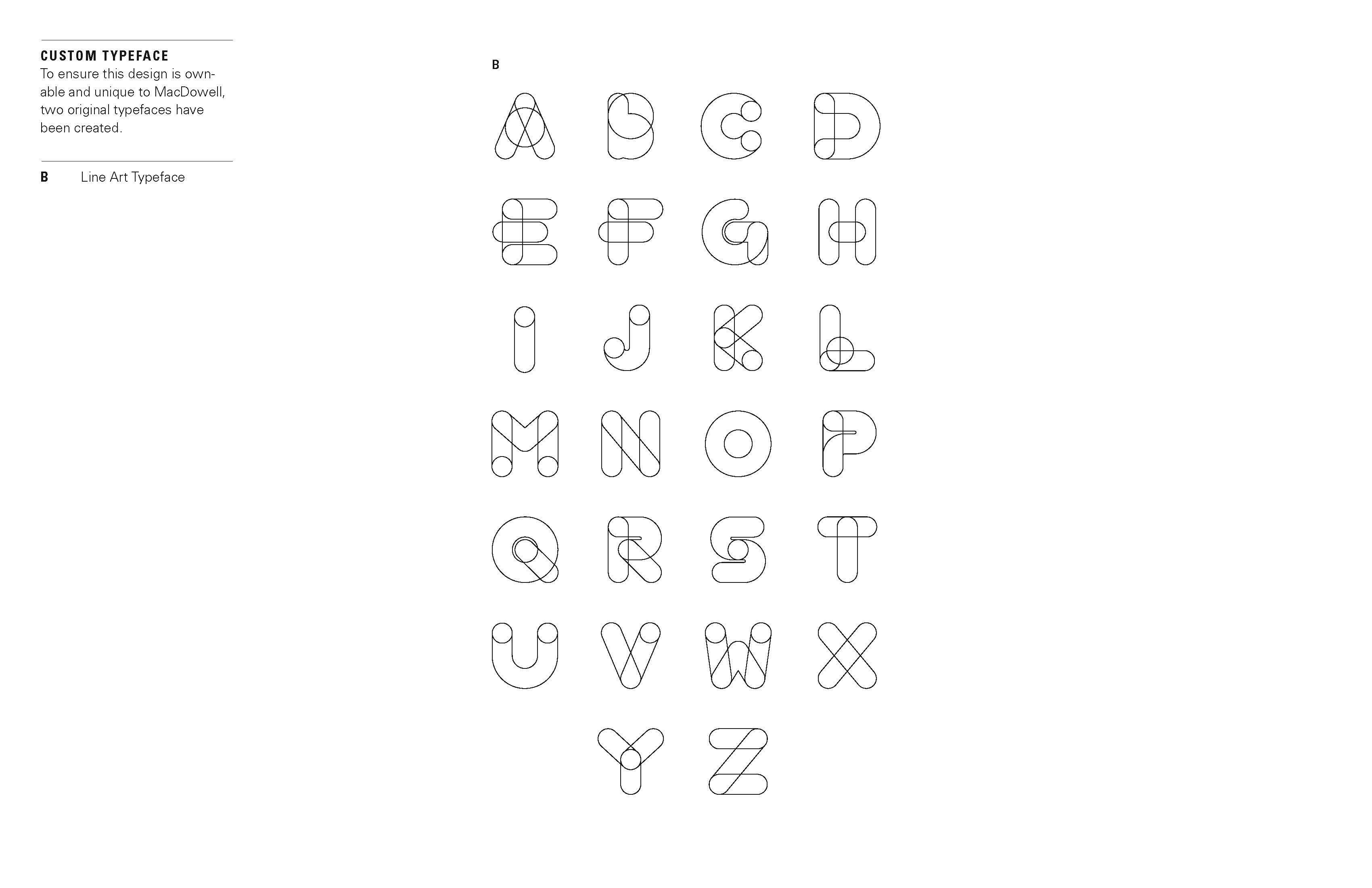
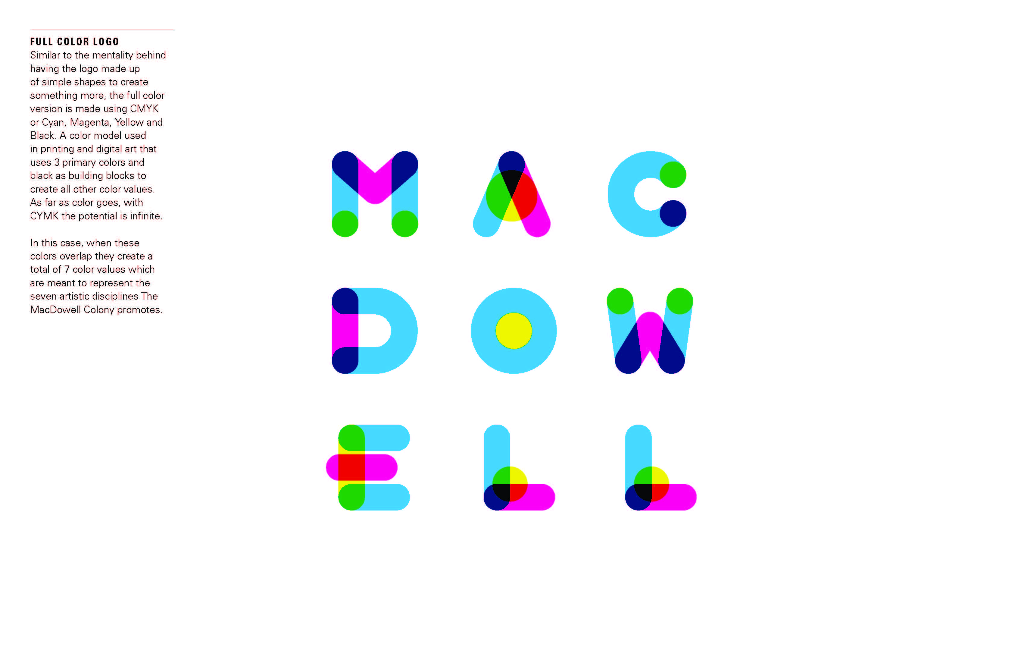
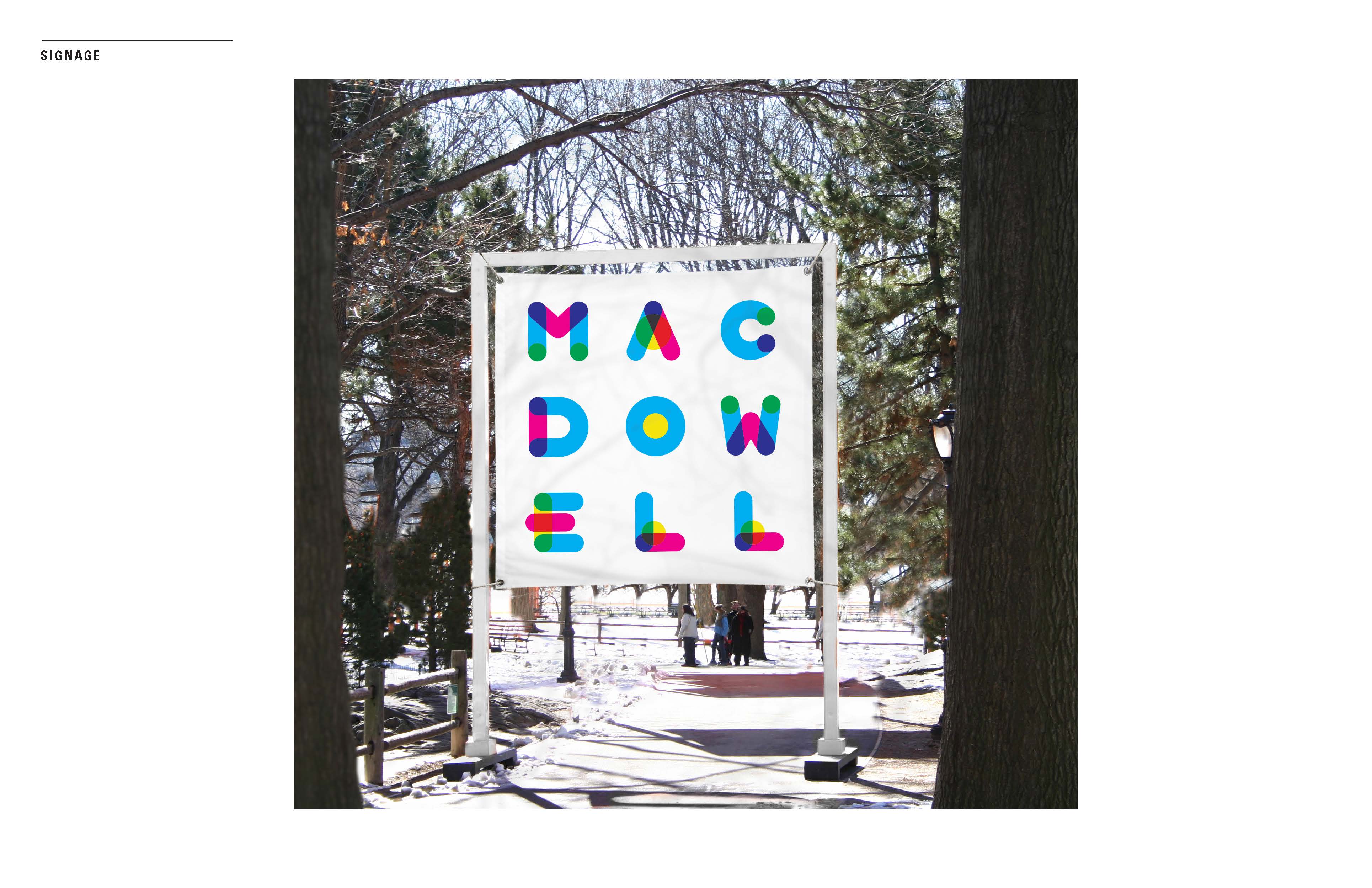
Digitas, the Connected Marketing Agency, today reveals a new brand identity for the MacDowell Colony, the artists’ colony in Peterborough, NH. This marks the first rebrand MacDowell has had in over 11 years. The full-scale rebrand includes a new logo, typeface, style guide, and website experience, all focused on MacDowell’s history, mission, and artists. The new logo and custom typeface is a representation of the creative process: made up of simple shapes, its convergence conveys an end result greater than the sum of its parts. The full color logo was made using Cyan, Magenta, Yellow, and Black. When these four colors overlap, they create a total of seven color values, which represent the seven artistic disciplines The MacDowell Colony promotes: architecture, film/video arts, interdisciplinary arts, literature, music composition, theater, and visual arts. Digitas employees across experience design, creative, and technology took on this pro-bono project in their own time, excited by the opportunity to work on a worthy cause so closely intertwined with the spirit of creativity fostered at Digitas.
Sorry, as a printer, all that transparency, it makes me cringe.
But it is cool, none the less.
![]()
I’m not familiar with the MacDowell Colony, so I don’t know what kind of image they’re trying to project.
Given that it’s the first redo in a hundred years, this new look is certainly too trendy to last for the next 100 years. The typography looks very much like some of the new color fonts that I’ve seen. Even the use of bright colors and transparencies looks very 2018ish.I like the looks, but I’d not be inclined to brand something with a here-today, gone-tomorrow trendiness.
Again, I don’t know anything more than I’ve just read about the MacDowell Colony, but this sure doesn’t look like rustic and wooded New Hampshire to me. Then again, I suspect they intentionally decided upon something that went against expectations and stereotypes.
Typeface reminds me of that free font Multicolore, but even so I still like it and think it works well. I might have gone a bit more gestural with it tho. Multi colored brush font? Please, stop me now.
I also enjoy seeing this fresh new ident carried through their website. CSS styln’ properties such as, mix-blend-mode: multiply;, as seen with those large svg accent-overlays. And to reinforce the colored stroke theme further down the page in their, Latest News + Events, see good use of, background-clip: border-box;
Kudos!
It’s very close the concept that Mohawk Paper uses..
Being in the print industry, I see this logo everyday:
Mohawk did a pretty good job of obliterating their previous two logos from the web.
The one before this, just a word mark. The one before that, a very un-PC-today woodcut of a Mohawk Indian.