good day again 
hope youre well …
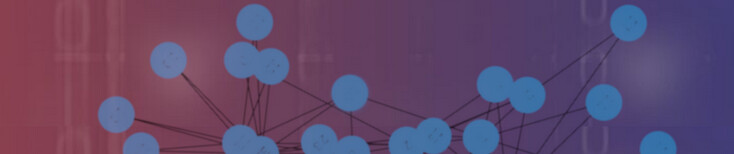
…well some musings while i am currently drawing the Image for a wesite consisting of visualization of a network (konsisting of dots that are linked) - all that is drawn on a Gradient Background (see above)
i have tried to make up my mind - and i have read a dozen of theory-pages and wikipedia-sites:
hmmm - regarding the Color-Sheme: generally spoken: i guess that the best choice of colours, gradients and dot combinations really depends on the idea, the goal and hmm - lets say the purpose of the Project: So i guess that we can say subsequently: different goals and contexts call for different moods, thoughts,emotions, sensual feelings, ideas and subsequently messages:
if this is so - we might want the colours to support that processes - if possible.
lets say for example: If our project is meant to evoke calmness and relaxation and things like that, we ought to choose subsequently the according colors that might be a bit softer, have probably some pastel gradients with gentle contrasts in the dots might work best.
On the other handside: If our project-goal is about energy and creativity and moods like those ones then wie should choose another color-sheme: i guess then - we should choose probably a brighter, more vibrant gradients with contrasting dots can create feelings and moods of “excitement”.
theoretically spoken: it depents: We can say that it depends from the project goals: so we need to understanding the project’s target audience: then we could talk more about the emotions we want to convey and the overall style.
to sume up: Each and every color evokes an emotional reaction from the person who viewing the color.
So, if we have got a list of different colors then we also have a whole list of the physiological responses associated.
hmm i am wondering: Which schemes or palettes do you think best capture energy and creativity without overwhelming the viewer? Do you have favourite combinations that work especially well in network-themed or innovation-focused designs?
Any go-to tools or resources you use for finding “vibrant but balanced” gradients?
I’ve been looking at options on various ressources and sites in the net – but before locking in a direction, I thought: Why not ask the colour experts here? Really curious to see your takes – whether that’s based on harmony theory, design practice, or just gut feeling.
Thanks again for your forum here - with the “Inspiration” sub-forum: this such an inspiring place to learn and share
which Colors wouly you choose!?
i eagerly look forward to hear from you
greetings