BACKGROUND
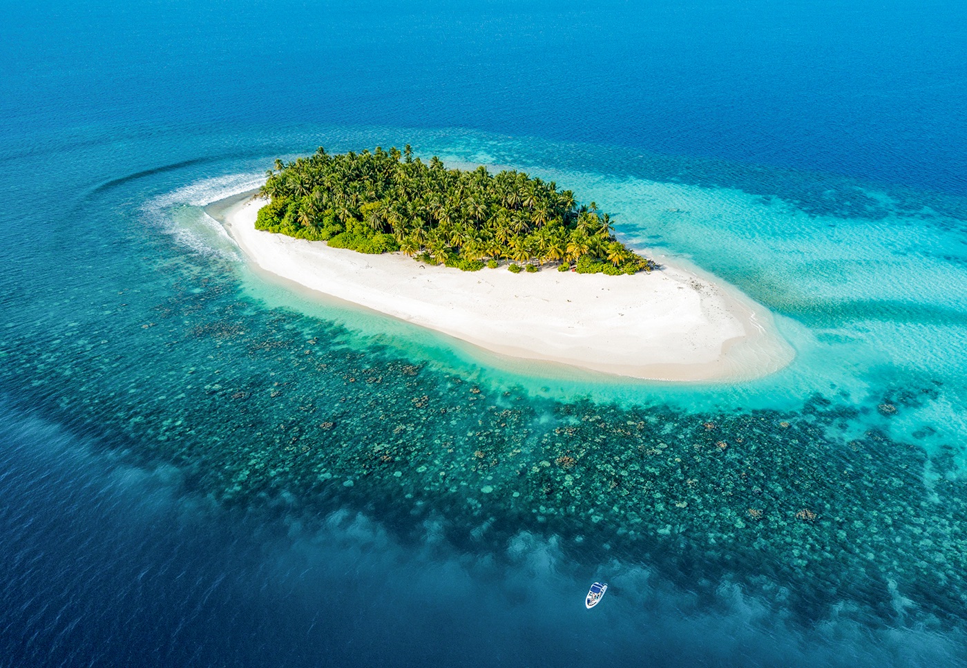
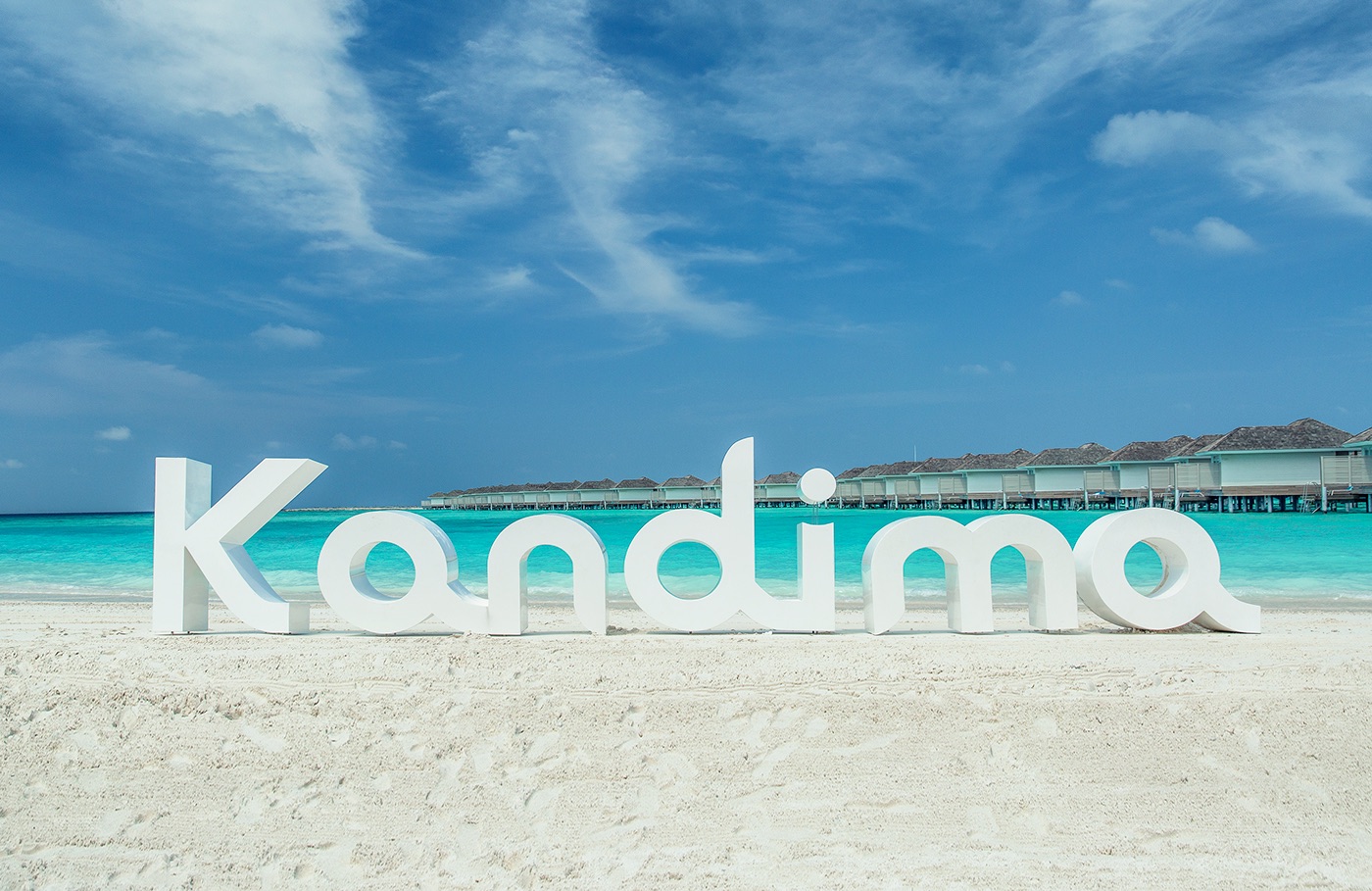
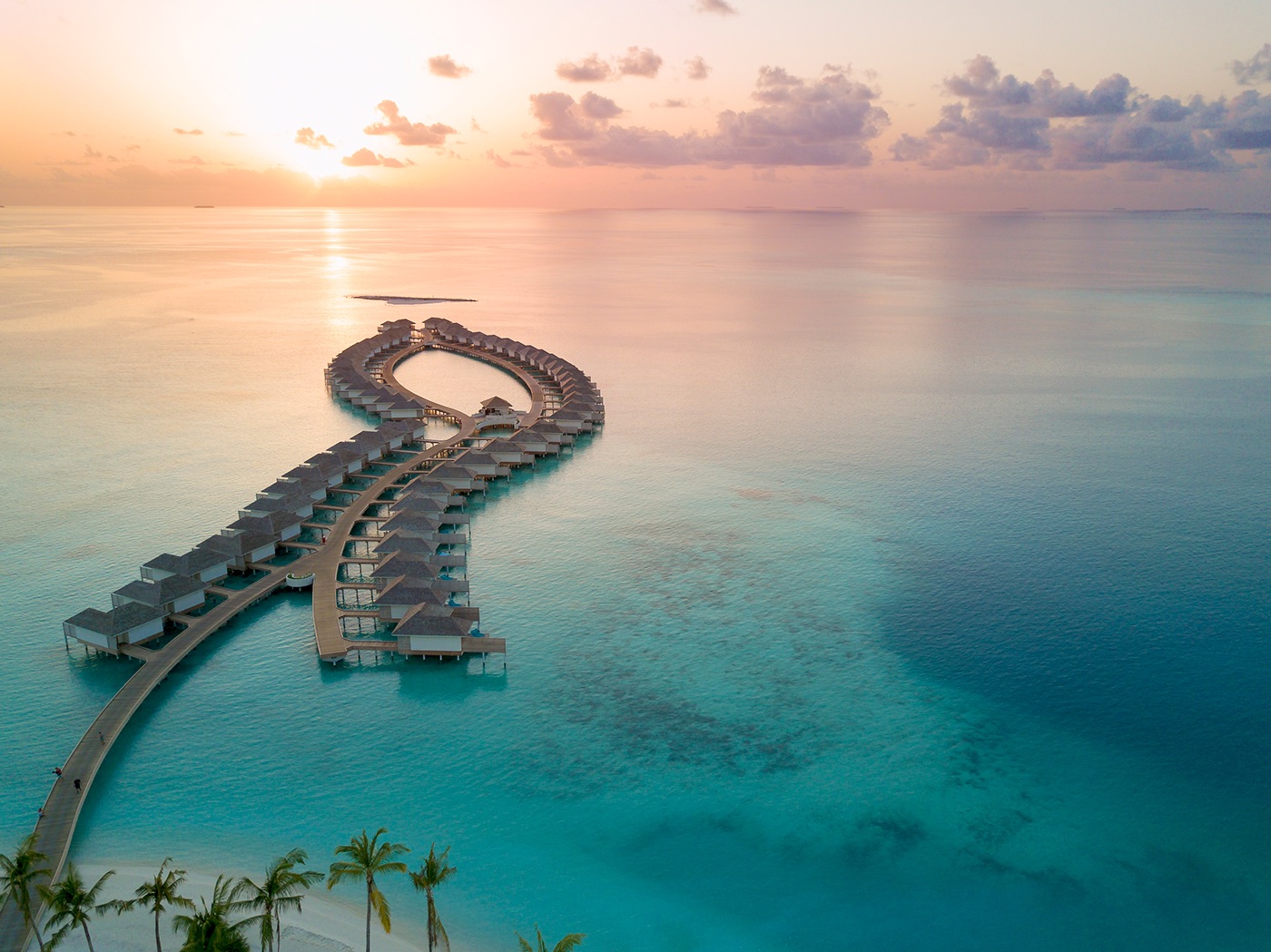
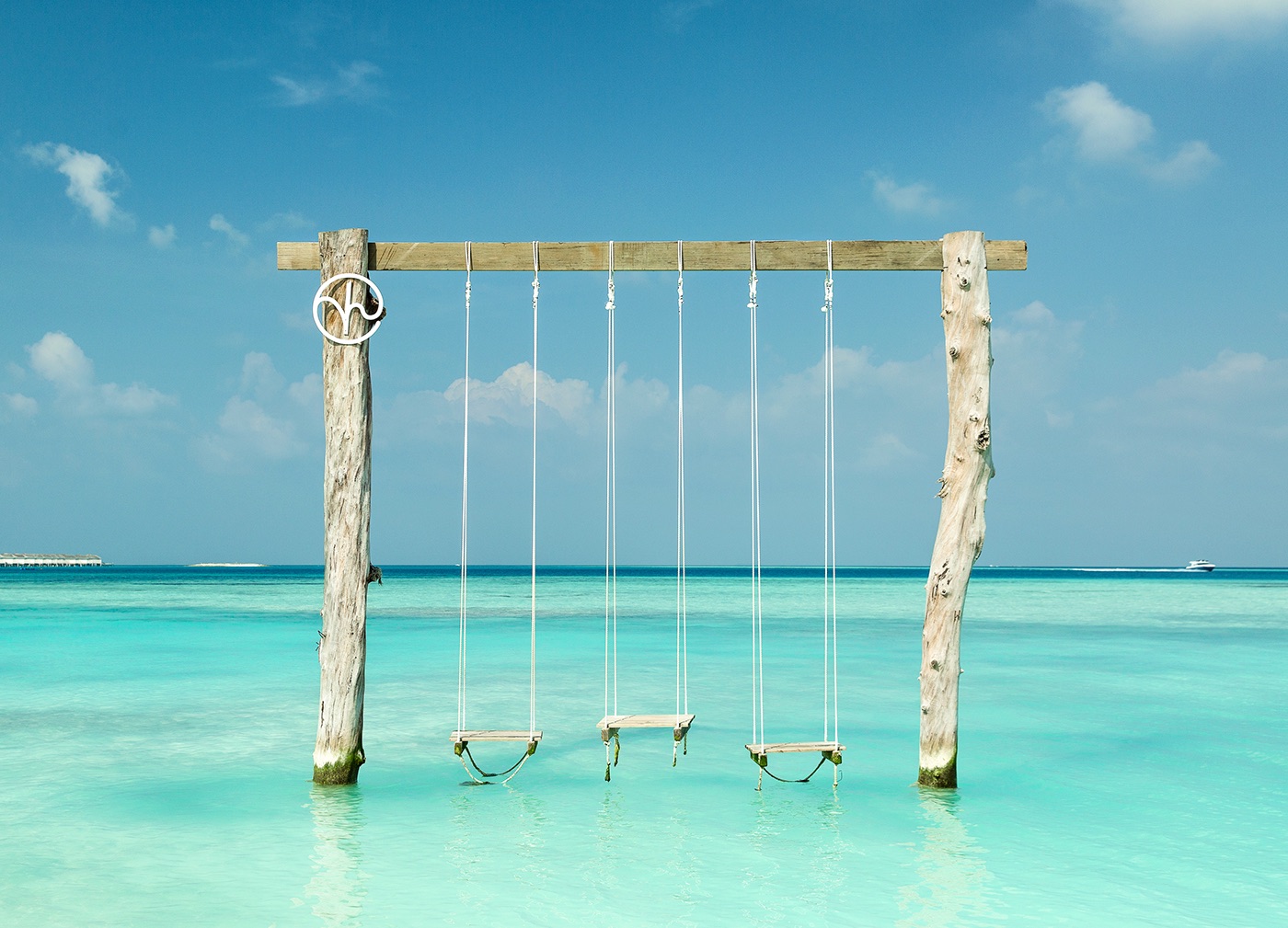
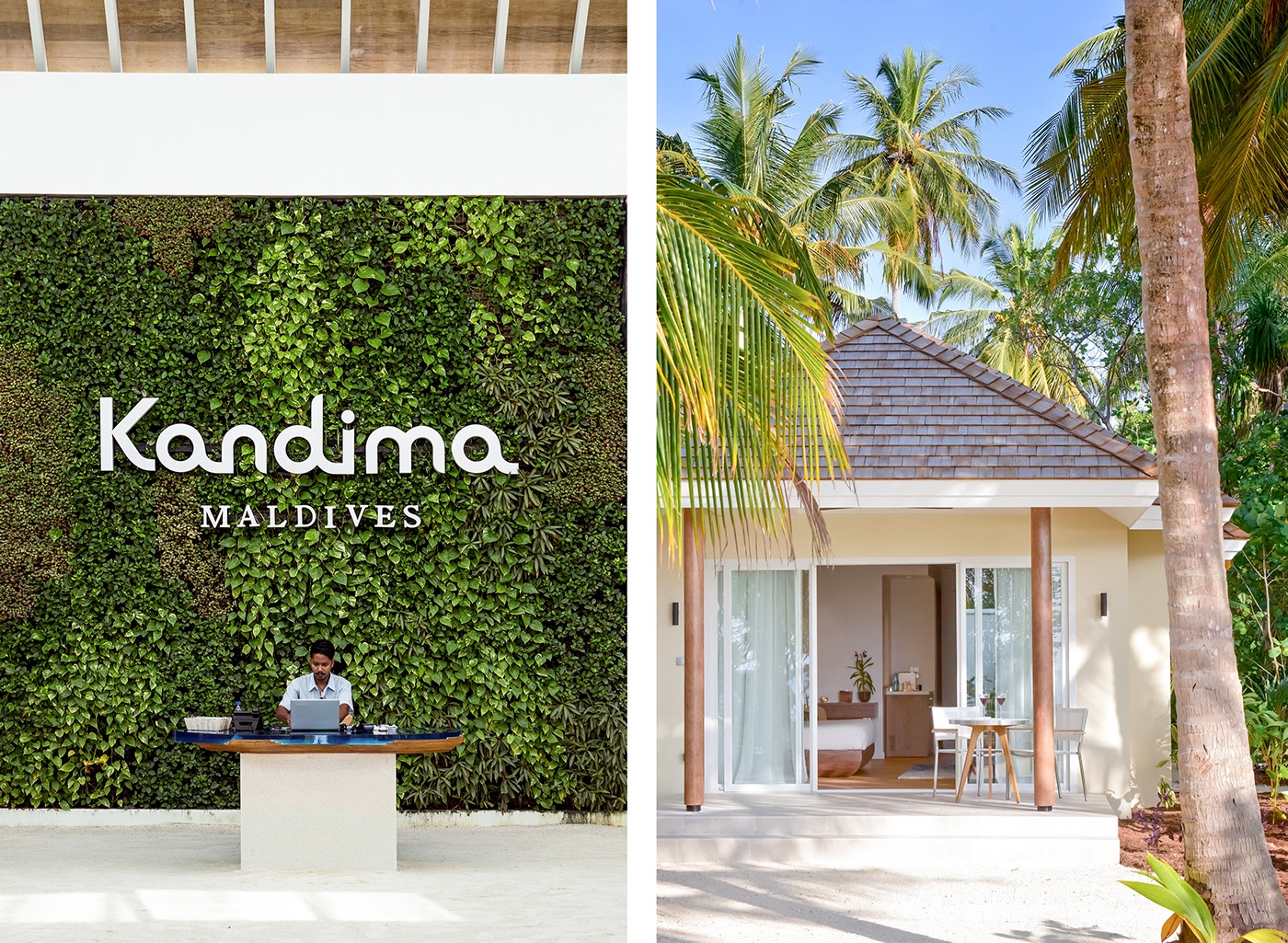
Kandima reached out to us and needed an identity. What we first thought was ‘branding for a hotel in the Maldives’, turned out to be the big, wet dream task of branding an entire island. Kandima is a newly opened family resort on its very own atoll in the Maldives. When we got the brief it wasn’t even built, but only seeing aerial images of the actual atoll and the architectural drawings were enough to make us scream YES! What a paradise.
THE CASE
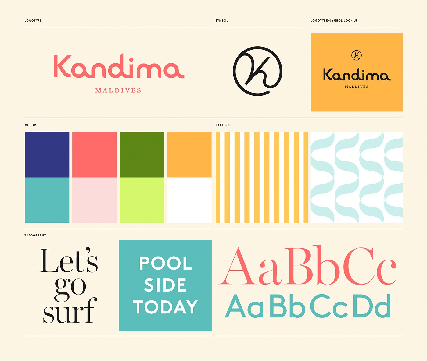
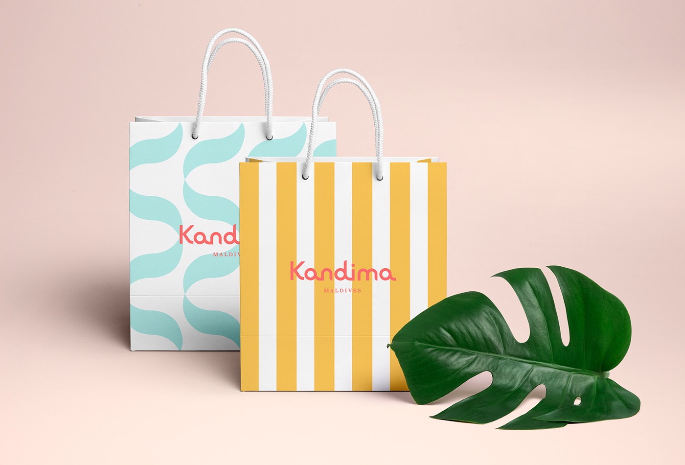
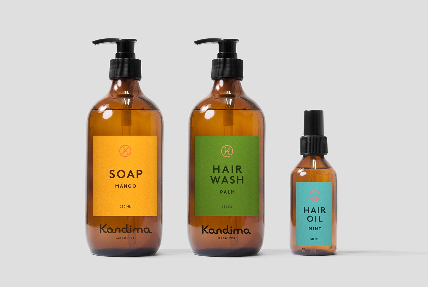
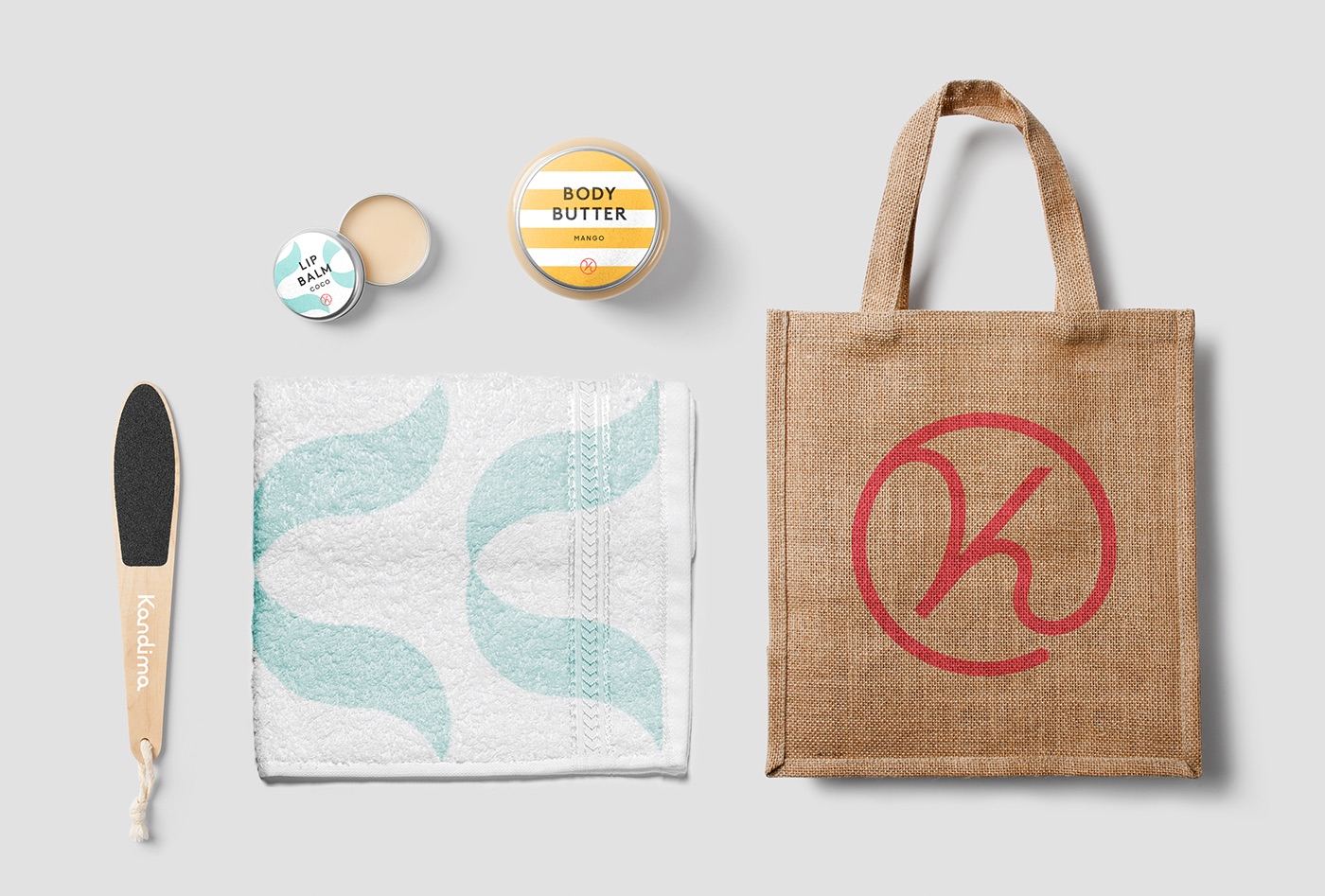
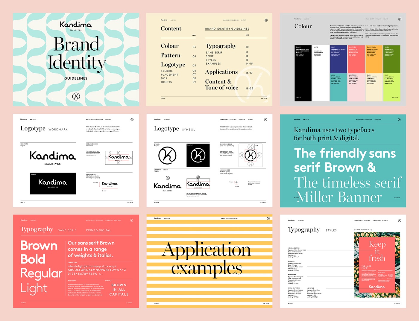
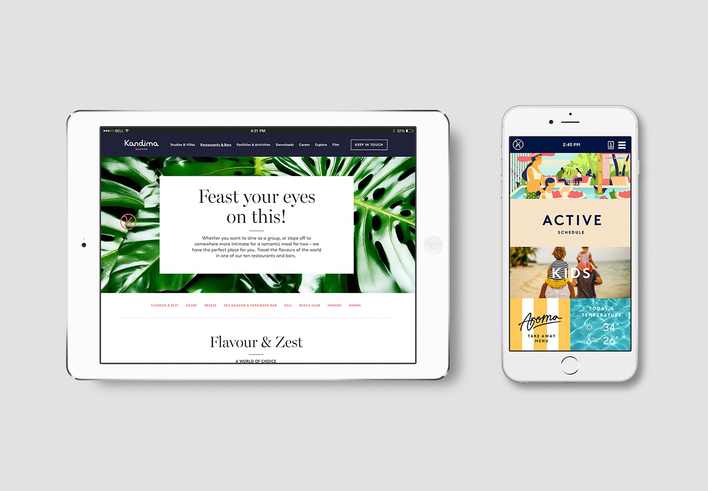
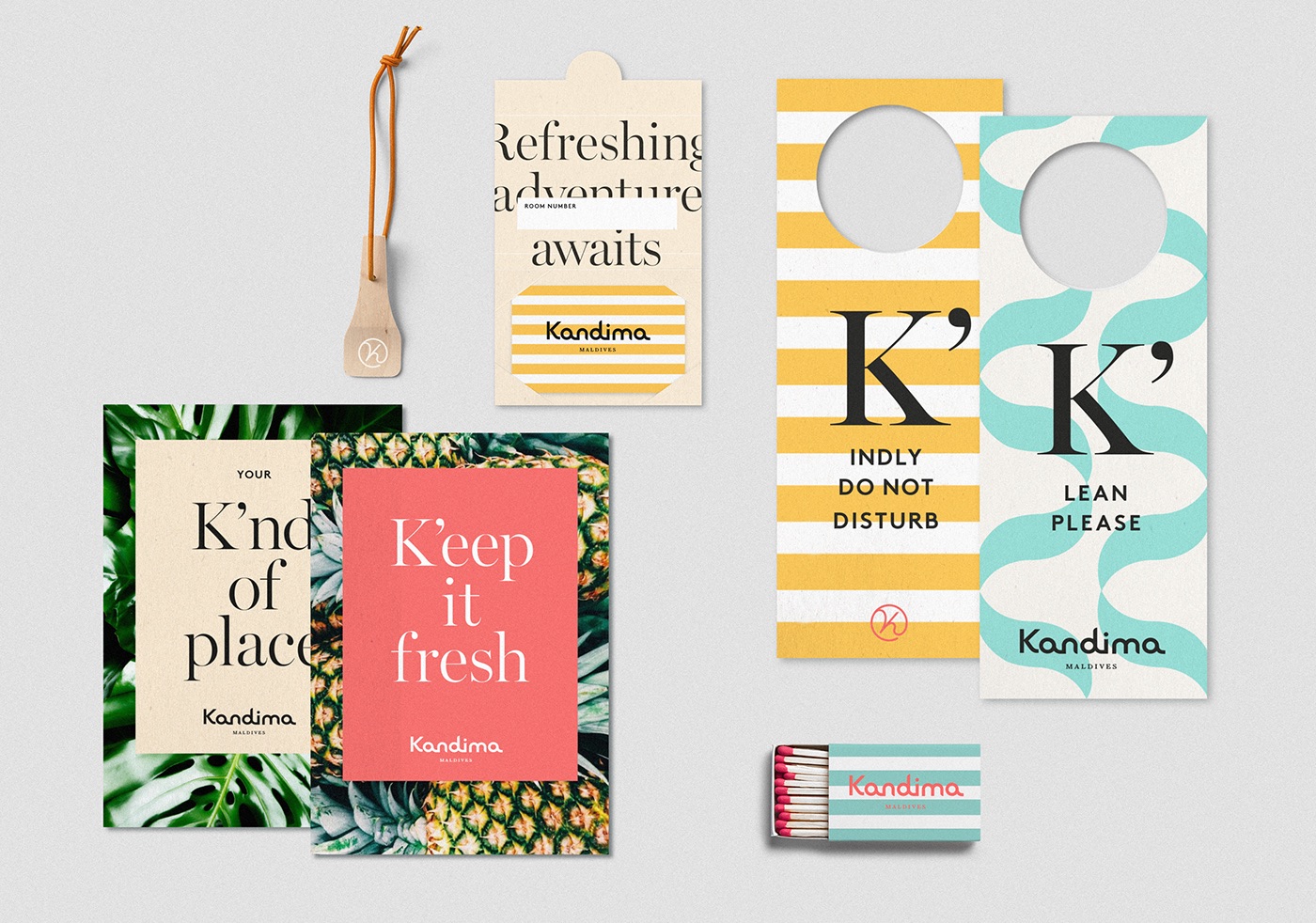
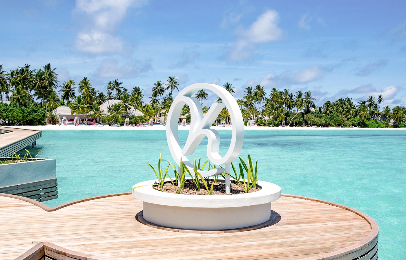
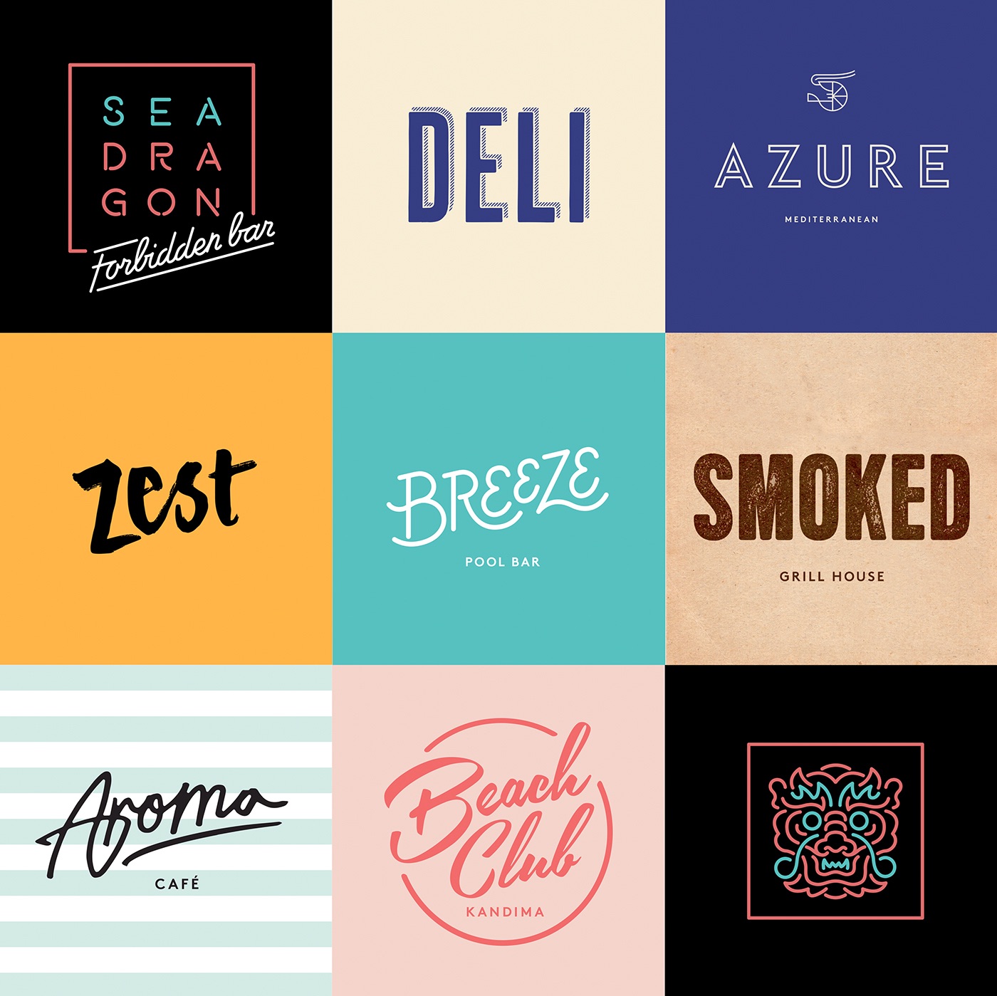
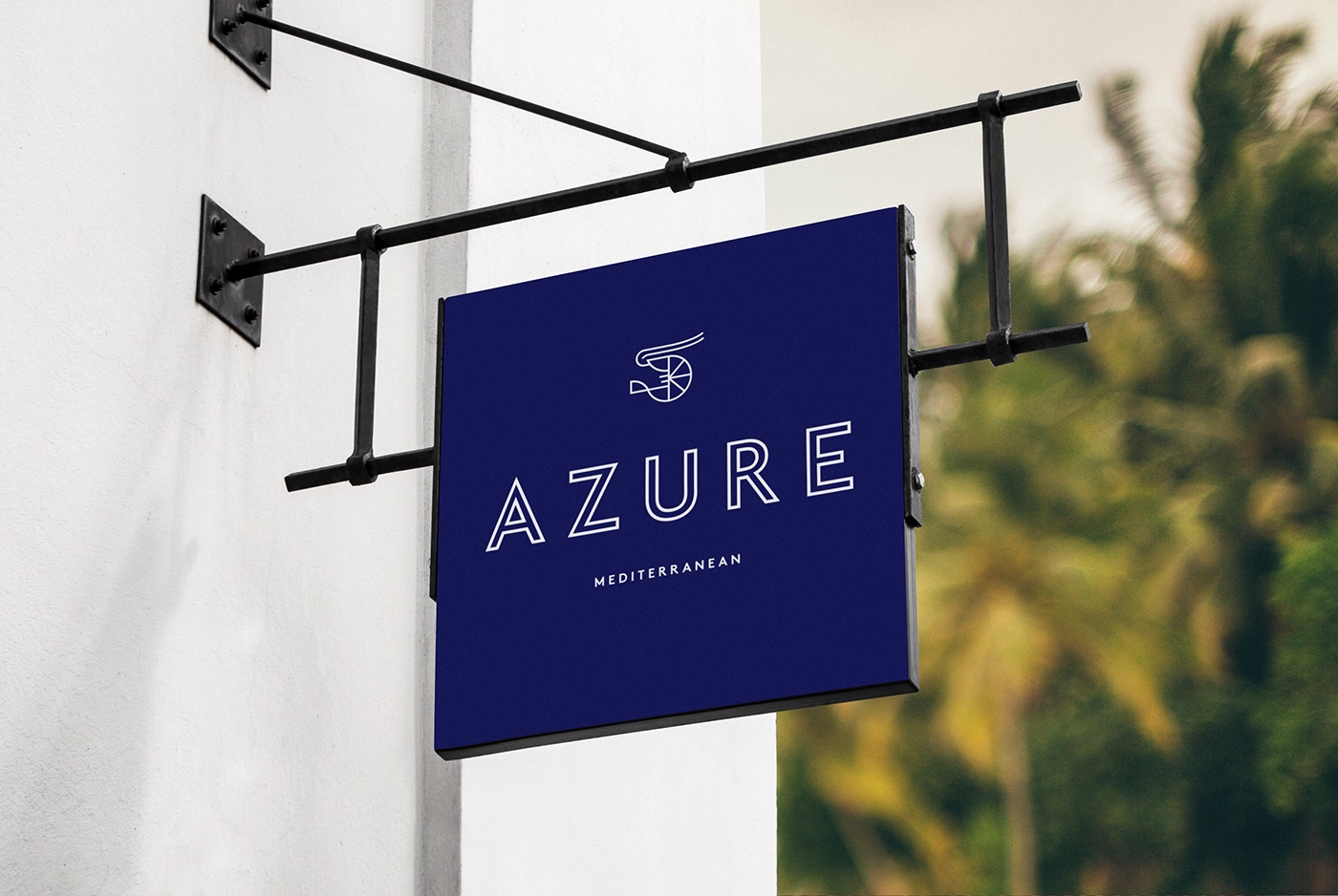
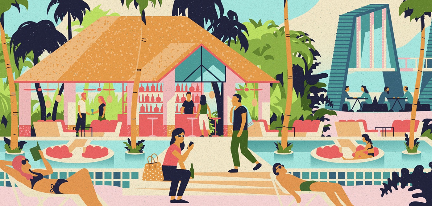
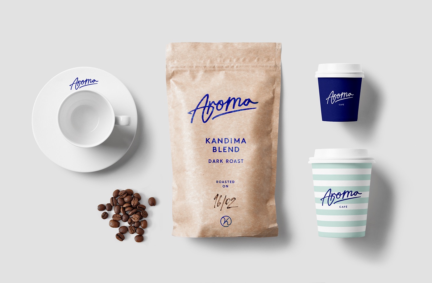
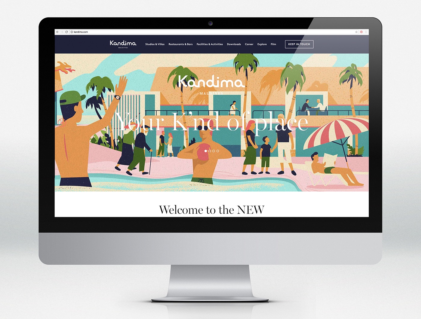
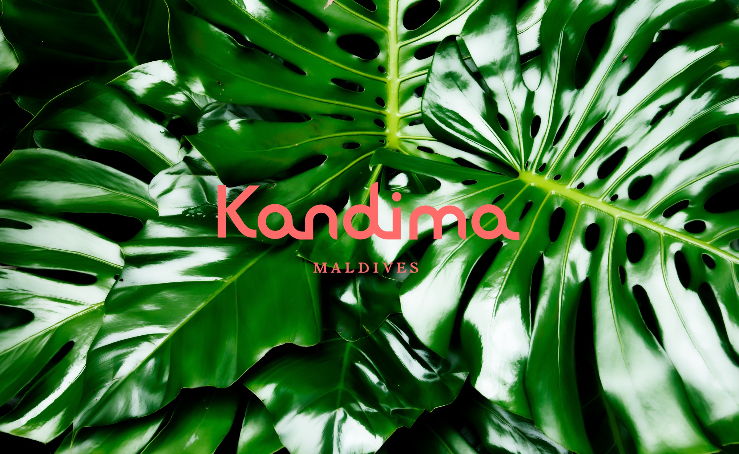
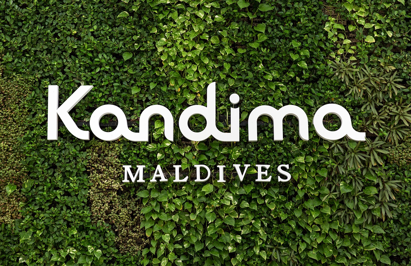
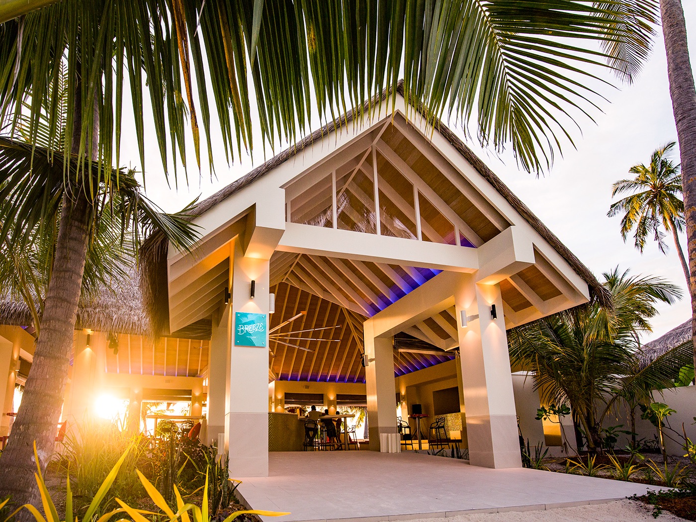
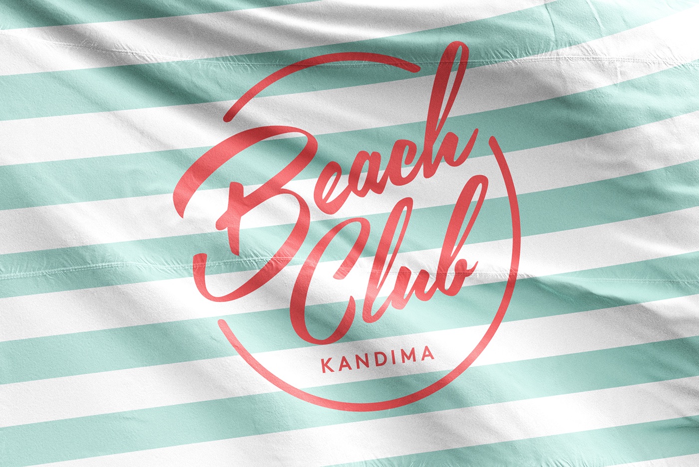
Many resorts on the Maldives are rather luxurious, but Kandima wanted to be new and different. They are a resort where everyone should feel welcome, various ages and with guests from all around the world. Therefore, it was important to create a vibrant and flexible brand, that is easy to roll out all over the island, with many different touch points. For instance, there are nine different restaurants and outlets on the island, we designed logotypes and identities for each and everyone. Kandima wanted a distinct symbol, something you should almost be able to draw in the sand. We created their Brand Identity Guidelines and rolled it out on the website, on signage and on to different collateral such as soap bottles, towels, coffee cups and more.
Gorgeous! Love the brief. You definitely see the family-friendly, fun vibe show through. Very different feel from the couples only, honeymooners type resort out there already.
I really think you need a field trip to the Maldives in order to get a good feel for the place. I mean, it’s in the resort’s best interests for you to make absolutely sure that you captured just the right exotic tropical atmosphere. I could probably even manage to tag along, um, you know, just to deliver and unbiased perspective.
Yeah, Um, I think you might need a committee of opinions based on first hand experience.
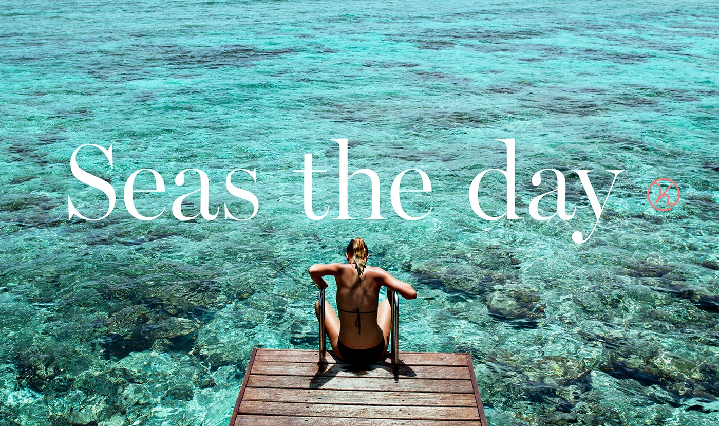
The lady on the ladder looks a bit uncomfortably awkward, like she slipped and fell or something. Maybe a slightly better image?
Are you still in the Request For Proposal stage? Or is this hired brand development? I ask because while you’ve done a beautiful job at presenting the brand itself, I still balk at the usage of store-bought templates for signage, wayfinding and brand specific packaging. Though I can understand their use for paper goods and standard items, and possibly for a proposal, but a real life signage program, especially, would require some in depth development, not some bought off the web image with a logo slapped on it.
And I see no wayfinding, though probably not much is needed if this is just “cabins and a pavillion.”
And speaking of such a tiny island…are you sure this is a real project? That island shown in the photo doesn’t appear to be much more than several palm-tree-heights long by even less palm-tree-heights wide. Not a lot there to support all that “stuff.” (that’s just the cynic in me, having recently experienced a lot of “not built yet” job RFPs.)