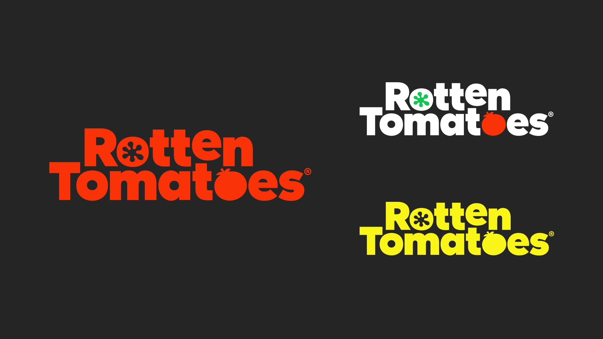
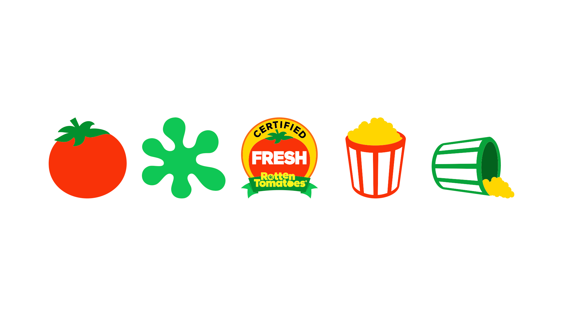
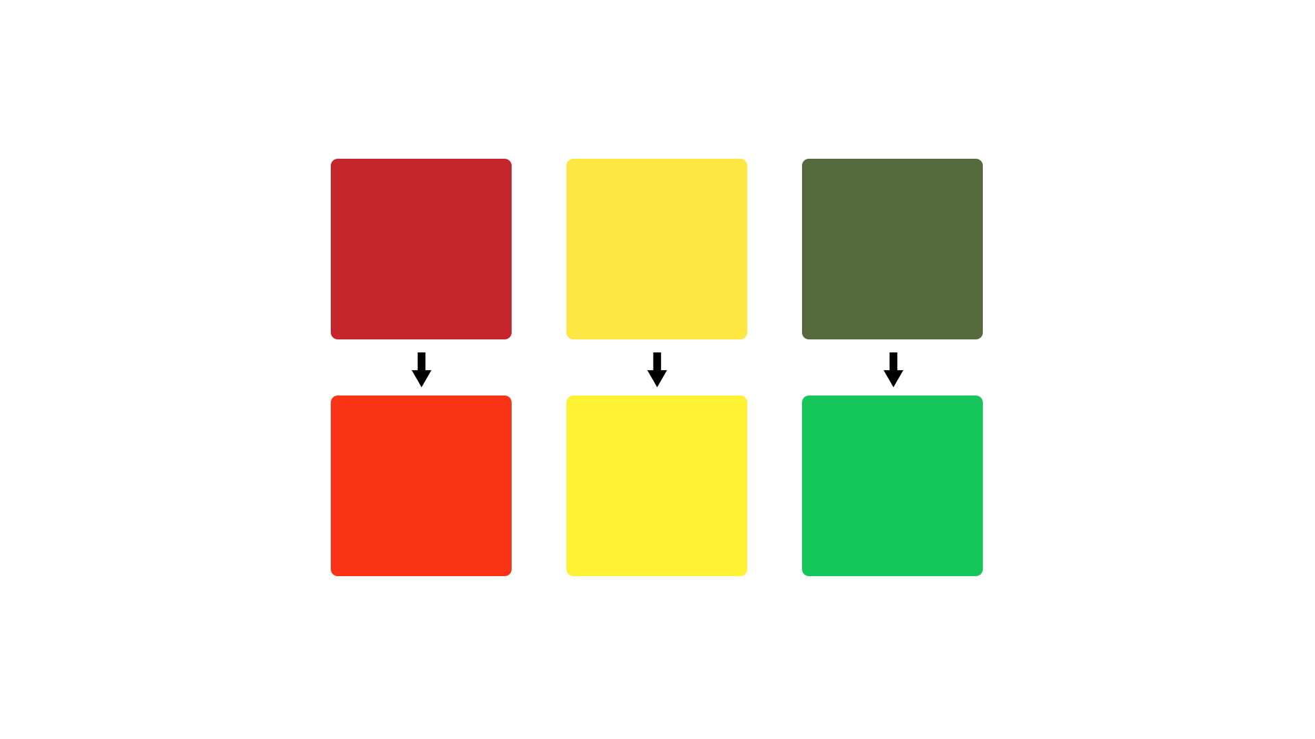
Rotten Tomatoes, fans’ go-to destination for entertainment reviews and information, announced today it will begin rolling out a new visual brand identity, including a new logo and icons representing “fresh,” “rotten” and “certified fresh” movies and TV shows. Starting on Rotten Tomatoes’ online, mobile, social and video platforms and then expanding to partner platforms, the redesign offers a modern, new look and feel, while maintaining elements familiar to fans.
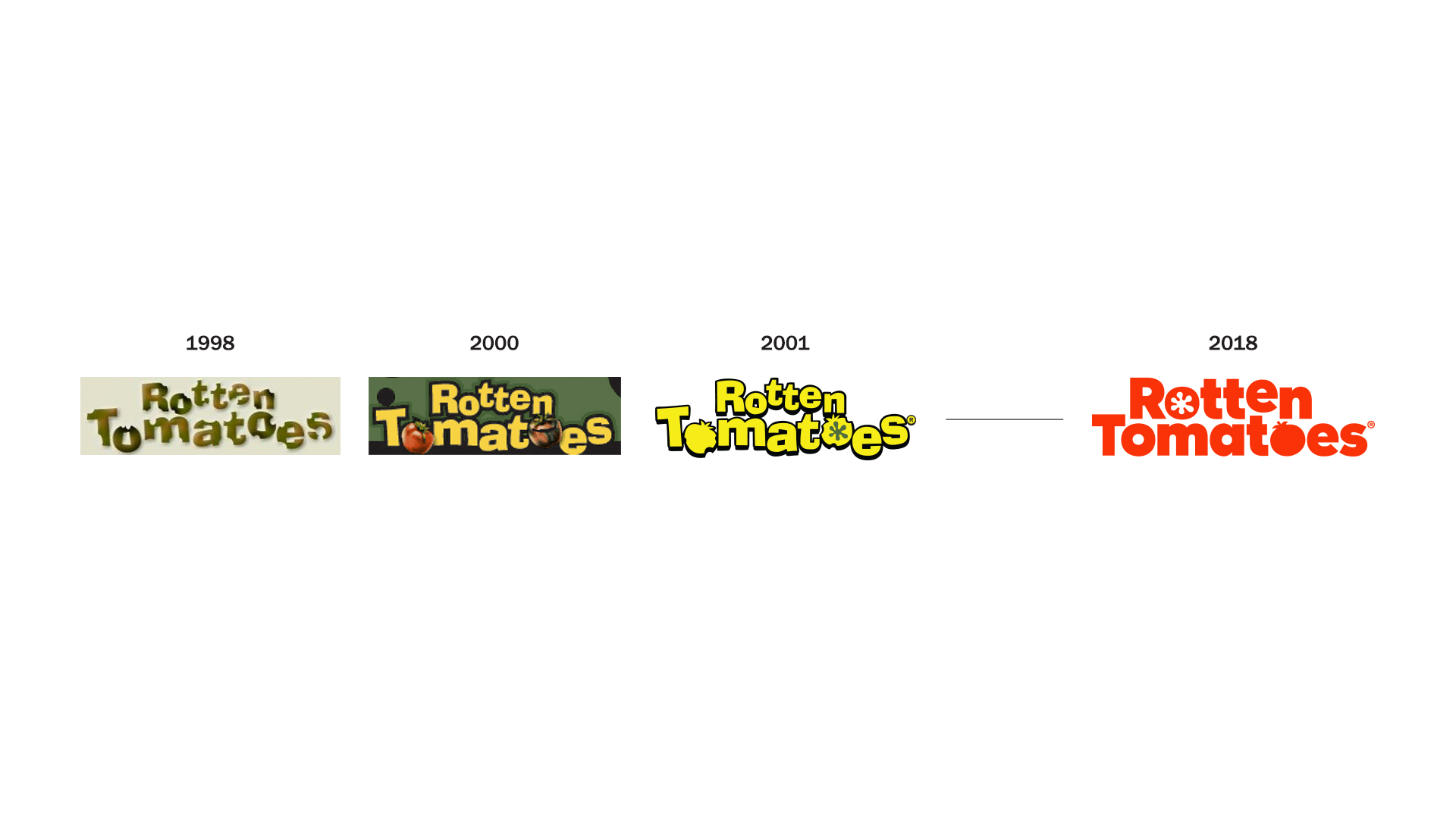
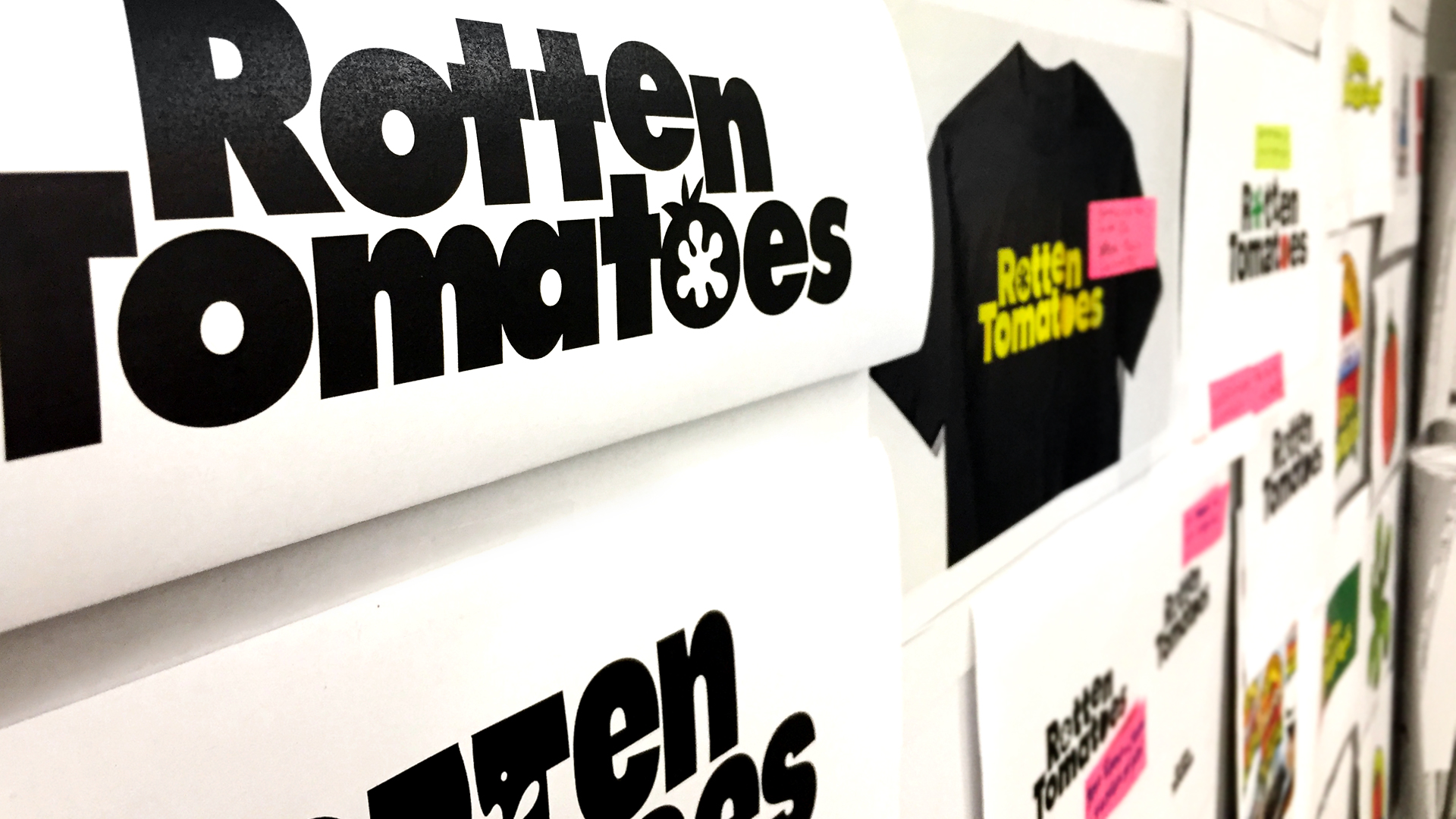
Over the past 20 years since the inception of Rotten Tomatoes, there have been several versions of the logo, as well as different graphic treatments. Designed originally for the web, the logo in 1998 contained caterpillar bite marks, then changed in 2000 to imagery of rotten, decaying tomatoes, and in 2001 converted into vector illustrations of tomatoes. The new visual brand identity launching today was created in partnership with Emily Oberman of Pentagram, the world’s largest independent design consultancy. The iterative process took place over an 8-month period and included extensive testing with Rotten Tomatoes’ passionate fans.