Hi all! I recently made this infographic about growing your instagram audience. I’m open to revising it so any feedback is welcome. Don’t worry. I have thick skin ![]()
1 Like
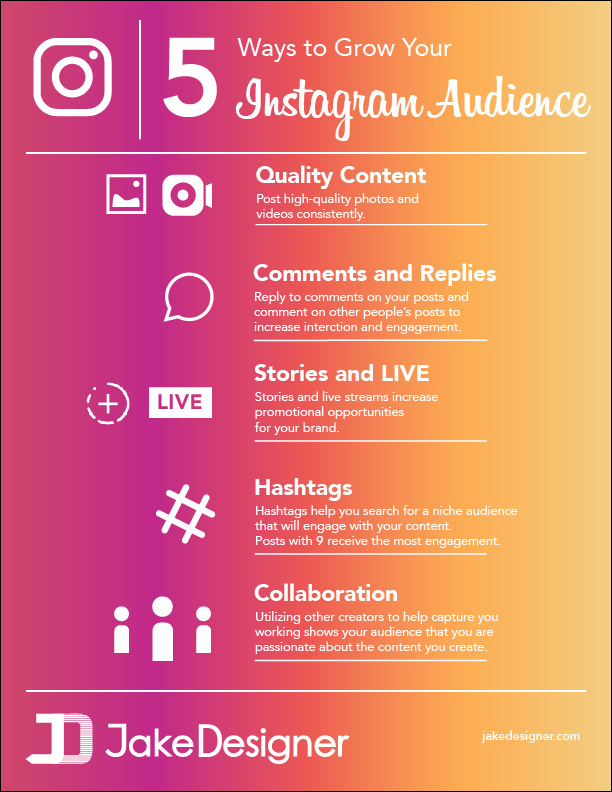
Legibility.
White on yellow sucks to read.
1 Like
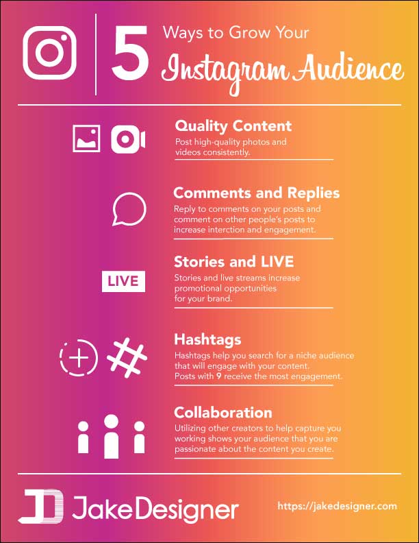
Ok. I can change that
Nope. Try some other colours.
I wanted to keep the orange or yellow because that’s the instagram colors. Should I just scrap yellow entirely?
The orange-yellow is simply not made for white reverse, especially body type, so, yeah, an alternative should be explored.
Context-wise, is this a school project? Or did Instagram hire you to design it?
To assess whether this is effective design, there must be context.
Is this an ad for your business? Your business identity at the bottom seems to suggest it is, but if that’s the case, it’s missing other crucial elements.
Conceptually speaking, the information is so pedestrian and obvious, the piece barely justifies its own existence.
-
Under Comments and Replies the advice amounts to: “To increase interaction and engagement, increase interaction and engagement.”
-
The advice under Hashtags doesn’t make sense as-written. Hashtags don’t help the poster search for an audience, they help the audience search for a topic. And, based on the heading of the piece, I wouldn’t think a “niche” audience is the objective.
-
Read the advice under Collaboration back to yourself. Does it read correctly? What does it mean?
As for execution, I’d agree that the colors are not conducive to readability. If the deliverable is an on-screen graphic, you’ll need to find settings that don’t litter it with so many compression artifacts. (The example in the first post doesn’t have this problem.)
I’ll add to the list:
- Legibility isn’t an option, it’s required. Matching brand colors should be a lower priority for this design. The value of this project as a whole depends on it’s legibility. I’d suggest making a solid background until you’ve worked out the other issues listed below…
- The copy needs work, as mentioned by @HotButton. If you’re trying to add real value, add something that’s accurate. Also, consider changing the tips. These are basic. I’d be more interested in reading “5 unexpected ways to grow an audience” or “5 Tips to from Instagram’s Biggest Brands.” A sense of discovering insider knowledge works to attract readers.
- The line space below each tip is too close to the text.
- Your icons are not uniform. Some have two icons, while others have one. Their sizing doesn’t match up either. Consider one icon for each tip and put them in a similar style for a more uniform piece. They do not have to be real functioning icons that exist in the app.
- I covered the icons with my hand and was still able to get all of the information. This means the elements and the copy are not cohesive. They need to better link together so that each tip/icon is a unit that would look strange if separated.
- Your logo on the bottom is almost as big as the header. I understand that you’d like to be cited if this piece, but this could be better accomplished by giving a value proposition or a reason they should visit your site (i.e. For more Instagram tips visit www…). I’ve done an image search of other infographics and their source citation is usually small and in the bottom right or left corner. It shouldn’t be visually competing with the content at all.
Nice but change back ground color its difficult to read on right side of text.
Excellent infographic that you have included here
1 Like
I’d echo what most of the others have said. If you’re going to use the instagradient then use it how instagram does (directionally speaking). That will help with your legibility problem.
Also, loosen the tracking on the copy a wee little bit.
1 Like
It’s a school project
Lot of great feedback. Thank you.
I’m moving this to the student forum where feedback might be more appropriate for student-level work.
Hey Jake, Awesome infographic man.
Just visited your website and you are good!
You should enable your infographic for embedding. It helps in getting quality backlinks.