Intel reveals new brand

  • Our new logo honors our past by bringing forward some of the strongest design elements while simplifying and modernizing them to bring dimension and breadth extending our brand into the future.
  • Some may see “Intel Inside” as a sticker; to us, it’s a badge. We’ve reimagined our badges as simple expressions that give our products individual identity while connecting them under the One Intel family.
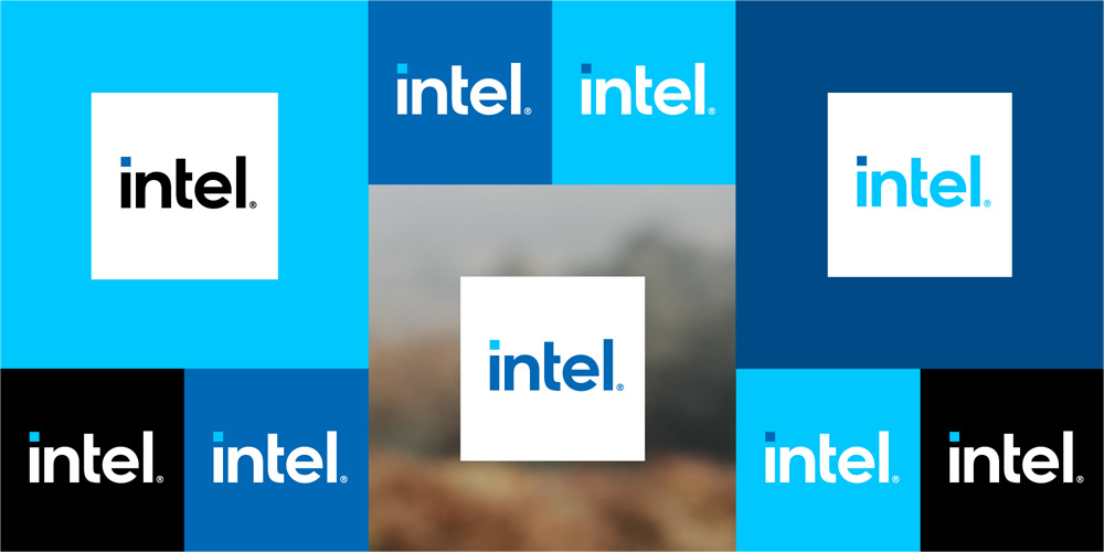
  • Blue remains the foundational color of the Intel brand. In addition to our classic Intel blue, we will introduce new variants with an extended color palette to add more depth and modernize our visual identity.
  • Our musical sound signature or “bong” will retain those iconic five notes recognized around the world, but a modernized version will roll out later this year.

Watch the video:

2 Likes

Me like.

I never realized it until just now but I’ve always liked or at least been impressed with my impression of the intel brand, ever since childhood and seeing those tv ads that said “Intel Inside”. I think this seems like a fitting move into contemporary branding.

Back in the '90s, I used to do a little after-hours work for the agency — Dahlin Smith White — that came up with that tag line and the commercials that went with it. They’re no longer in existence, though. That’s the big problem with working at ad agencies — when they’re hot, they’re steaming, but when they lose a big client or two, everything goes cold, they can’t pay the bills and everyone starts bailing out.

1 Like

Dang it @Just-B I’ve been thinking you probably had a great story…was just waiting for it to come out. Very cool man.