Please can I get some feedback on rough drafts I have for a school project.
Concept : interactive identity system
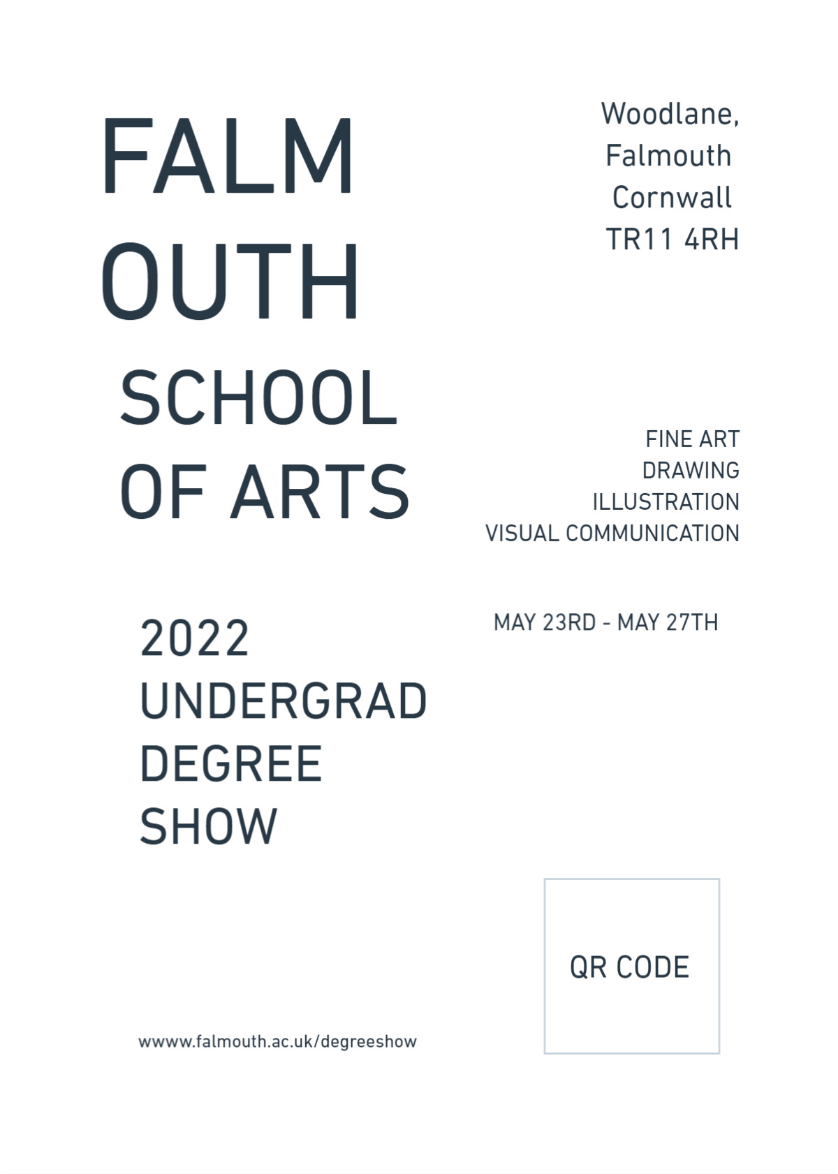
Purpose or Goal : Falmouth University’s School of Arts 2022 undergraduate summer degree show
Format : website, physical A2 poster, physical invite, e-invite and social media advertising
Audience: 18 - 25 year olds; potential students and second year students thinking about attending uni and looking for inspo for their final year projects
Your Experience Level : visual communication student
Nature of Job: school assignment
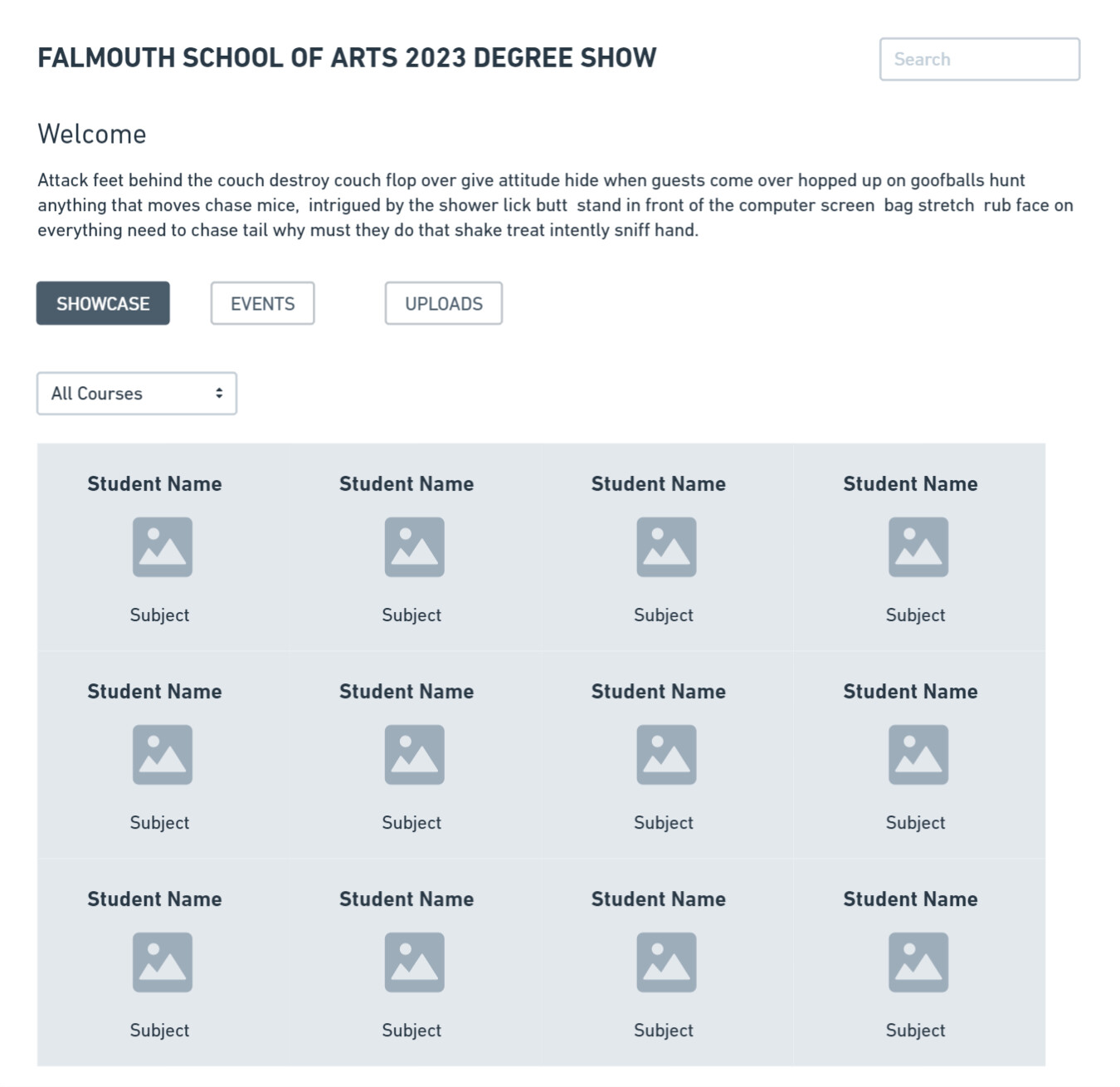
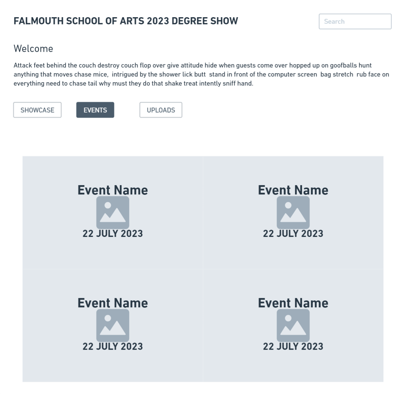
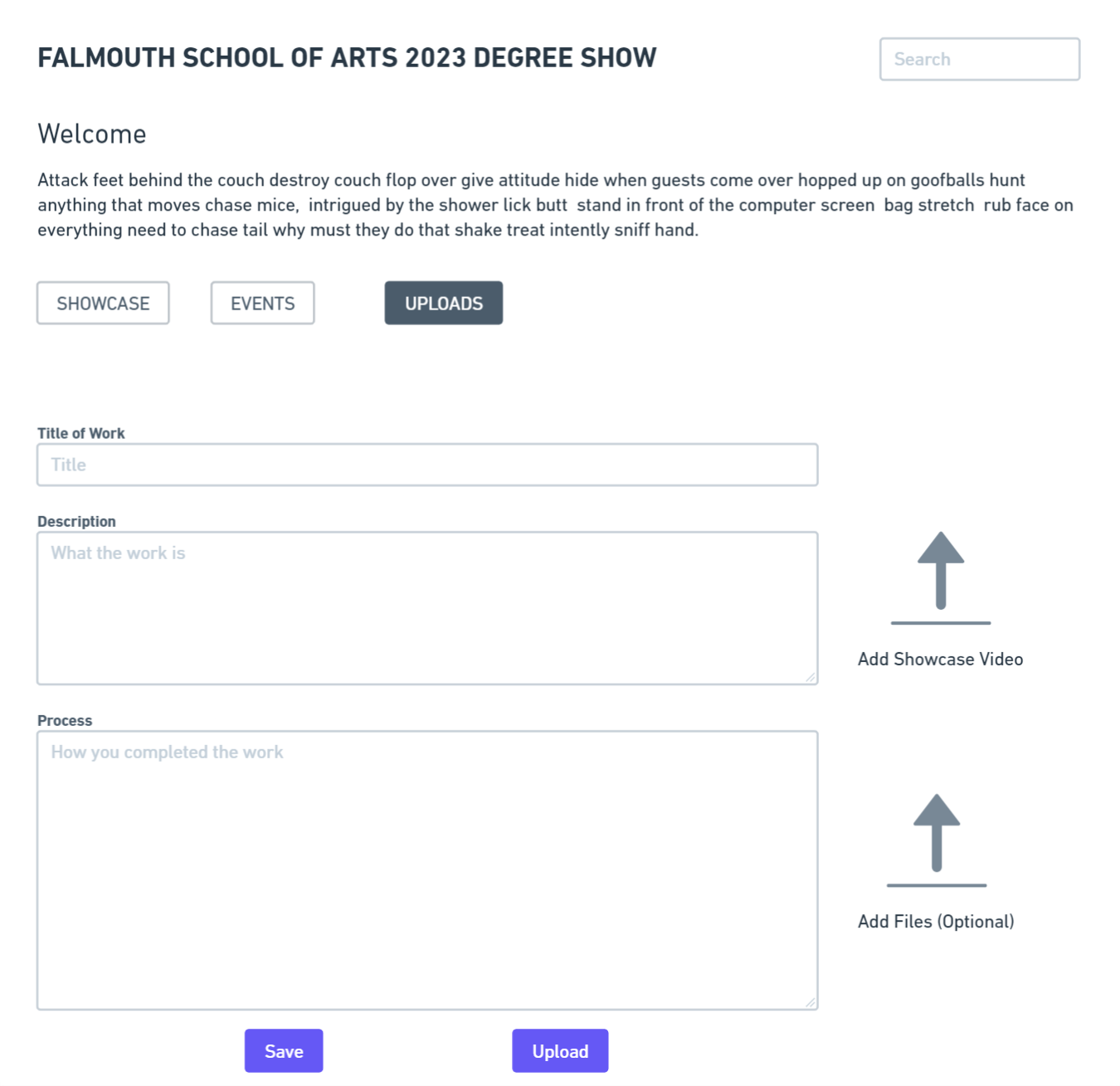
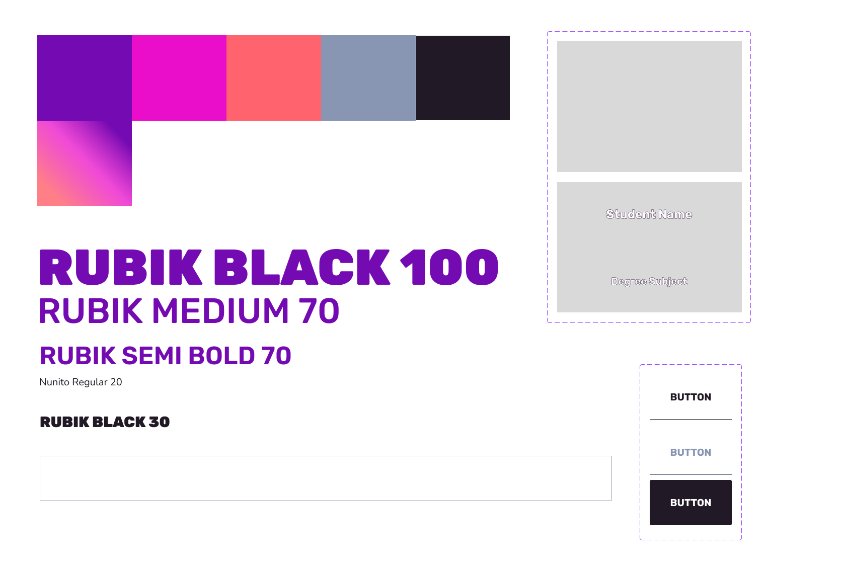
Below are rough drafts of the poster design, which can be applied to the social media physical and e-invite designs. Beneath that is a rough design of the website in three different states and at the bottom is the style tile with the text format, colours, buttons, text field and image placeholders I plan to use.
You probably need to flesh out your ideas a bit more before a critique. For example, let’s examine the poster. All you’ve seemingly done is placed the words you feel are important on a poster-shaped space. I’m assuming the final poster will look much different, but I have little idea about what its final design might be.
Similarly, the Site Showcase, Site Events, Site Upload, and Style Tile examples contain too few of your design ideas to enable a meaningful critique. They’re too bare-boned and preliminary for me to know how they all fit together as coordinated elements in a larger design.