This article is a bit old. But interesting nonetheless.
Here’s an excerpt:
And the whole legibility thing. Number one, I feel strongly that it got way overstated. I can think of one or two incidences in my entire career where I would say you couldn’t read something, and at that point it was sending a different message. People read what they’re interested in reading. Recently, researchers gave a bunch of college students information in strange fonts, from Monotype Corsiva to Comic Sans, and another group was given information in Helvetica. The people reading the stranger fonts remembered more and did better on tests later.
Exactly @Neverman. I don’t think the argument is actually about legibility, but rather accessibility. There are so many printed materials that people walk past that if you cannot capture enough attention, you lose them. I looked at a few examples of this typographer’s work and basically, he’s making you “work” to read the message.
His objection against lazy design is valid (Helvetica is played out), but most people also do not want to struggle to consume content. I think that if you’re going to play with your reader and make them decode your content, you’re doing so under the premise that the brand has enough equity and trust with the audience so they justify the struggle to consume your content.
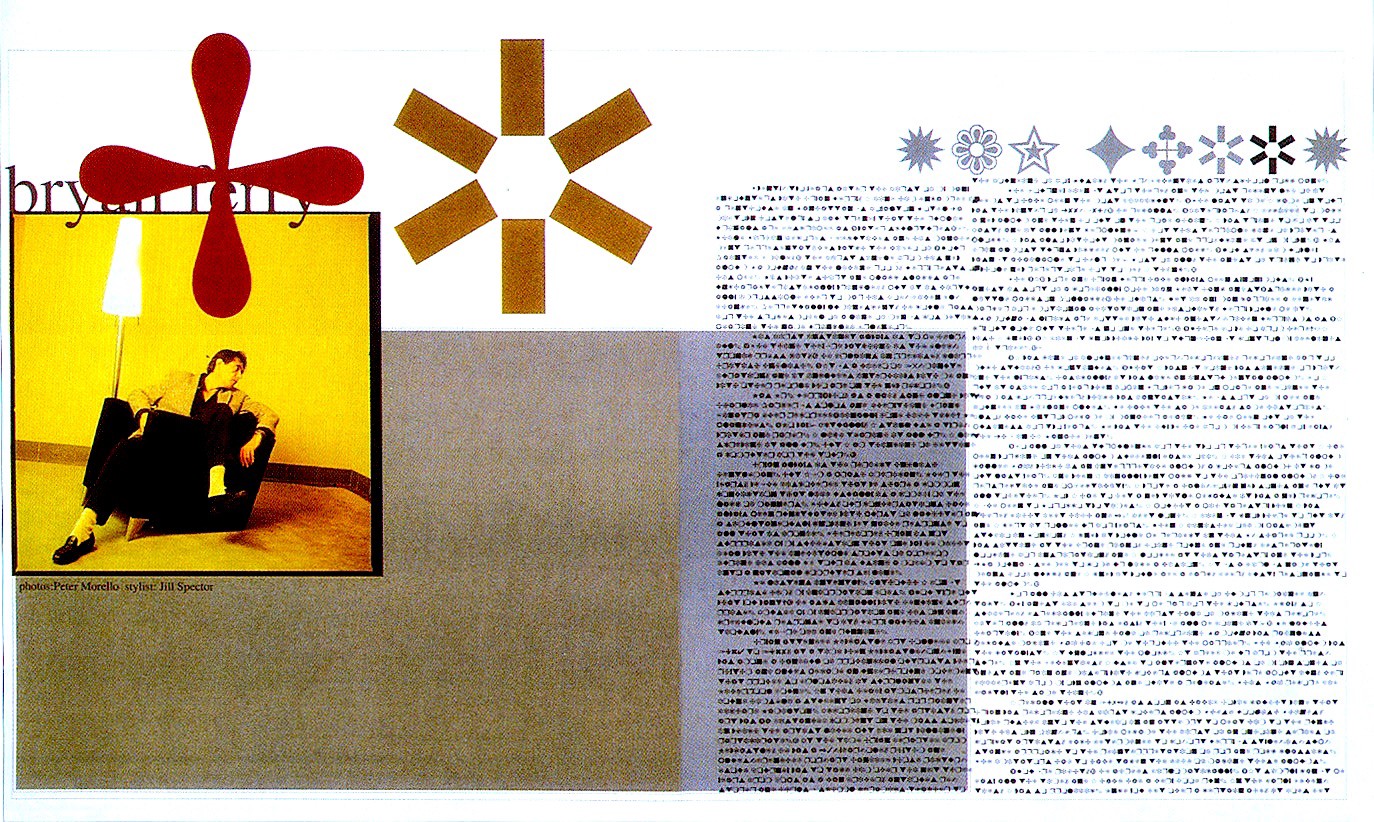
Don’t forget that David Carson set an article in Dingbats. He said the article was boring. However, who is he to decide? I always wonder how the writer felt, perhaps finally got their work in print only to be set in dingbats. It’s kind of an asshole thing to do…
“Let’s get this straight. Graphic design is not and never will be fine art.” - Chuck Close (speaking at Art Institute of Boston '96)
Carson thinks he’s a fine artist. No, he’s a tool who decided to screw over someone else to look “XTREME!!!”
Graphic Design is visual communication of specific information.
The goal of Fine Art is to elicit “a” feeling. That feeling can vary greatly from one person to another (nonspecific message dependent on the viewers own life experience).
If I owned the company I’d fire the editor and sue Carson for the cost of a complete rerun AND destruction of the current article. he can pay for it by collecting them and autographing the page if he’s such a fantastic success.