I have a bunch of PSD files, in which I used Arial Black spaced out dashes (20pt. size, 40% reduced height) all typed on a curve - - - - - - - to create a dash with arrow at the end >>> on a curve. However I noticed that when export to PDF the dash will not appear properly but starts getting crooked and weird. Once I changed the 40% back to the original 100% Arial Black font height, then the dash is exported properly on a PDF file. My question is: Is it possible that the 40% will print correctly as it appears properly on the PSD file, and it happens to only be the PSD file that can’t render it properly for visual accuracy? I think, since I don’t have time and I don’t want to be redesigning all the PSD files now, I will just rasterize all 40% height dashes to appear as I intended them to be.
What happens if you select your text and convert to shape (in effect converting your text to outline.)
I’m slightly more concerned with what you may have created in Photoshop that has text that you are printing as a PDF. Photoslop is not a layout tool and its PDF creation is overly bloated.
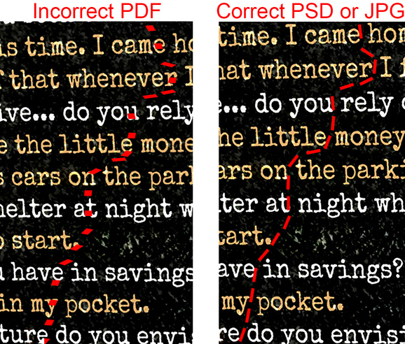
Could you post a before/after (am image from the PSD and the image from the PDF)? What happens when you save as a TIFF?
Just to recap, the correct dashed shape is Arial Black at 40% height set in Photoshop. If it was 100%, the dashes would look quite thicker.
By the way, this issue gets resolved as PrintDriver said, by converting the PSD layer to Shape and then exporting to PDF. Although if my layer has multiple elements and colors, then that’s no good because the shape conversion makes everything in one color and into many different shapes. But for my purpose I am fine with the conversion to Shape.
Hmmm… what about just recreating that line in Illustrator and then pasting as a vector into PS?