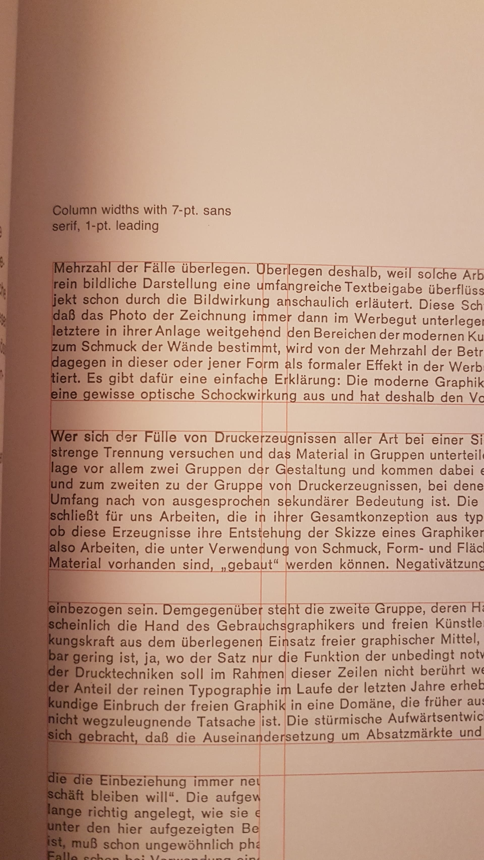
I am reading a classic book on Grid Systems. So far I’m loving every bit of information given in the book. However, there is one place I’m kind of stuck. There is a section about line spacing (or leading). I’m attaching the screenshots. The type size is given 7pt. and leading is set to 1pt. But as I’m trying the same setting in my software (Adobe Illustrator), the paragraph looks so bad, 1pt. line-spacing is just not enough. When the software is set to auto, it set leading 8.4pt for 7pt type size. I’m not sure if I’m missing something. Please help!
1 Like
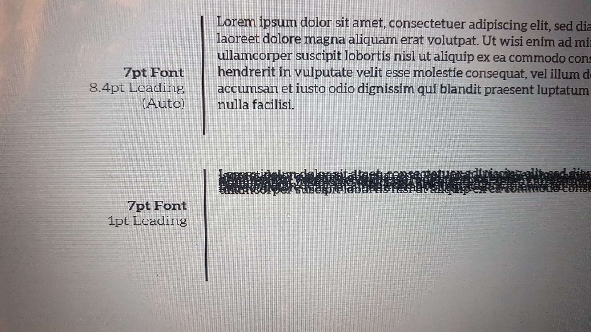
The 1pt leading in traditional typesetting is in addition to the type point size. It is a physical piece of lead strip 1pt thick, laid between the lines of metal type. In modern systems (for some reason) the leading is the space between one baseline and the next. The default is 1.2x the type size. So if you have 7pt type, the auto leading will be 8.4pt. You can change the auto leading measure in Preferences, but for most purposes just change the leading in the text box.
4 Likes

I think you have solved my problem. So, in order to copy the example of the book into Illustrator, I will simply add the leading point to the font size and add 1.
For example,
7pt font (1pt Leading) in book = 7pt font (8pt Leading) in Illustrator.
and 20pt font (3pt Leading in book) = 20pt font (23pt Leading in Illustrator)
Thank you so much! ![]()
You’re the designer. You only follow rules until you know when or how you can circumvent them.
This isn’t normal.
Any font — even when it’s set solid with no leading — should have space between the lines.
There definitely isn’t 1 point of leading here. You have a negative leading problem occurring. What software application are you using? You might have added 1 point of leading, but somewhere in the application, something else is going on to subtract leading.
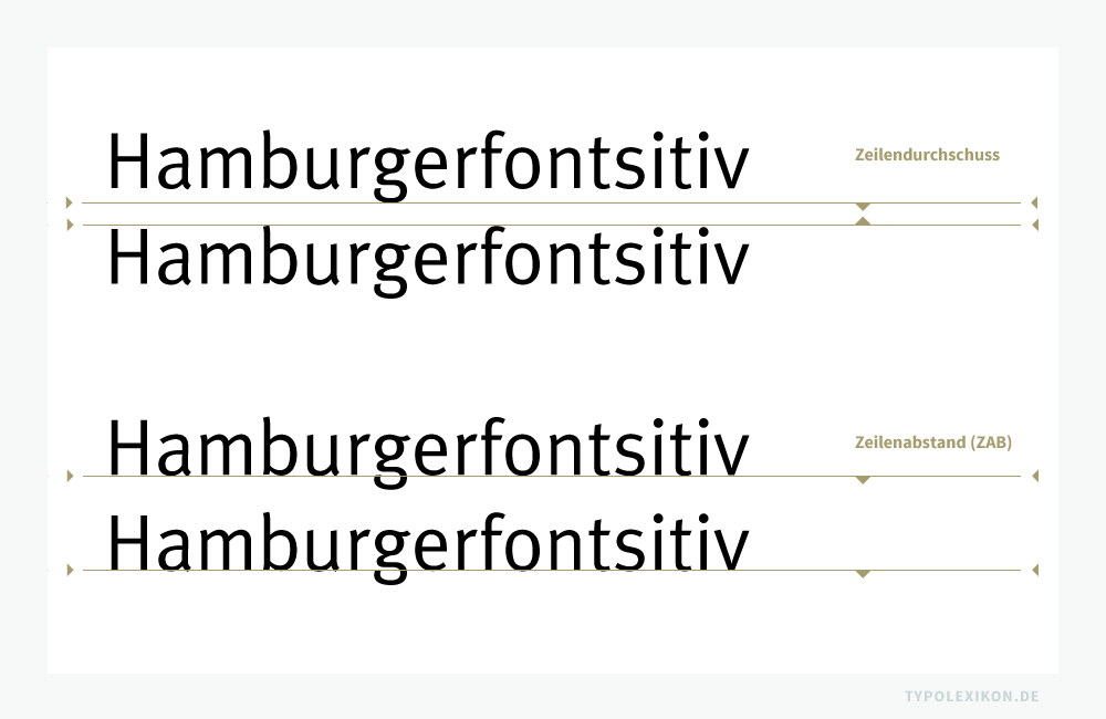
When set with no extra leading, the distance between one baseline and the baseline of the line above or below corresponds to the point size of the type.
For example, let’s say you type in two lines of 72-point type with no extra leading between them (set solid). When you print it at 100% and measure it, you’ll find there are 72 points of space between the baselines.
The leading is whatever extra space you might add (or subtract in digital type) between those lines of type. If you add 5 points of leading to the lines of 72-point type and measure it, you’ll find that the printed baselines are 77 points apart.
2 Likes
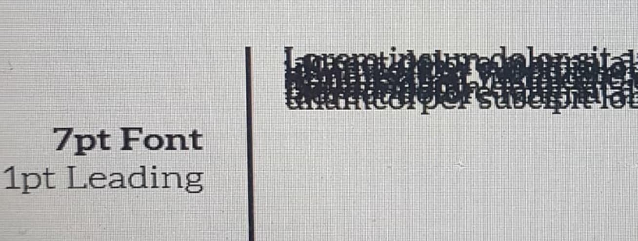
I completely agree with your explanation, it is logically correct. But, I don’t know why software like Illustrator and Photoshop are behaving differently. 1Pt leading there simply means negative linespacing (overlapping text). You can’t go less than 0.1Pt leading as it shows error in the software. Please check for yourself and let me know if your software is acting any differently on setting the leading (7pt font on 1pt leading). It should be 8pt spacing between the lines right? But I’m sure it will give you overlapping texts.
The type leading is measured from the bottom of the text line to the next of line and the bottom of that text.
If you put 1 in pt leading on 7pt size it’s written as 7/1 which is a negative leading.
Where there’s 1 pt between the baseline of each line of type.
7/6 is negative leading too.
7/8 is positive leading.
I can see how it’s confusing, so in addition to Smurf2’s explanation (which I agree with), I’ll overexplain it another way.
Back in the olden days (yeah, when I started), when type was speced and sent out to the type house, we would have written out the instructions for 7-point type, plus 1-point of leading as 7/8. In other words, 7-point type where the addition of 1-point of leading increased the baseline-to-baseline measurement to 8 points.
For example Palatino 7/8 x 16p, justified would mean we wanted the type set in 7pt Palatino with 1 point of leading in a 16-pica-width column that was set justified.
Adobe has sort of kept up this convention. In the Adobe apps where the leading is entered, 1 point of leading would be entered by adding 1 point to the point size of the type. In other words, if you want to add 1 point of leading, to 7-point type, you’d enter 8, not 1.
Oddly enough, this never occurred to me as being counterintuitive since, for me, it’s always been this way. I can certainly understand, however, that someone might think this makes little sense to do it this way.
There’s a lot of old terminology and ways of doing things that have been held over from the days when type was set in metal and the terminology made sense. Some of these things make little sense today with digital type, but the old terms and conventions are still used in many instances.
1 Like
We have different words for that in the German language.
Most of the time I just “feel” the type color
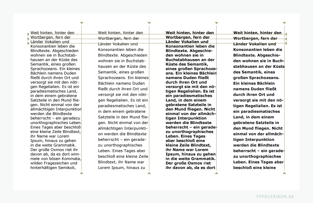
I wish there was an english version of typolexikon.de