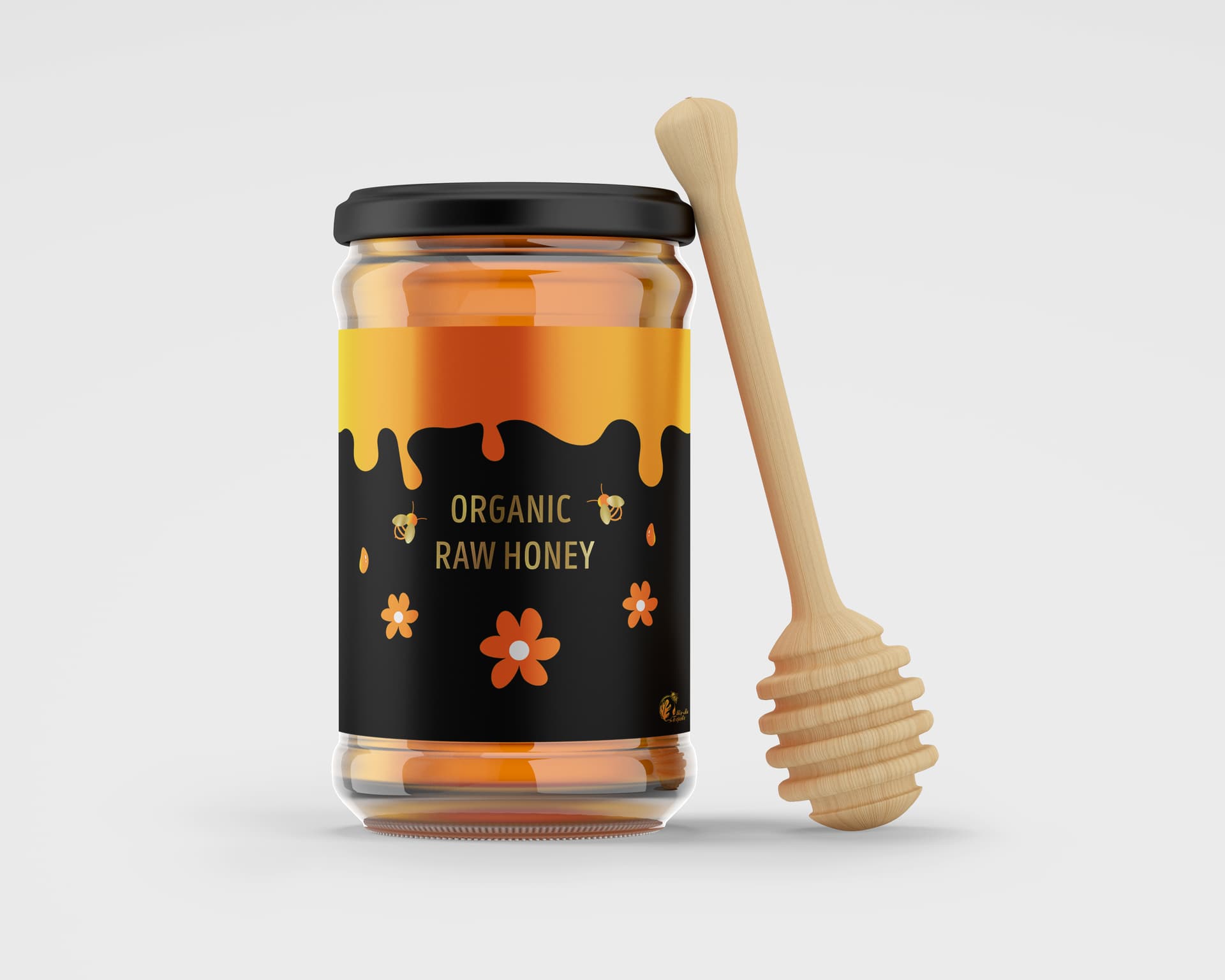
There is no brand identity. What there is is hard-to-read copy.
Make it POP.
First of all, it’s tough to evaluate design in a vacuum, and you have given us nothing to go off of. No brief, nothing about the target market you’re looking to attract, nothing about the competition, etc.
Also, the true measure of whether or not this is a good design would be how well it performs at retail.
All of that said, this is a big improvement over your previous design. As in not even close to what you did before. So good job.
If I were going to criticize this, I’d say there seems to be some tension in the design. You have sleek black, a modern sans font, and what looks like foil stamping. But then you have an organically shaped, hand drawn flower. So there seems to be a disconnect there. Also, the type looks to be sandwiched in its spot and overwhelmed by the honey motif across the top. Maybe what you have is the best answer, but I’d encourage you to experiment with the proportions and weight a bit.
What those guys said. Plus, I’d want to know what the strategy is behind the design. Things that go on supermarket shelves have to compete with tons of noise. So we often use brand-blocking as a strategy to outsize our visual presence. Sometimes you’re aiming to aid consumer navigation when you have different flavors.
The glaring oversight here is that the label hierarchy is always brand first. That never changes. Brand first and this doesn’t have one.
Supermarket shelves are deceptively dark, shadowed by the one above. So the black is going to make that worse. The metallic would definitely help though. Usually it’s just not in the budget.
The glaring oversight here is that the label hierarchy is always brand first. That never changes. Brand first and this doesn’t have one.
I immediately found an exception in my archive but I still think that’s good advice.
I still see a jar with stuff in it … and an overworked label.
The label is a lot of fun, and it’s nice-looking too. From that perspective, I like what you’ve done.
However, it must do more than sit on the shelf looking nice. The design must help sell the honey while meeting all the usual labeling requirements.
Looking attractive certainly helps sell the product, but if it sits on a supermarket shelf, it must hold its own against all the other jars of honey. Whether it does this might involve a trip to the grocery store to look at the competition. On the other hand, if this is a small private brand available only online, the problem changes.
The biggest problem is the generic branding. There’s no mention of the larger brand. The honey doesn’t have a name. On a shopping list or in the ordering book of the supermarket, the honey needs a brand name, or nobody will know what to call it.
For example, if it’s Katie’s Organic Honey, it needs the word Katie’s in a larger, recognizable logotype. This gives the honey a name and helps create a larger brand for when Katie’s begins selling jelly or marmalade.
View the label as an advertisement for a point-of-purchase sale, repeat sales from satisfied customers, and the more extensive line of products the company sells or might sell down the road.
I can’t say much about it … because I don’t know much about it ![]()
But, face value - I like where you are going with it. It’s playful without being cliche’. ![]()
Overall - I really like it. Simple enough and works.
Bees + Flowers = Honey
Organic is important for a lot of people.
You’ve not gone the usual route of honeycomb backgrounds.
One thing I would say is it looks a bit childish, the pastel colours in the flowers and the illustrations of the bee.
It doesn’t look like a adult package.
But looks like it’s aimed at children.
A lot of Honey Labels are aimed at the adult market
That’s not to say there’s not a market for children’s honey
Without knowing what market you were aiming for.
It looks quite good in my opinion.
I agree with others, needs branding/logos
What’s this logo?
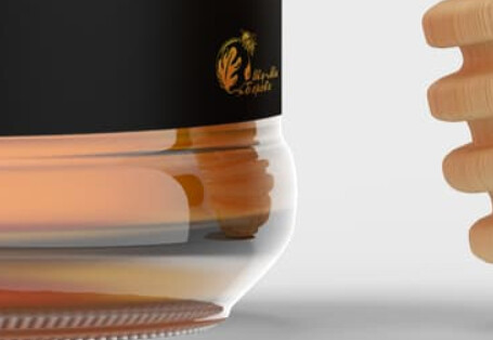
I’m glad you pointed out that little logo Smurf.
It was on the last label too, and I would bet that is the real logo cuz last thread said it was a natural place on a hill surrounded by trees - or something like that.
If that is the company logo, it should be more near the front of the label.
A little generic… Needs work.
This topic was automatically closed 365 days after the last reply. New replies are no longer allowed.