Hello.
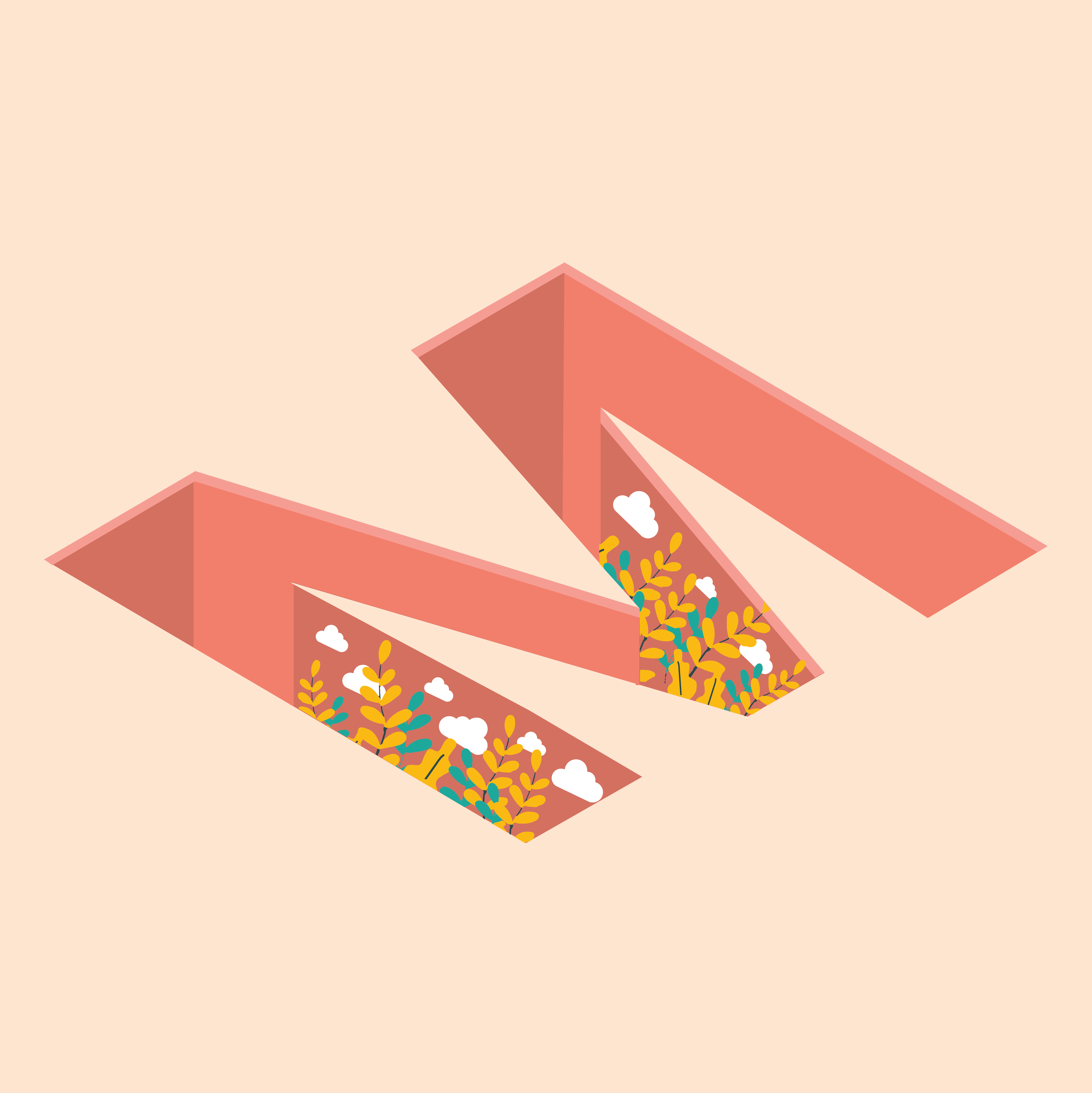
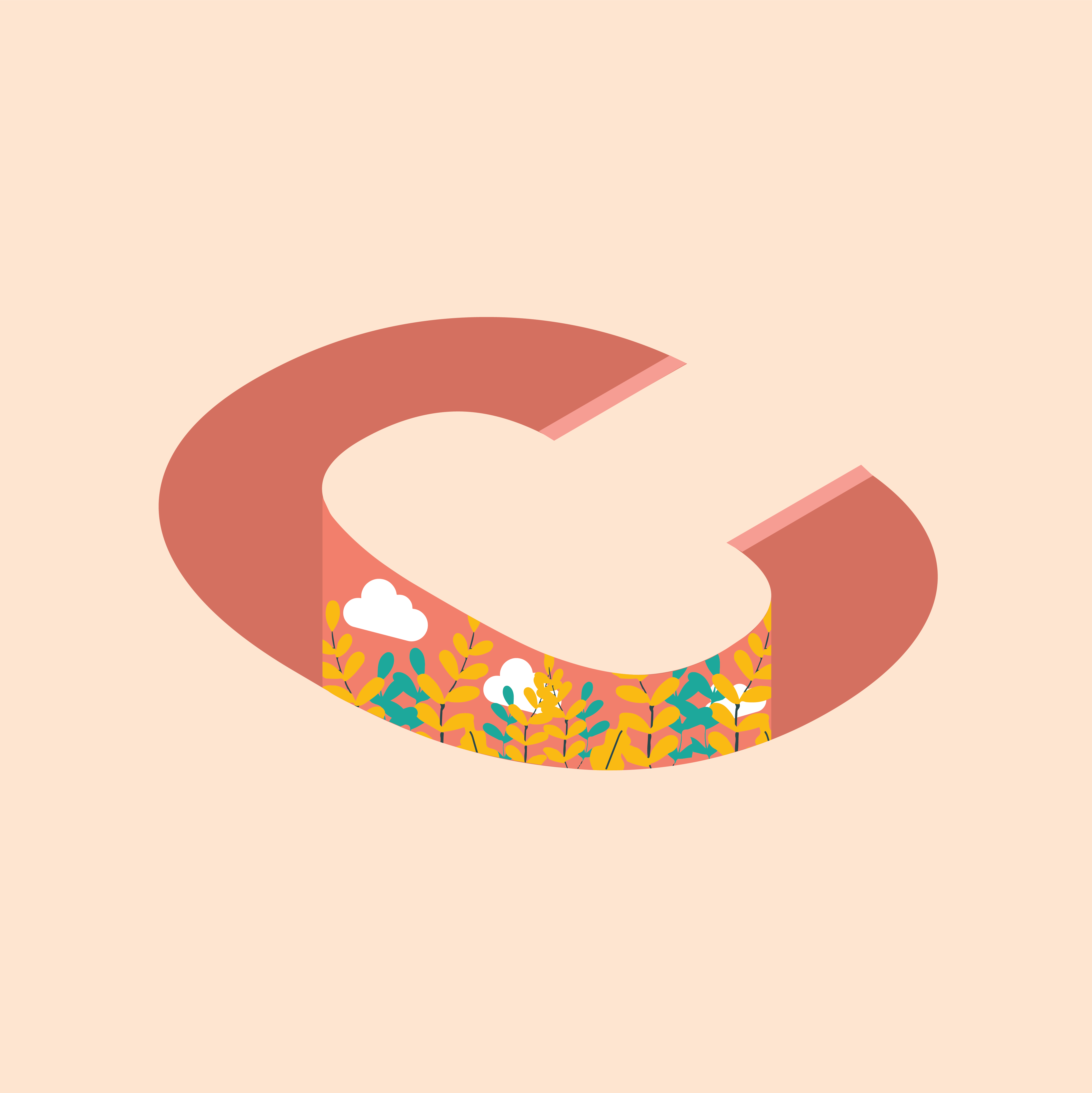
It’s my first time designing isometric design style, so i just quick demo using my initial name which is MC and 2 different styles of isometric.
Feel free to comment, really appreciate any feedback for me to improve since I’m still student and still need a lot improvement
Sincerely,
Melissa Christine
I like how you tried to dig a hole with the first two. Your brain is messing with you though.
On the M, the top light pink line would go all the way around. Or it would change color like the vertical drops do.
the C is flat. You would have vertical drops on the outer corners of the closing hooks. Again the light pink would either be a full border or you wouldn’t see the top one if it dropped into the hole.
On the MC, you inadvertently flattened the C by aligning the bottom closer hook to the baseline of the M. See if separating them or overlapping them fixes that.
The evil thing about isometric art is that it is meant to be used for drafting. It has no perspective so therefore looks like a mistake. When doing 3D letters like this, they will usually have one or two point perspective, not isometric.
1 Like