Just a simple Social Media cover, I made in honor of Juneteenth for my internship. I designed the font and background on Adobe Illustrator and then I found a png of the United States to put it tell me what you think.
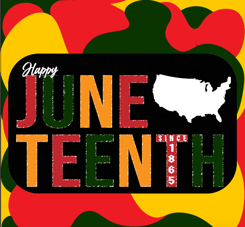
I do not like the white outline on the letters at all .. it looks like a really bad cut and paste job. I also don’t think you need the US addition. Or at least not in white. It’s like a blob throwing off the whole piece. Otherwise the green, yellow, black and red, are appropriate. Unless you really want to keep some white … you could always go with the traditional flag colors of red, white and blue. Not the US flag .. the Juneteenth flag.
You used illustrator for this? There’s an awful lot of antialiasing going on that detracts from the intent.
And that little skitch of green going into the red at the top right is a sloppy detail that draws attention to itself.
I don’t particularly mind the grunge look of the lettering. 3 fonts is too many though with the word “happy” not fitting into the general feel, and the nazi-esque blackletter typeface?
I agree with RKK on the white US. But probably for reasons other than aesthetic. That has way way too many un-PC connotations in this context…
This piece does still show one thing, the thinking on this is still back in the 70s. The retro vibe here is telling. Nearly 50 years…smh