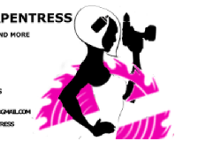
Not super experienced with graphic design. I basically found some stuff on Google, modified it and cobbled it all together with Gimp. The logo is for a friend of mine who does custom wood furniture, picnic tables and stuff like that. She’s a great Carpentress, and is also really girly. She wanted a logo that was Uber feminine and glamorous, but also portrayed artistry craftsmanship and an ability to get things done
found some stuff on Google, modified it and cobbled it all together with Gimp
images on google are not copyright-free. Unless by google you mean free clip art sites.
Most clip art sites specifically forbid using the clip art for logos in their EULA.
Changing a few details does not void the original copyright holder’s ownership.
Gimp is an image editor. Logos should be vector art, not photo art. Think Inkscape using shapes, not gimp using photos.
Way too many details and way too many very fine lines. You are losing some of those lines already at the business card size logo tagged here.
What’s that thing in her hair?
Who is your client selling to? She may be really girly, but many people seeing this logo on the side of a truck might more think this is a guy with a very sexist view of women, even with the pink buzzsaw. The logo isn’t selling to your client, it is selling to your client’s clients. Always keep that in mind.
2 Likes
What PrintDriver said.
The thing in her hair is a can of spray paint, spraying the face onto the image. she spraypaints or stains most of her work. She sells to middle class yuppies, weekend warrior biker types, and wanna be redneck suburbanites who like the rustic look. She wanted something fun, flirty and cool, which incorporated the elements I listed in the OP. I get what you’re saying though about the client’s clients. Didn’t think about that. Not sure what you mean by too many fine details though. Oh i am aware of the copyright laws that may apply to the images on Google.
I can see the spray can once you mention it, but am having trouble with some of the other finer details. Is the circular saw cutting through her body silhouette? What’s in her left hand? I am liking the attitude of the figure though - hairdo and all seem to work well.
Can you post a larger image?
Fine line details. Like the outline of the figure. The line at the drill chuck. The circular lines in the blade and the small lines under the blade’s teeth.
You could probably ditch the spray can. Extraneous detail.
Though you may want to give the drill driver a driver point. A small one.
Simplify
I’m not sure yuppies exist as a classification any more. It’s a dated term.
Not trying to be a jerk, but this logo flat out isn’t working.
You are trying to portray:
– fun, flirty and cool.
– Uber feminine and glamorous
– artistry craftsmanship
– an ability to get things done
And appeal to:
– middle class yuppies, weekend warrior biker types, and wanna be redneck suburbanites who like the rustic look
This is a tall order.
I think you need to put together a mood board that includes a bunch of photos of her furniture. Also, add photos of rooms and yards that incorporate a look that works with her furniture. Let that brew for a bit. Then step away from the computer. Spend an afternoon sketching out concepts that will represent her products – not necessarily her. Post your sketches. If you don’t feel like posting your sketches, pick the best 10 and develop those in a vector art program. Pick your best 5 and post those for review.
I think the message needs to be distilled down to the absolute basics, and then the logo should start over from there.
The logo should tell your client’s customers what’s in it for them. It doesn’t need to express her… so most of the information about her can be left out, which simplifies your task considerably. ![]()
I’d list the elements in order of importance.
- Business name
- Custom Wood Furniture
- Craftsmanship
- Made by a woman… Is this important to her market? For example, a single woman’s homeowner group? If not, it’s not necessary to include it on the logo.
1 Like
I don’t particularly have any problem with the logo representing a woman with attitude, but it has to take a step away from the crude portrayals of women that have been somewhat rampant in the trades up until the last decade. And still does to some extent (have you ever been to a building materials trade show? What are the booth hooks? Not pretty graphics. Pretty girls, with lots of cleavage!") Be tasteful.
Woman-owned trades companies are given preferential treatment on certain types of jobs.
Yes they are - if the job bid is based on EOE points.
No one needs another carpenter logo with hammers and saws.
This could work, if it was simplified and didn’t come off as a “sexy carpenter” for wink-wink “hire.”
1 Like
this was the first one, minus the bitch part. That was only there is meant to be funny like I said it’s for a close friend of mine. She didn’t like it and then she wanted a girl holding a drill then she started talking about wanting to go be glamorous and then she sent me actually the image of the buzzsaw and said she wanted to incorporate that I kind of tried to give you the impression that the buzzsaw was wrapped around her like a pageant ribbon sort of that makes sense Lincoln was an accident at first but honestly I liked it kind of looks like the face is coming out of it she liked it as well as far as like a big business I don’t think it would work but for this it does
I appreciate the feedback actually she’s already used this logo for her business cards. And someone else saw it and actually hired me to do another one for their business but haven’t actually gotten anything done with it yet so I’ll definitely be posting step by step or idea by idea post