Just starting: 2 graphic design Critique

I just started a graphic design class and I feel overwhelmed!

Here are the first 2 assignments

  • a chocolate bar, the logo is imposed, it’s made of the letters of our first name)
  • a magazine cover

It’s in French, but hopefully I can still gather feedback on the overall look.

Any suggestion/comment/feedback is welcome. Obviously I’m not looking to have the work done for me, I’m simply looking for pointers in the right direction.

magazine

Thanks in advance!

Chocolate bar. What type of chocolate? Is it vegan friendly? Calories? Flavour? Snapshot of chocolate?

Magazine cover.
Price?
Barcode?

Other than that. The designs are not great. Needs a bit more polishing. More details.

Take to the shop and study what’s in the sweets and magazine range.

Who are the competitors? What have they done and why? What can be improved?

Step away from the computer
Design with pencil and paper.

I’ll echo what @Smurf2 said.

Go out either virtually or physically and look at chocolate bars and magazine covers. Take pics or save pics as reference. Think about what worked and what didn’t, think about what needs to be included. Think about what caught your eye. Then scribble, sketch, jot down notes, words, etc. to think through your own chocolate bar and magazine cover. Do not copy, but be inspired by your research.

Once you get to the computer you shouldn’t be playing or moving things around and trying to figure it out there. Especially when you are learning. Instead you should figure it out before and then figure out on how to execute your sketch/idea.

I like the Aztec theme and colors of the chocolate bar wrapper, but I’m having trouble imaging how it will wrap a candy bar.

The magazine cover looks as though it’s directed at small children, but not many small children play Scrabble. It always helps to determine the target audience since making the design relevant and appropriate to that audience is very important.

Thanks for your fast replies guys!

The chocolate type is free to choose, I was going for a fancy dark chocolate. We are doing the design only for the front part.

Price: thanks, I’ll include this somewhere. We were instructed not to add a bar code for now (it’s part of a later class).

Thank you for all the input. I will keep looking at similar products and do more sketching.

The magazine is indeed not for children, it’s aimed at grown-ups who play board games. It’s a wide age range, probably 20-50. I’ll try to tone down the colors.

But you can’t just pseudo-analyse our critique and wash over it.

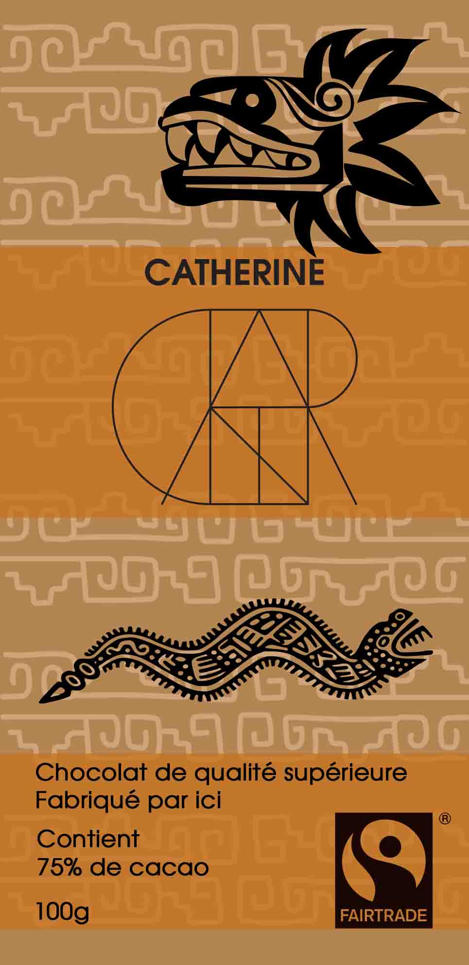
As a consumer I need to know what type of chocolate I am buying.
What flavour is it?
How many calories?
Portion size?
Nutritional Info?

Picture of the chocolate - not necessarily needed … but can be nice
If you’re not including this - then it leads me to think it’s a luxury or specialised chocolate.

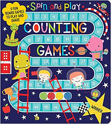
I couldn’t tell from that packaging if the demographic is kids, teens, adults or all demographics. Is it luxury? Is it specialised? Is it mainstream?

Packaging needs to tell the story of what is inside the package.

I could assume from your packaging it’s Salted Caramel - because of the colouring of the package.

This could be a USP - and if it is - then you can have different packaging - like reversing the colours would show it’s a Dark Chocolate.
Adding purple could hint at it being a Raspberry flavour chocolate.

It could easily be a package design for a box of matches.
Just change the text on it.


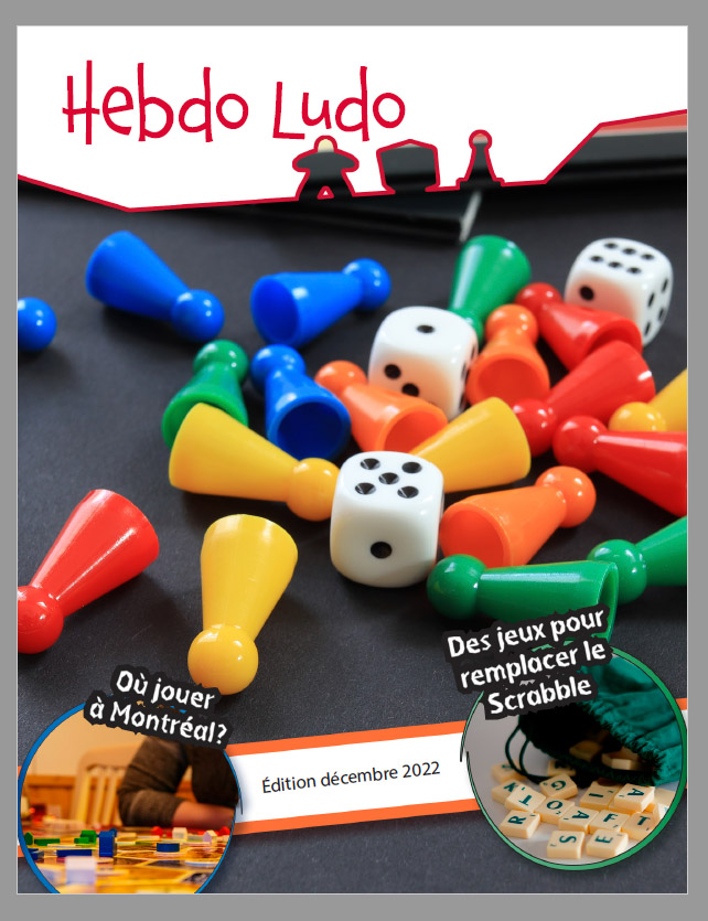
The magazine - ok you don’t need a barcode - but where does it go?
It could easily go on the back. But typically the barcodes are located in a similar location so it’s easy at the checkout for the cashier.

It’s usually the bottom of the cover - usually on the right hand side - but not necessarily all the time.

There’s logic to where they are placed. Just like why all full-size dishwashers are the same size, and all double ovens are the same size etc. because it makes it easier for kitchen fitters to design the kitchen and not be worried they bought an oven that’s 2mm bigger than the cavity. They are identical for a reason.

Ok - you don’t need the barcode on the cover
But leaving a space for it shows that you’ve thought about the space required on the cover etc.

Just a thought.

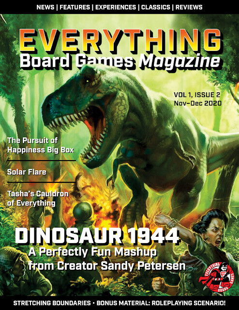
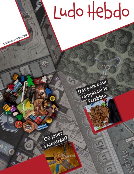
Look at your competitors
image

This would be way more interesting for me to pick up
image

These are more in the demographic you describe - adults into board games.

image

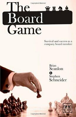
Ok - maybe not this one…
image

image

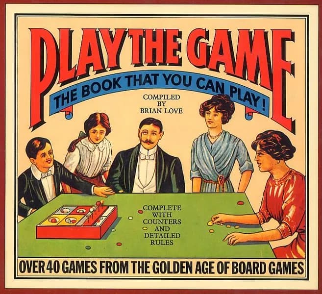
These are the competitors and the standard you need to hit.

I appreciate you are only starting out.
And I truly hope that you reconsider your designs.

Thanks again Smurf2, I appreciate you taking the time to reply. I am indeed re-considering the designs. I’ve had ideas and I’m working on them. I will post an update once I have a new and improved version. :smiley:

Because it’s a school assignment the placement of the barcode will be imposed, I don’t yet know if it will be on the front or back. I would assume the back, that’s the case for most magazine here. I appreciate it you bringing it to my attention nonetheless, as you did for the price.

preview

Here’s my latest. I sketched it before getting on the computer. I tried to go for a diagonal force line, less colorful to look more mature and I took pictures to replace the free-to-use ones I had previously found online.

I agree that normally I would try to please my target audience, however in this case the person I have to please is my teacher (and I really wanna please him!). He’s into artistic minimalist designs. He advised us no to do a busy/clustered look like many magazines have. The price is to be added later.

I’m afraid your new design is not minimalist at all and is in fact quite busy and cluttered but I know it is hard when you are first starting out. It’s definitely a good idea to sketch before going to the computer when you are able. There is a lot that could be improved but here are just a few comments/suggestions.

There is no focal point. The first things that pop out to me is the busy grey gameboard background, and then the pile of game pieces. They are competing with each other and my eyes are not sure where to look. The white shapes at the top with the red outlines are also distracting. The diagonals are overwhelming. The overall vibe is kind of creepy due to the colors, angles, and styling of the article text. Try losing either the pile of game pieces or the background.

If I were you I would go look at covers of actual magazines. Compare them with one another, look at how the designer handled imagery, text, and layout, and then try to emulate the best qualities. Most magazine covers have one main image, a large masthead (magazine title), and then various article/cover lines. Look up Magazine Cover Anatomy. If you are still confused after you look at a few things maybe post a few examples of what looks you like for us to see and perhaps we can help break them down for you.

Try not to feel discouraged. It takes time to develop a good eye and design sense. I commend you for reaching out for feedback from professionals. Most students don’t do that and it shows that you have a genuine desire to learn and improve so kudos.

No - that’s not minamalist.

All you have to do is look it up
Minimalist covers