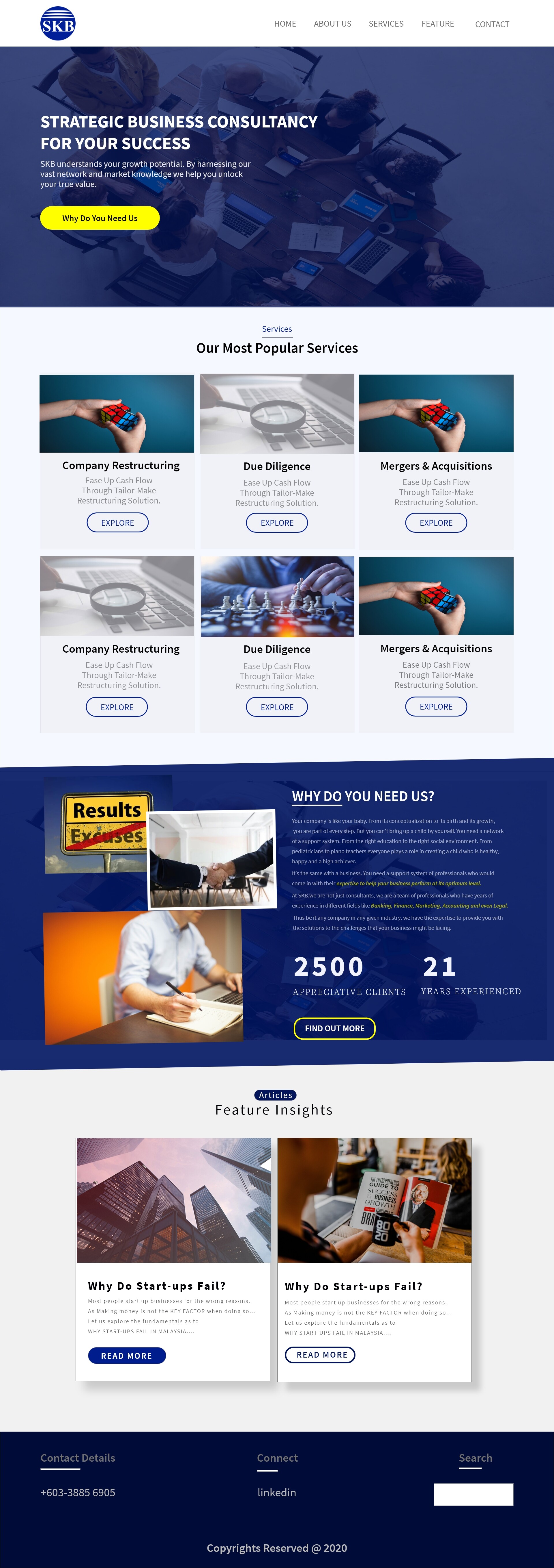
I think it looks good, am not a huge fan of the nasty generic stock images, but I presume these are just placeholders? ![]()
Also I would say that I think the configuration of the images in this section seems off, it feels like there’s too much going on and the “results/excuses” sign is particularlly jarring:

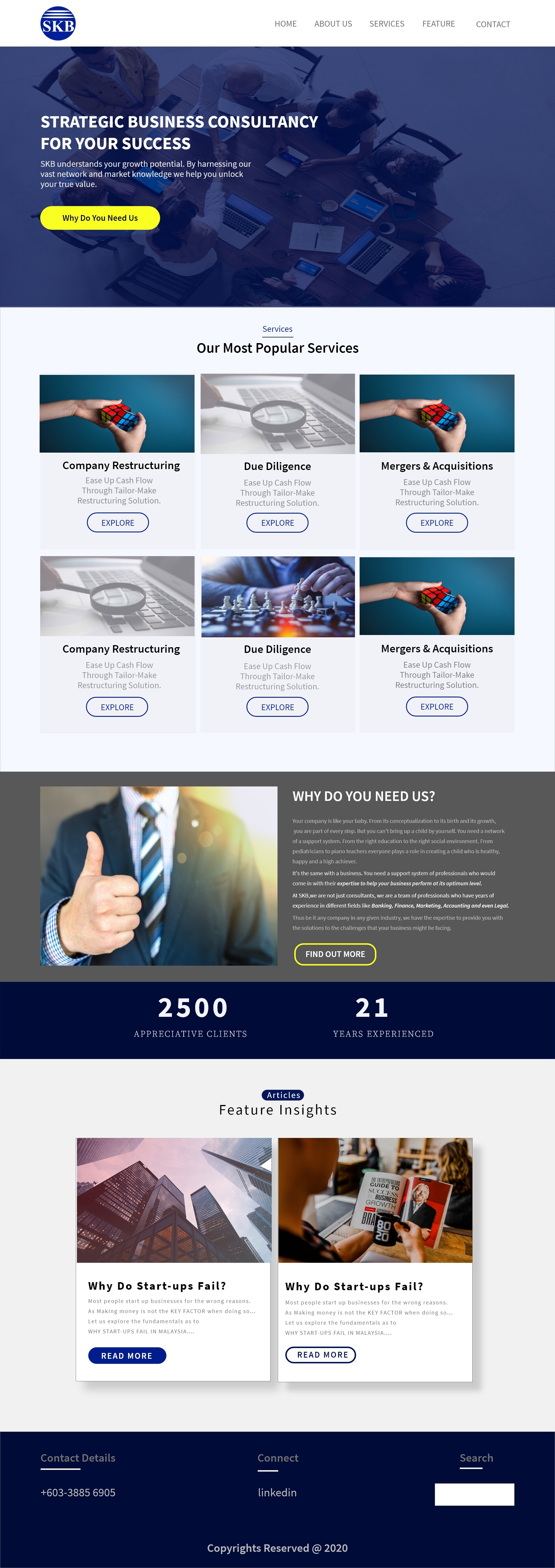
Would definitely drop the sign image and arrange the images in a more structured way that aligns with the rest of the page, or just use the second configuration you used which I think is better:

Good luck with your project ![]()
I find the UI quite confusing, and therefore not so user friendly. Is this the ‘Home’ page only, or a scroll page where the header navigation let’s you jump to the various sections. If it’s the latter, the section names do not match, apart from ‘Services’. Also, where would ‘Home’ jump to?
For 21 years and 2500 clients, this site is a bit on the “amateur-generic” side, from the stock art to the wording. Step it up. Several levels. This has to appeal to UPPER LEVEL management, not the average web viewer.
This one is just a landing page…