Hi, everyone!
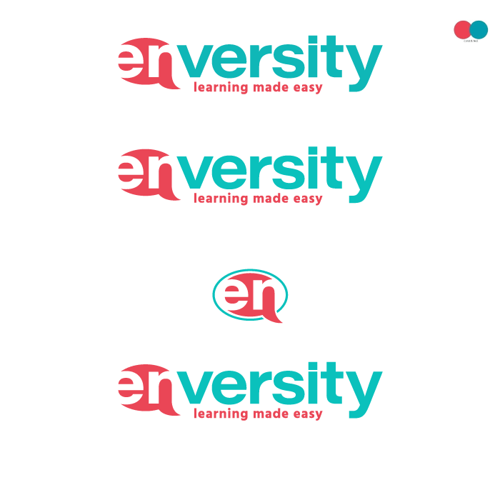
I designed a logo for my client recently, but we’re having trouble choosing colors. She’s a language school owner, witty, energetic and stubborn. We like the structure of the logo, but colors…I conducted every color study I could think of, nothing worked, so I’d appreciate your feedback on this logo. Something just feels off and I think I’ve missed something important, that’s why I turn to you for help and perspective.
Thanks a lot and have an awesome day!
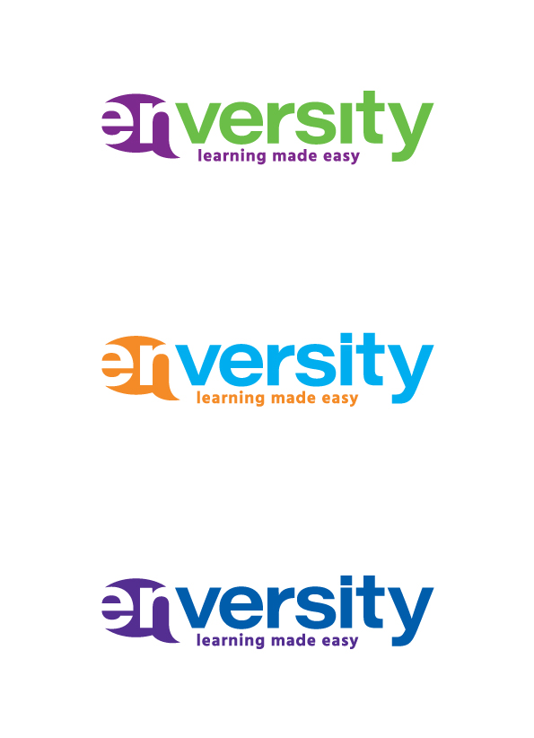
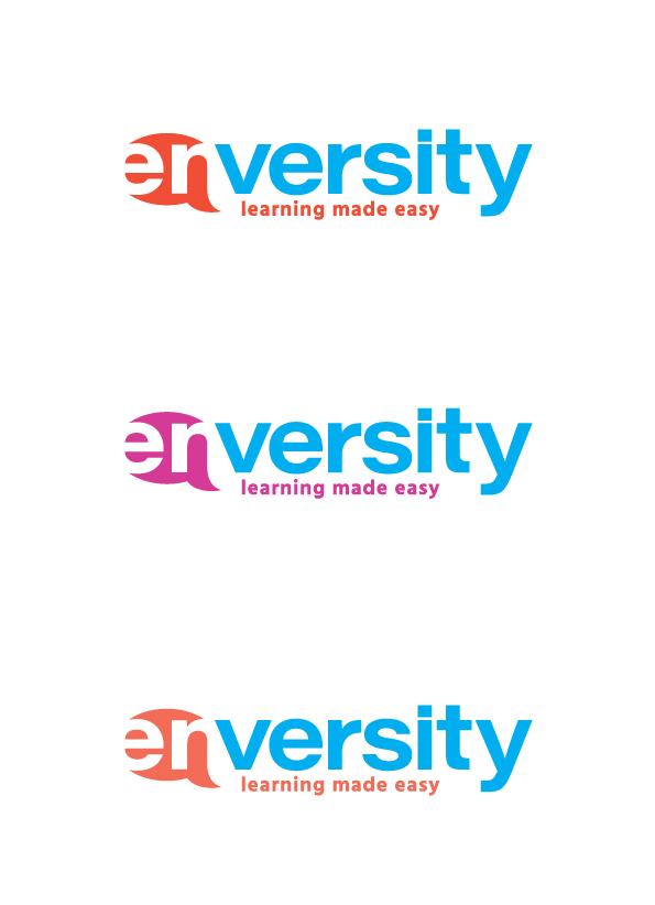
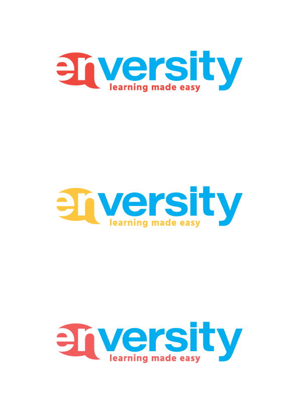
You have a couple of options here that are nice. However, since you feel something is off, I’d suggest you try pairing a dominate color with a more subdued color. All of the options shown are two strong colors. Look at something like Cool Gray 6, for a more subdued color, plus the green or cyan as the more dominate color. That said, I tend to be a sucker for grays in branding.
2 Likes
i was staring at the LYFT logo and likes their swoons. i think this log needs to connect the n with the v somehow, they seem far apart and that will throw off the viewer.
perhaps use the versity color inside the en text?
The N uses the negative space with the V to create the shape of the N. Move them closer and you lose that.
As for Grays in Branding - proceed with caution. Gray is EXTREMELY variable on press. Depending on the ink build, you might get opposite extremes from cyan-gray to magenta-gray when using some of the more loosely profile-oriented gang printers. Gray point is something that always has to be kept under control and getting a neutral gray sometimes means adjustments just for your file.
In all the logos, you have two rather aggressive colors competing for attention. If it were me, I’d be dialing back one of the colors to let the other win the fight. As has already been mentioned, a grayish color could work (warm or cool, not a flat, lifeless, difficult-to-print neutral gray) for one of them. A really bright color could be used for the other. The contrast between the aggressive and neutral colors might actually have more impact than two aggressive colors.
It took me a little too long to see the “N”. At first I wan’t sure if it was an N or a lower case r. Of course, that sounds dumb, but logos must have instant recognition.
I was actually quite moved by the violet-green one.
But as @Steve_O said, trying something with contrasting levels might work.
Check out Google’s use of some products that have grey type, but still keep the colorful icon. Not sure which product in particular, but might be of help as a reference.
Good luck,
L
1 Like
Hi!
Thanks for all your input. My client loves bright colors, but maybe I can convince her to try something more subtle. Thanks again, I appreciate your feedback, because I think I’m getting closer to what bothers me about the whole thing ![]() . Have a great day!
. Have a great day!
Moved? Wow, like reading a good book or hearing a good song moved?
I’d say that should be explored by both the artist and Leart to try to figure out what caused the emotional attachment. - no joke. If you evoke a “feeling” with art, just make sure that feeling suits the client.