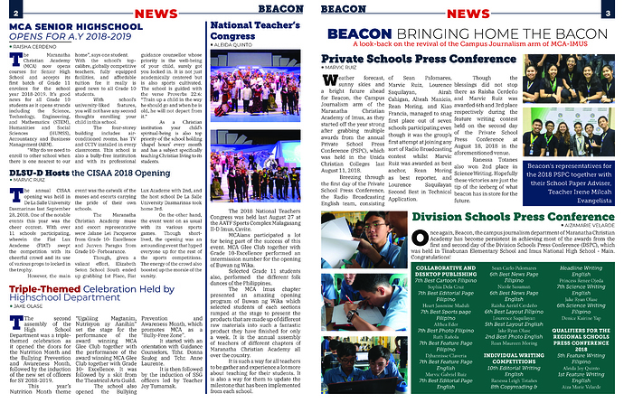
Hi everyone! I’ve been working on my school’s publication and I would like to have some feedback on the layout that I made! Thank you!
Try to make something dominant; something that stands out enough to make most eyes go there first. Even better if you can prioritize all the elements of the layout to guide most eyes in an intended direction throughout scanning the layout.
will certainly do that. Thank you so much!
The columns of type are very narrow, which makes lots of back-and-forth eye movements necessary to read it. Narrow column widths also create word spacing issues. Notice that some of the lines have big, unsightly gaps between the words. You can eliminate this problem by setting the type flush left-ragged right.
Really, though, not a bad job, and I’ve seen plenty of student newspapers. 
You need to create a grid (the National Teacher’s Congress column is wider than the other three columns). You need to create style sheets (why is the headline / subhead for MCA Senior Highschool set in a different font family that the DLSU0D Hosts headline / subhead). The paragraph indents could easily be a third of what they are now. Be consistent (author’s names are all flush left except for Division Schools Press Conference). The style sheets and consistency comment would also apply to the drop caps. Most are three lines, then you have one that is two lines. Also on the drop caps, they should be the full height of the lines. If you look at the T under MCA Senior, you’ll see that the baseline of the T does not line up with the baseline of the third line. The NEWS and BEACON in the header could both be much smaller. I don’t think they need to draw that much attention to themselves.
If you use justified text believe this will help:
[https://www.youtube.com/watch?v=VZAV8tPAoXQ]
Also regarding line length the average I believe is 7-12 words per row, I might be slightly off on this one but it is a good range to stay in to ease readability.
Also, try to stay away from rivers, widows and orphans (not literally  ), this article explains this : https://www.fonts.com/content/learning/fontology/level-2/text-typography/rags-widows-orphans
Other than that just stay consistent in your alignment and I believe this will work great, good job!
- try and add quotes to the main articles.
- be careful of widows and awkward spacing
 if you can unfocus your eyes, I find it helps when looking for rivers.
 - be consistent with your headlines and dropcaps. On the first page, It changes between the three headlines styles and the right hand article is missing a drop cap.
- Color-coded article headings is fun for the designer but the reader won’t notice, unfortunately.
- I’d probably change the Press conference to not be on a bold background, also going back to printing in black and white.
What program was this made in? understanding your program is almost as crucial as understanding layout and design.
