Hi Guys,
I’m currently working on doing a layout for a client who I have a few photos for. The photos are very dissimilar (different colours and settings) and I’m having a problem making the ad look cohesive. I have been rattling my brain about it, and was wondering if anyone had any tips about doing a layout with very dissimilar photos?
Any tips would be appreciated! Feeling stuck!
Make em duotones?
Black and white?
Use only the photos that work together and ditch the odd ones?
Depends on what the layout is for.
1 Like
Without seeing the content and knowing the objectives, this is speculative, but you could consider choosing one of the images and making it the “hero,” with the others in significantly inferior, supporting roles. This will help minimize the visual disparities by creating an even larger one.
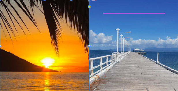
Vertical 1/2 page ad for two restaurants on an island. They want to advertise both restaurants in the same ad, which is fine, but want to advertise sunset drinks for one and daytime relaxing for the other. The photos they gave me are very bright orange/yellow/pink sunset, and white/beige/blue beach view.
I would put a headline across the top to unify the design. Put the 2 pics in separate boxes with a thick white border to look like photographic prints. Add a drop shadow. The name / logo of each restaurant can go on top or above with the opening times or other text below. Angle each picture slightly (2-4 degrees) to the outside (the one on the left anticlockwise and the one on the right clockwise) and let them break the boundaries of the ad, clipping if necessary.
This will make it clear that there are two venues being advertised, but the headline and unifying style should bring the design together.
Try making them into Polaroids dropped on a wood table.
The type should carry the rest. Maybe the photos just act as bullet points.
I guess you could try blending them with a gradient?
Better yet, try to talk them into better photos. Those are both really awful. They don’t say restaurant, food, or even nice view. Boring…
Marketing images are need to be strong and compelling.
They should either use stock photos or hire a professional.
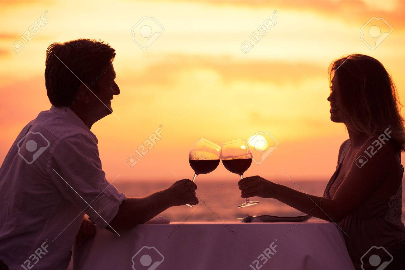
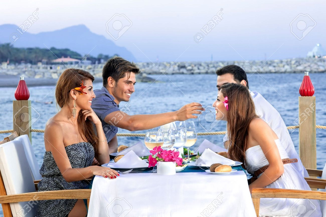
Yes, I already tried to talk them into better photos/ stock photos, or taking new photos with people sitting eating and drinking in front of the jetty and sunset. Agree with all your points for sure.
Thank you, I will try it out!
Ahhh I never thought of making polaroids! Thank you!