Alright. So I have some business cards i’ve designed for myself - have for a while now - but never bothered printing them. And it’s not really a priority. I have a lot of lines incorporated into my design and they are purposefully supposed to be thin. But i’m wondering; are they TOO THIN? I thought 1 pt was far too thick, but then read 1 pt = 1/72nd of an inch. The lines are currently set to .25pt/s, so that’s a quarter of THAT size. Meaning they’ll probably be as thin as a hair. How can I get a proper frame of reference for line thickness when printed, without printing?
.25pt should be fine for positive print - in fact .125pt should be fine
.25pt for negative print.
But check with your print provider, it depends on printing method - digital vs litho and what tollerances they have in play for their machine.
You see, when viewing the design in Illustrator, and I change it to 1 pt, the lines seem overwhelmingly thick. .5 is better, and .25 is just right. I’m only worried if it were printed, it would actually be far, far too small.
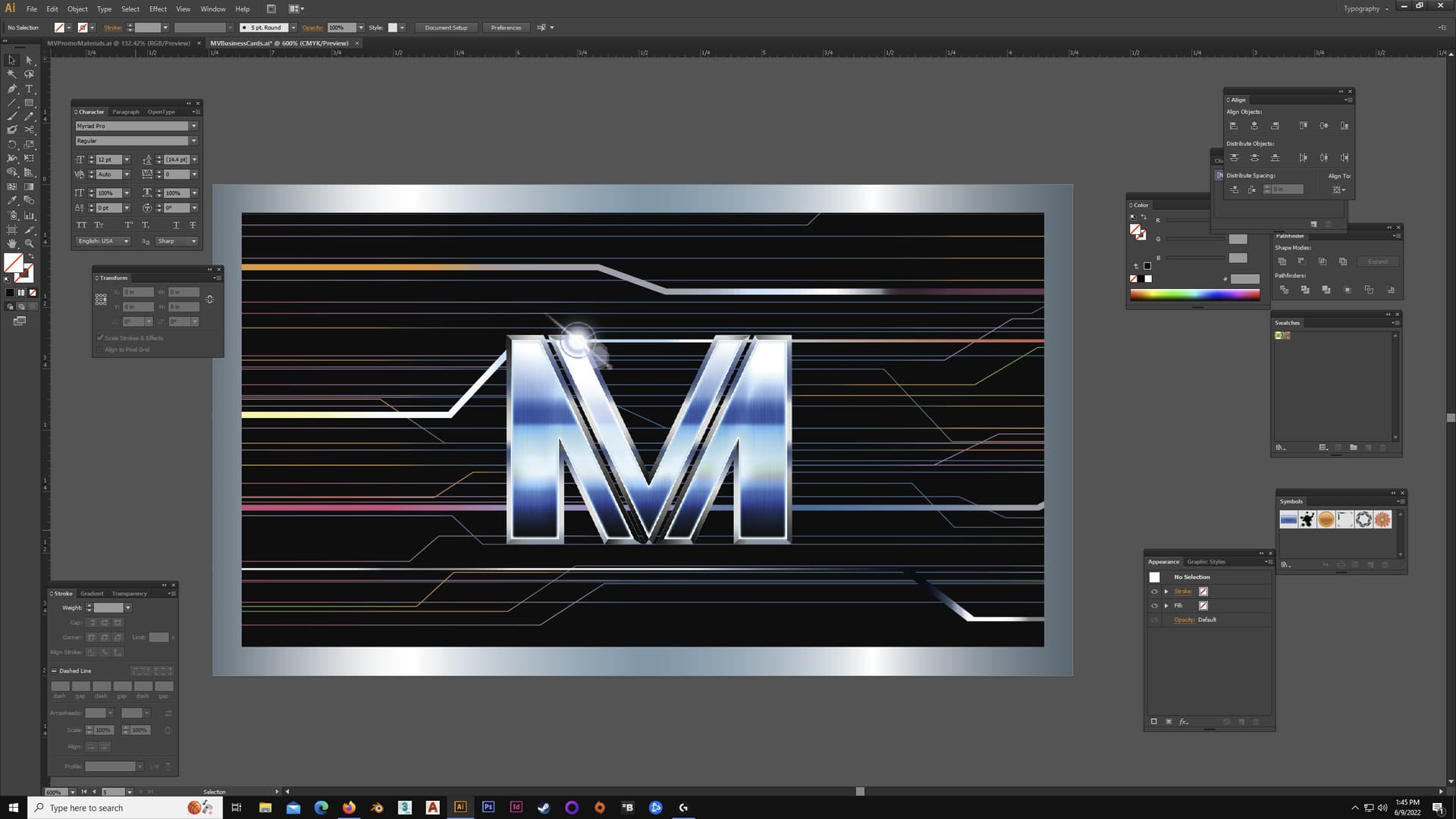
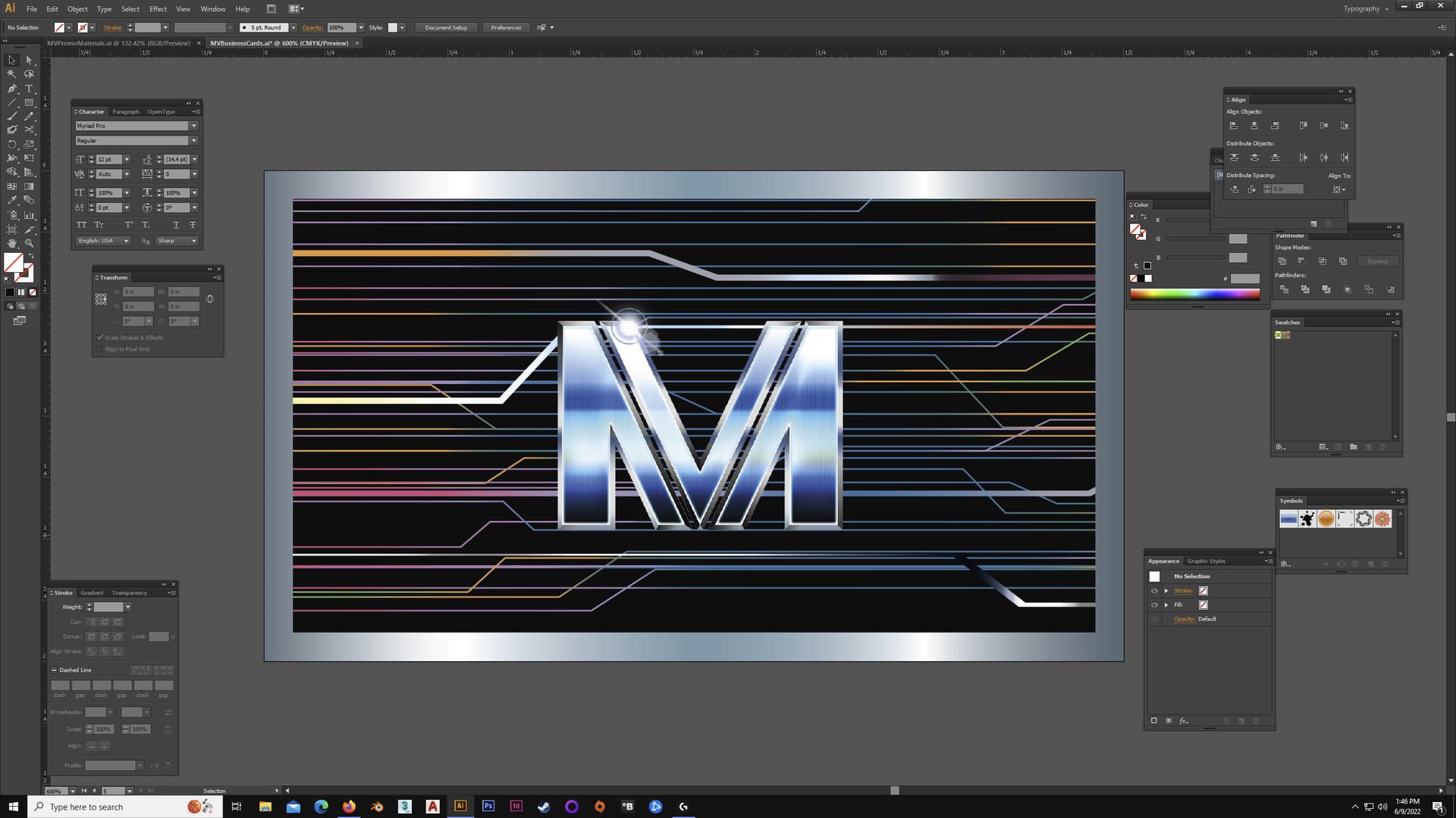
There it is. An increase from .25 to .5. I didn’t want to really talk about the design too much but I also think it loses its effect. The many lines and multiple colours make sense against the deep black background more. The .25pt increase I think loses that effect of visual balancing and looks too cluttered, to boot. But then there’s no way for me to tell just exactly what it’ll look like when printed. In terms of size. But in the software, it seems just right at .25 pts.
It appears you are looking at the design on a large display. That will always give you a false impression. To see if a line really works, you have to print the design in actual size. Only then can you be certain of how it will look before you spend your hard-earned cash on multiple prints.
Much depend on whether the line is made up of process inks or is a solid color. If the line is a solid color made from one ink with no tints, make it as thin as you want it. However, even a 1-point line can be too thin when composed of halftone dots and superimposed screen tints of the four process colors.
If the line is reversed out of another color, the problem becomes more difficult due to dot gain (ink spreading) filling in the line.
And speaking of dot gain, it’ll be greater on uncoated stock than on coated.
Was not expecting that complexity! Wow.
I didn’t consider this.
You really need to speak with the printer.
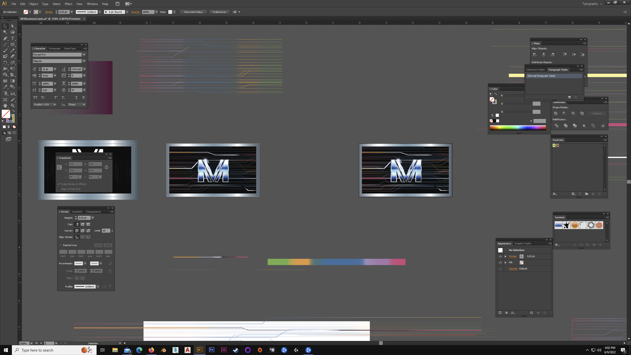
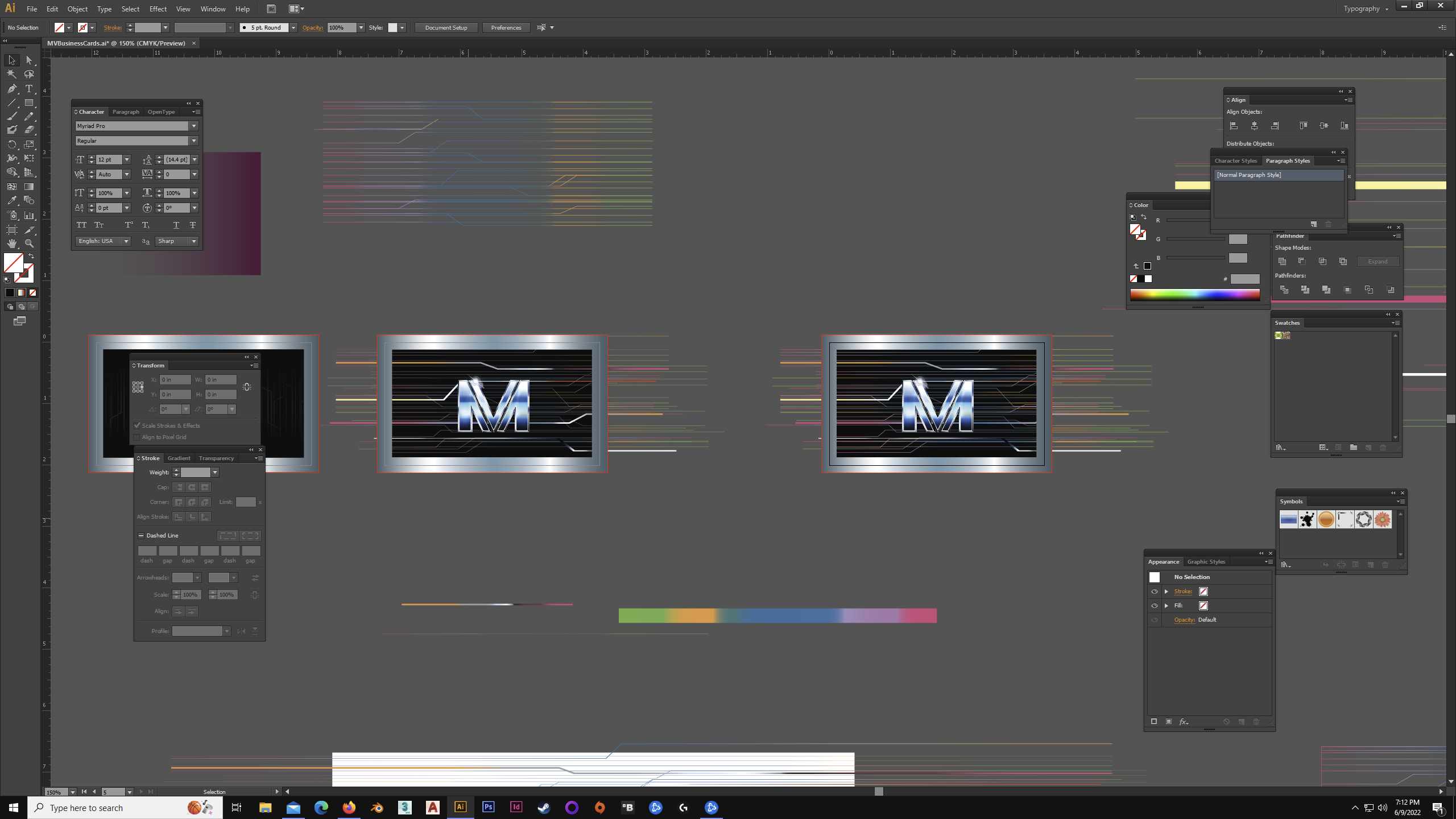
It’s kind of ghetto, but to get an idea of what it’d be like when it’s to scale I put up a small architectural scale to the screen. And at 150% viewing zoom level it’s perfectly 3.5" x 2" on the screen. ALMOST. Just slightly off on the height. But not much.
There’s viewing level 150%.
Oh, also. Since i’m already talking about my business cards. If there’s a placed image, ideally a TIF, correct? Or do people do something like an EPS sometimes?
Note that the silver frame may not be the same width after cutting. This is a scenario where inaccuracies in cutting double. 1 mm cut deviation causes one side of the frame to be 2 mm wider than the opposite side.
1 Like
TIFF would work, but I usually use PSD.
There’s not much reason to use EPS — especially if the placed image is a bitmapped (raster) file. For that matter, there’s hardly ever a reason to use the old EPS format outside of very specific circumstances when using vector art. I don’t remember saving anything to EPS for years. In most instances with vector art, I just save to AI.
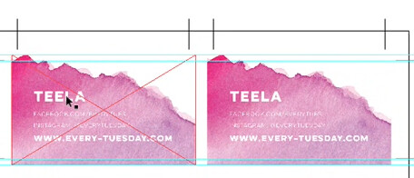
Also, I agree with @Joe if the silver border forms the edge of your business card. It’s usually best to avoid situations where there’s a potential for everything looking off if the trim isn’t spot-on. Also, don’t forget your bleeds.
Not sure why the perimeter was brought up. But what you’re seeing is just a clipping mask the same size of the cards so I can get a sense of what it’s like if they were to be cut. I use a rectangle the same size as the cards with a gradient stroke, aligned center so the size is projected by half in both directions. I think it’s either 8pts or 12. So 4 or 6 pt. And it’s going into the bleeds. In this scenario even past them I think.
Ah, as 18 points. Right up against the bleed. So 9pts either side. Or to be more relevant, 9 pts inside.
But now you’ve got me paranoid. So sometimes they fudge the cutting, and they roll with it? What the?
I wouldn’t say they fudge — cutting stacks of paper has built-in inaccuracies.
I’m having a little trouble following what you’re saying, so if I’m responding to something you didn’t say, my apologies.
The standard bleed on most hand-held printed items is 3mm or 0.125 inches. In other words, when a printer trims the printed material, there must be enough space for the trim to be off either way by 0.125 inches.
It’s unusual for a trim to be off by that much, but it can happen. If the trim needs to be tighter, those requirements must be communicated to and agreed to by the printer.
So with that in mind, creating a border around the edge of a business card (or other printed materials) is problematic. As @Joe said, if the trim is off by even a millimeter (which isn’t unusual), that inaccuracy can result in a noticeably fat border on one side and a skinny one on the other.
Wait, now that I read that again, i’m confused. Are you simply talking about Bleed? That’s a basic basic. I pull my Bleeds, as you can see in the screenshot. Or you’re actually saying the trimming might even go IN a little?
I never would’ve thought that. It’s like sending a CAD file (I do that, too) through a CNC and expecting it to make some mistakes. So if something is designed with a border my business cards, what would be the solution then? Logically - to me - it would be; not to use that design approach. I never expected there to be such loose tolerances and shoddiness. wow. ![]()
If the business card is a standard 8.9 x 5.1 cm and the trim shifts a millimeter, yes, it will be in by that amount on one side and out by that amount on the other.
The outside trim tolerance is the bleed area. As you said, it’s “basic, basic.” The inside tolerance is called the safety area (also basic). Anything in the safety is at risk of being trimmed off or pushed uncomfortably close to the trim.
The 3mm bleed and safety are primarily precautionary. A good printer will get the trim pretty close, but sometimes it varies a bit. I wouldn’t call it shoddiness as much as I’d call it one of the consequences of cutting hundreds or thousands of individual printed items from sheets of paper that are stacked up and sliced in bulk with a guillotine.

It’s generally best to avoid borders - the smaller the trim size gets the more noticeable it is.
Can it be done? Yes. But it’s a painstaking job for a guillotine operator.
Typically, they’ll do a bigger run of your business cards, trim them, discard the shoddy ones and give you the best pick of the litter.
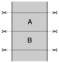
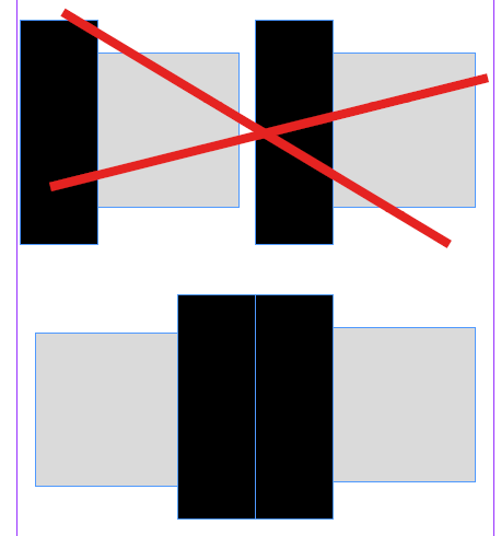
The way your business cards needs to be cut is to do it with a double cut.
That is - they will step up your business cards side by side, and as they trim them, they are basically going to cut each one out individually.
So where the lines are - the guillotine strikes each line.
In guillotining - you want to do as few cuts as possible.
That’s why a dead split (or single cut is preferred)
The reason your card has to be double cut is that the image of the bleed beside each other is going to be different, as it’s a gradient - so there’s no way to match the bleed.
With a dead split - you are going to see differences on each card.
Often printers will flip the cards on one side to achieve a deadsplit.
this is favourable because they can then can do a single cut.
See my very basic example
You’re fighting a losing battle - it’s not shoddiness.
You’re up against the humidity on the day (paper expansion)
You’re up against paper being stacked correctly or shifts in paper stacking
You’re up against paper movement when loaded into the machine.
You’re up against roller movement.
You’re up against restacking the paper when it comes out.
You’re up against lifting a stack to be placed into the guillotine.
You’re up against every single sheet being aligned exactly when cut.
You’re up against the machine operator inserting the correct cut positions into the machine.
So when it comes to designing for print you need to think about finishing a the beginning.
2 Likes
There is an ideal world and there is the real world. Do not assume they are the same.
The solution is to cut each card by hand. Ideal, but not practical.
Or by laser
Borders are ok on Business Cards as long as they are thick enough to hide the inevitable variations in the cutting. It’s not shoddiness, it’s a consequence of the process.
Well I never heard of that, other than in editorial design. InDesign usually has an inner border in a working file page. No mention of any inside tolerances. Only making sure art is on the final product and not thin lines of bare paper on the outside; aka what Bleed is for.
Well, if i’m honest, I can’t pretend to understand what you’re saying. Even with the examples. Going back to the gradient, it’s a single line, aligned centre. The stop positions are in the same area.
And i’d still call is shoddiness. I don’t know. Maybe imprecision is nicer? I expected far, far more automation and computers involved in cutting these things. Or even as you mentioned, lasers perhaps. But I can confirm this if I ever go to print them and it’s good to know, though. But It was completely unexpected and I was totally blind-sided by it.
As often as not, it’s not so much imprecision in the cutting as it is the placement of the image composite relative to the facestock edges, or in one sense, “registration”. No matter how much “computer” involvement there is, the inescapable imperfections in mechanical tolerances when it comes to paper feeding and stacking will cause variations in the registration, however slight. So even if the cutting was laser-perfect (and it isn’t), a small printed border at exactly the same inset from the cut on all four sides, on every one of several hundred or thousand copies, is physically impossible here on Earth.
There’s an automatic margin added to InDesign - but you’re supposed to create margins to suit your layout. Not just use the default settings.
For business cards 5mm margin is good enough.
When you get into book work then having inner margins larger than outer margins is essential.
I’d highly recommend that you visit a local printers and ask for a tour of the facilities.
And ask all the questions you are having trouble with here - as seeing it first hand is really a sight to behold.