Any improvements and advices how i can frame the text and the great britain flag? thanks
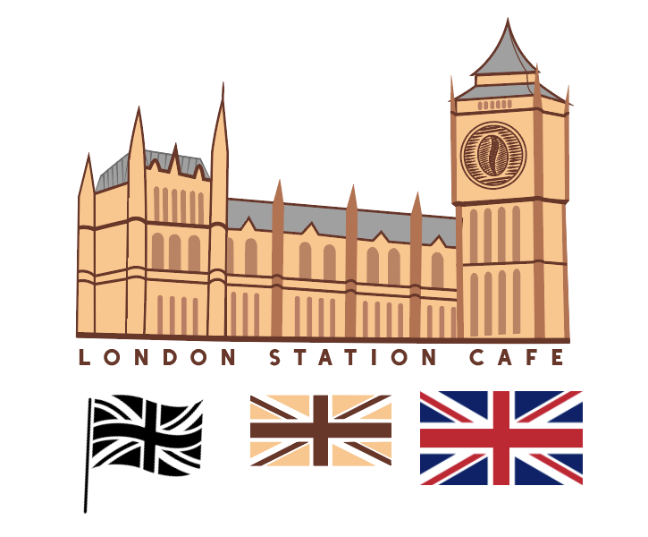
I don’t have any advice on how to frame the text and the flag because that’s too much — you have a illustration done in one style, the coffee bean done in another style, the type, and the flag. Also, the illustration of the building is way too busy and the perspective seems off kilter. All of that said, the idea of replacing the clock with a coffee bean graphic is an option worth exploring. Take a stab and making the illustration just the top portion of the tower with the coffee bean graphic, show the tower square on rather than at an angle, work on the illustration, and combine the bean in a way that uses a similar style. The type can hang out underneath or to the right of the mark.
I like the flag in the middle. Britain will be proud of you.
2 Likes
In addition to what Steve said (which I agree with), I’m pretty sure you’d get some pushback when trying to switch the colors of the Union Jack to various shades of brown (assuming this is targeting a British audience and not one of their previous colonies that still holds a grudge).
1 Like
This little corner of it isn’t, particularly!
Honestly, though I agree with what others have said, to an extent, I think I have to go much further – and you a probably not going to like what I have to say all that much.
You haven’t said, but I assume this is intended as a logo for a coffee bar in or near a station in London.
If so, I am not at all sure why you have used a pretty loose drawing of the Palace of Westminster, or is it supposed to be St Pancras Station. If the latter, you need to do more research so it does look like it. Even then, that would only work if it were a coffee shop in St Pancras.
If it is supposed to be the Palace of Westminster (Houses of Parliament), then why? As some cliché representation of London? If so, don’t do it. If the coffee shop is anywhere in the UK, then Brits don’t need cultural clichés thrown at them. They are already painfully aware of them and are not going to respond well to any business that uses them.
The flag recoloured in coffee colours. Don’t. You are going to get under people’s skin with that.
You are at the first stage of thinking, we all do it, but those of us who’ve been doing this long enough know to reject those first ideas, as they are always visual clichés.
Think deeper about the particular coffee shop and where it is. Use direct local reference if you have to, but even then, I wouldn’t, unless that reference had direct reference to the business.
Far better to think about the business itself, what makes it unique, the demographics of its customers. You need to appeal to them directly, or they will just walk past and go to Starbucks, or Café Nero.
What is unique about this business that it can lure customers in from the big hitters.
Clichés rarely work. They just indicate how unimaginative the business is and it never ends well. Remember whatever you do will be the take-away (no pun intended) that potential customers have about the business. Typically you have three seconds for people to have an initial reaction to something. If it is the wrong one, you have a serious uphill struggle to change perceptions.
Hope this helps.
1 Like
I spoke with my tongue fairly firmly in my cheek.
1 Like
I assumed so.
If this building is not the location of the coffee house then don’t use it. If it is, then color it with the same colors used in the British flag (make the colors uniform with the flag.) Otherwise, start over and expand your thinking.
The building is the Houses of Parliament, which is an icon in London but not a cafe. The building should be smaller and the text (name of the business) bigger. Don’t mess with the flag unless you want to annoy certain sections of the population.
Nor is it a “station,” or for that matter, a logo. Too many details, too many colours.
The building seems to detailed for a very usable logo design; looks more like an illustration. There are some details that are also not matching and confusing. Sorry. I think this logo design would be better if it were simplified.
This topic was automatically closed 365 days after the last reply. New replies are no longer allowed.