Other than me not reading massive or any other word, HotButton summed up my views.
I have no opinion on whether it’s appropriate for the purpose at hand because I have no idea what it’s supposed to represent.
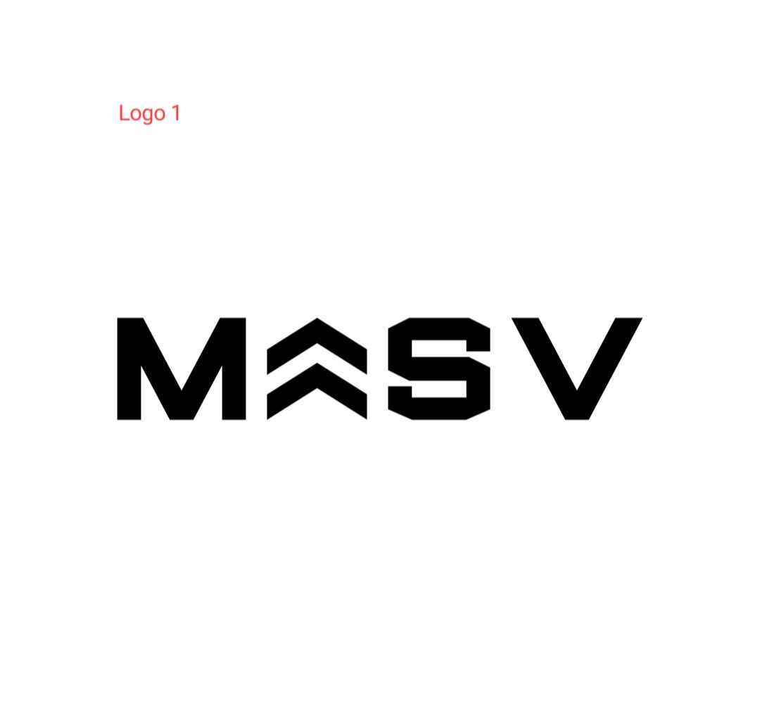
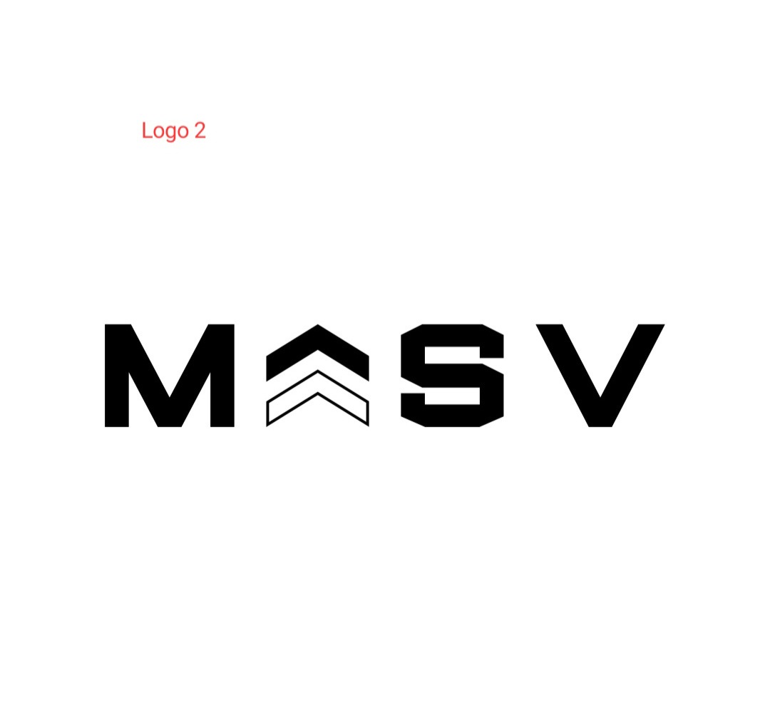
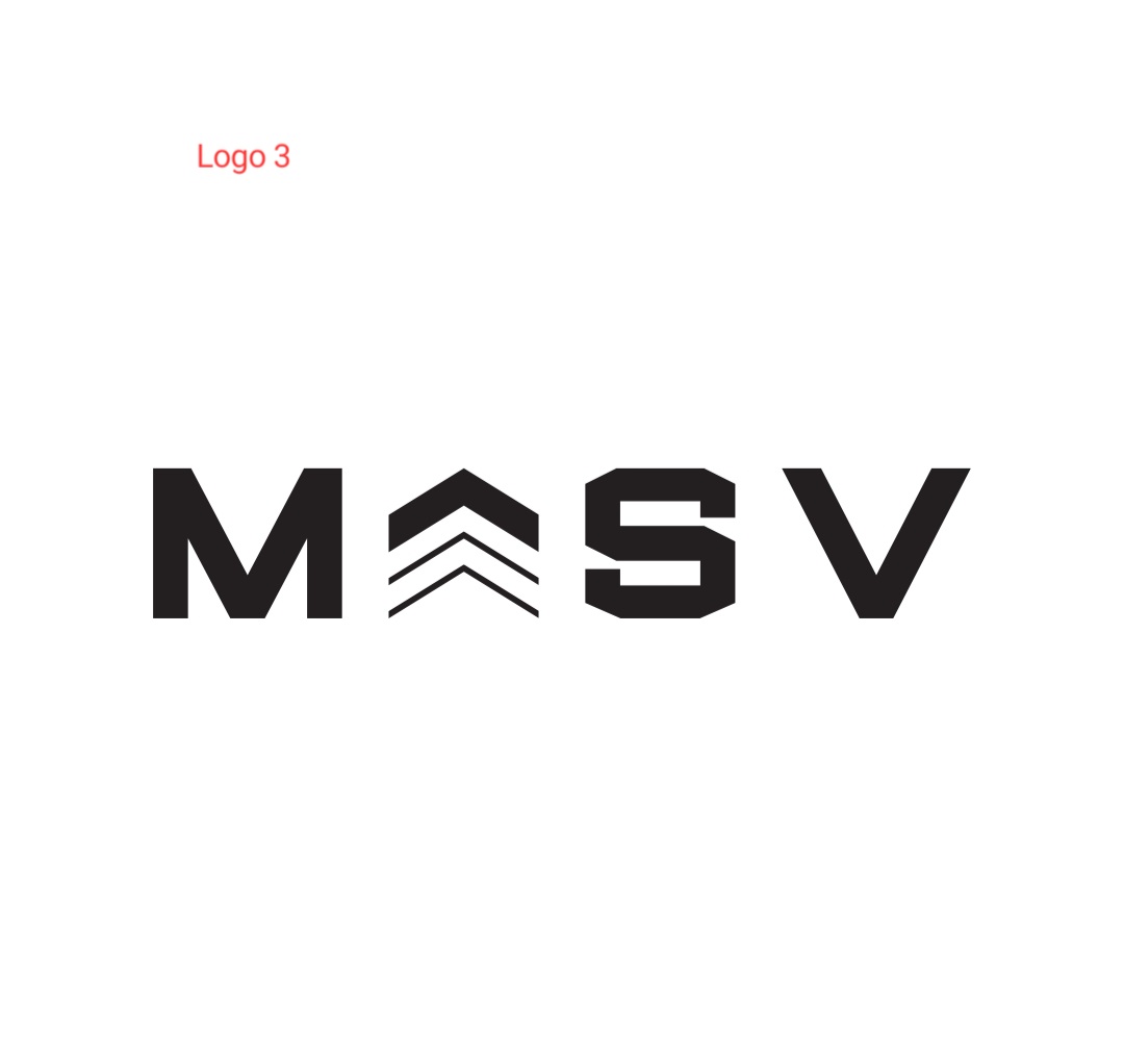
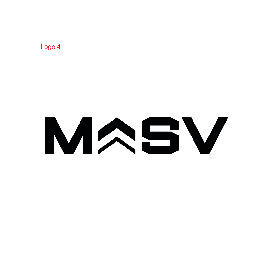
The chevrons look like a corporal’s insignia and the words look vaguely military or collegiate. However, what you’ve done with the chevrons in the bottom two examples probably isn’t appropriate if you’re after a military look.
For that it’s worth, there is considerably more space between the S and V than there is between the other glyphs. In other words, adjust the kerning.
Hi sorry I deliberately kept it vague but I should have prob given more background info.
Its supposed to be for a gym / strength equipment brand (barbells, weight plates, squat racks etc)
Youre right its is supposed to say Massive, but stylised as MASV.. and the chevrons are supposed to symbolise getting bigger.
The fact that they relate to the military isnt intended, but I guess works well anyway as people in military do train weights etc.
I initially liked Logo 1.. but the reason I started experimenting with the chevrons was that I didnt think they looked unique enough if ever used on their own as an icon.
So in Logo 2 I made the bottom one hollow, and also added more space / kerning between all letters, purely for aesthetics, as I see alot of modern brands do this.
But I thought it still looked a little.amaturish so my own personal favorite currently is Logo 3.. but wasnt sure if it was “too much”.
P.S. the spacing between all letters is exactly the same. Obviously the gap in bigger at the bottom of the V, but I’ve messured the gap at the top since thats the widest part of the letter.
I want it so when printed on expensive gym equipment in the shops it will look good.. but just wanted others opinions.
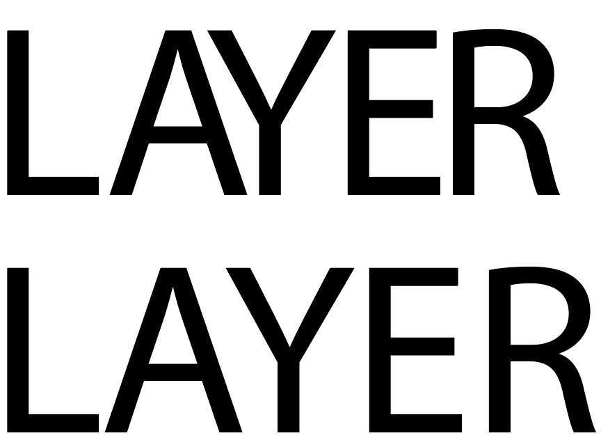
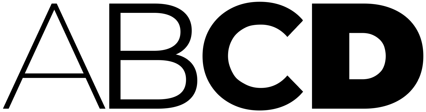
You can’t determine kerning that way. You need to determine it visually. Good letter spacing isn’t a matter of measuring distances. It’s more a matter of optically adjusting the volume of negative space in relation to the positive in a way that creates an even color.
Here’s an extreme example. The top word below has approximately the same distance between letters. The bottom word is optically adjusted.
From a purely artistic or aesthetic point of view, I like the first one best. For that matter, it looks pretty good. However, I think it conveys something other than what you’re hoping to convey, which is probably of equal (or greater) importance than how nice it looks.
I like your idea of visually implying weak-to-strong, puny-to-beefy, or small-to-large. However, you can do that using only typography without needing to confuse the issue with something that conveys a military look.
I’m not suggesting that you do the following, but I am suggesting keeping the basic idea of growth while figuring out how to communicate both the name and the gym’s personality in ways that don’t contain unintentional connotations and confusing ambiguities. People need to be able to read the name (which I couldn’t) if you’re using it as a word mark.
Not by measurement but visually. The peak is allowed to protrude slightly. You could also try with it from bottom to top what JustB did with ABCD
Looks like a college font but only one letter has the typical shape. Choose another font or another „S“ or choose another “M” and “V” or put egyptienne/slab serif serifs on them.