Hi everyone,
I please you to get a look to my work. I welcome all constructive tips that may come to your minds.
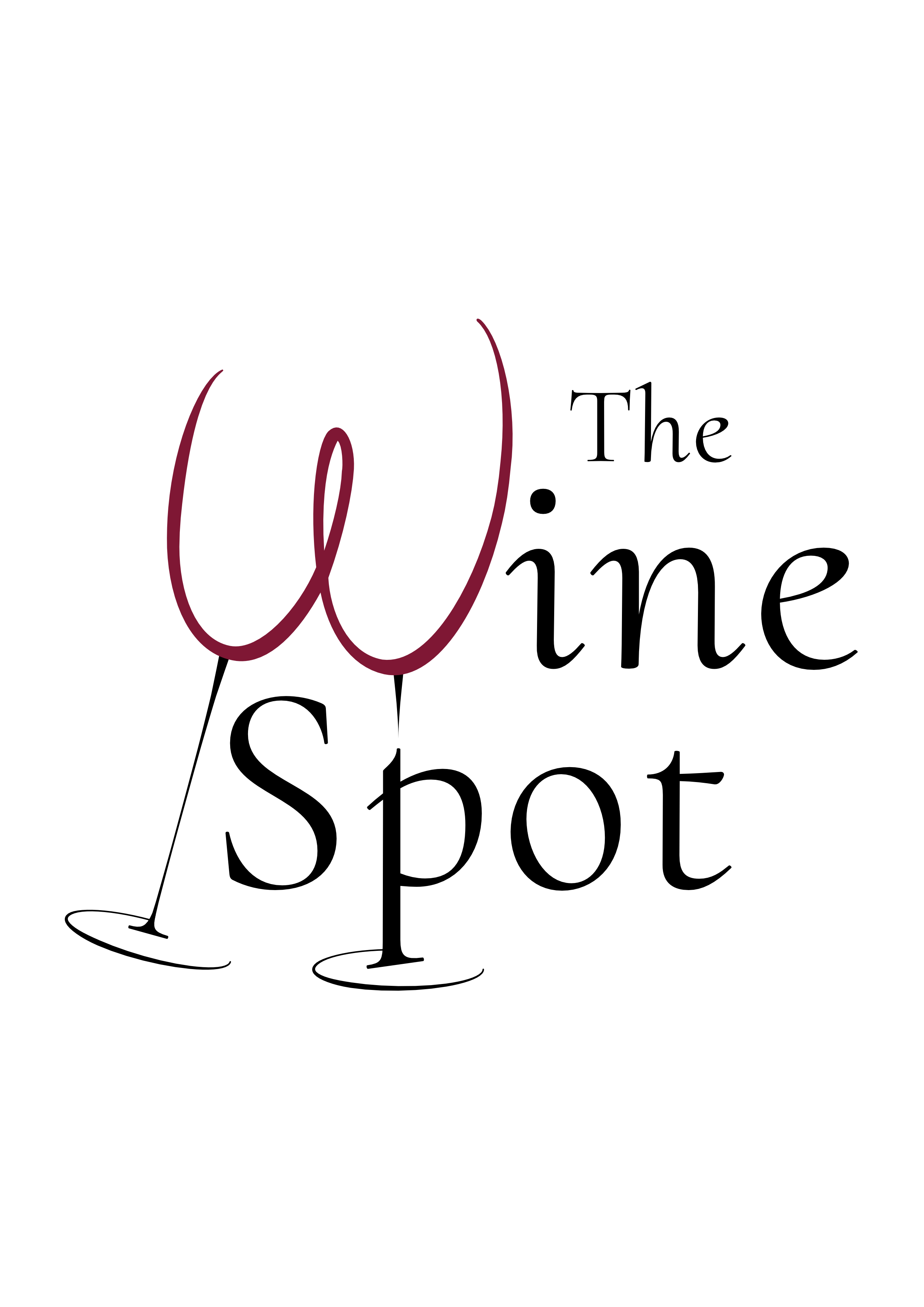
It is a logo for e-shop, where they want to sell special boxes with wine for regular customers.
Thank you for your time ![]()
Hi everyone,
I please you to get a look to my work. I welcome all constructive tips that may come to your minds.
It is a logo for e-shop, where they want to sell special boxes with wine for regular customers.
Thank you for your time ![]()
Wine drinkers are sophisticated people whose mind turns strange after the third glass of Barolo. Don’t tempt them.
First of all, I’ll give you kudos for the concept of turning the glasses into a W. It’s a cute idea. (I’m usually not big on substituting art for a letter shape, but I think this could work.) And you’ve done some things right like not relying on gradients or shadows.
However, while the idea is nice, I feel like the execution is lacking. At first glance, it reads “The ine Spot.” It takes a second pass to read “Wine.”
I believe the type is rather weak. The “ine” almost looks like they are italic characters that have been straightened out, and they don’t blend that well with the characters in Spot. I’ll assume you’re using one typeface here, but the “n” in “ine” doesn’t even look like it’s from the same font as the “t” in “Spot.” What face is this? I’m probably going to end up with egg all over my face if it’s a nice font from a well known type designer, but I just don’t feel like it’s working in this case. Also, the kerning on “Spot” needs work.
Try changing “ine” to red so it will blend with the glasses. This might make it more legible as “Wine.” Also, take a look at moving “The” to the left of the glasses and moving “Spot” to the right of “Wine” so that it’s all on one baseline. The way it is now, you have a reverse diagonal running from the top right to the lower left.
One more thing. If the client is really into wine, assuming they are, I’d be surprised if they don’t mention this. You have the glasses in red, which I like, but they are shaped more like a white wine glass – bordering on champaign flute. Look at adjusting the shape of the glasses so they are wider or shorter.
Sigh …
The wine glasses are the third thing that came to my mind.
The first starts with a T, and the second starts with an A. I know. I know. I’m weird.
The kerning though – I agree, it needs work.
Yep. Sad to say I went right down the same rabbit hole as Eriskay.
And it may have been because the stems to the wine glasses were below the scroll bar, but now cannot unsee.
From a layman’s perspective, I like it, but the “S” of “Spot” looks like it is on a layer where some white is obscuring the stem of the second glass. Maybe you can streamline that stem and the letter “p” somehow.
“Sad to say” ?
Well, shoot. I did not pick up on that at first. Then I thought it was a stretch. Now I see it.
Yeah sad, as I like to think I’ve outgrown the high school humor that slides that way.
Sorta glad I haven’t though.
No offense, I hope.
None whatsoever. I thought I have grown up and matured, but really I haven’t. Then I thought “Why fight it?”.
You, sir, have more class and poise than I can ever hope for.
I like the concept but not the typography and the lines are too thin.
Aside from issues above, the wine buying market is very nuanced.
If they are selling fine wines, chances are the name is likely to put people off. If I wanted a decent bottle of Borgogne, I wouldn’t go to a place called The Wine Spot. I might if I want a quaffing bottle of cheap Merlot for a Friday night piss-up.
If their market is the latter, typographically, it needs to be more budget, approachable. If the former, slightly gimmicky letters made into wine glasses is not going to cut it with a sophisticated, epicurean market.
It appears neither one thing or the other to my mind.
Thanks for good tipes!
I´ll play with it a little more.
The used typeface is Cormorant Upright and yes, I changed the kerning.. ![]()
anyway I think the gentle strokes of the font fit to handwritten ‘W’.
You are wright with the diagonal and the the colour is a good point ![]()
Thank you
Don’t be worry, it see it there too.. why I hoped it would adjust?! ![]()
Hello! It is very clever turning the W into a wine glass, however keep in mind that some people will see a bottom with two legs (naughty cheeky minds cant help this). Maybe play around with just having one stem or removing the loop to separate out the glasses.
Agree with the previous comment that having the W in Black will help with readability (ie wine instead of ine).
Give consideration to what the most important word is and give emphasis to that. The spacing of the ‘The’ seems closer to wine, which makes Spot stand out on its own a bit more.
Thank you, it really seems like there’s a forgotten layer.. I tried to change it, but I don’t think it looks like better..
The stem elements are very very thin. As a sign guy, I hate that.
Second version with full stems is a definite no.
With the elements all one color, it looks even more like what I initially thought.
Is this going on a store front? Print it out on a piece of paper, tape it to the wall and walk backwards until you can’t see one of the elements. My guess, on a sign out in the wild, the reading distance on this is going to be less than 30’, depending on the surroundings and the colors used.
Also consider the shape of your sign blank (the board the letters go on) and take into consideration the negative spaces the shapes are going to create.
Ok, I’ll think about it.
Thank you everyone for your time ![]()
This logo seems simple, but interesting to me, and I like the minimalism in logo design. This is a good logo.