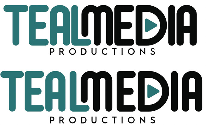
I like it.
Although I would make “Teal” as the teal color instead.
You have given no context to this whatsoever, so all we can do is provide personal opinion.
While I hate to disagree with @DannyD, this work isn’t doing too much for me. I don’t care for the font chosen for TEAL MEDIA in this application. I’m glad you chose a different font for PRODUCTIONS in the second iteration, but the sharp points on the N do not flow with the rounded font used on TEAL MEDIA. The play button seems like a cliche. I’m not saying it can’t work, but you’d need to get more inventive than just plopping it inside the D. The ratio of TEAL MEDIA to PRODUCTIONS looks off with PRODUCTIONS being too small. I don’t mind the way you’ve combined the L/M, but it’s not enough to carry the whole logo. The type needs kerning work, especially the T/E.
Maybe I am just being grumpy because it’s Monday morning, but I think you need to spend more time in the brainstorming and concepting phase.
I agree with @Steve_O, so I won’t repeat what he mentioned.
Despite knowing nothing about the company or what kind of productions it’s involved in, I’m having difficulty imagining that the typeface you’ve chosen has the appropriate personality for the company.
If you decide to keep your chosen typeface, the letterspacing and kerning need major adjustments. The objective with letterspacing is to create an even color (an evenness between the positive and negative areas).
The only way I can explain this is to show you. In your example (top), the negative space between the T and E is huge. This is because the T and E letters have so much built-in space around them, whereas the space between the I and the A can fit much tighter.
As I’ve shown, you should consider offsetting this problem by placing more space between the tightly fitting letters and tweaking the letters themselves to even out the positive-to-negative spacing and make the overall color more consistent.
Sorry for not explaining. It’s for a freelancing video editing and animation business… is the typeface not appropriate?
The typeface has a casual, funky, roundish vibe to it that reminds me of the late '60s or '70s. If that’s the personality you think is appropriate, great.
For example, let’s take two extremes. I suppose it’s fine if the media productions center around birthday parties and animated cartoons. If the company is doing work for the Science Channel or National Geographic, I’d head in a different direction.
Thanks! The production is for small projects… but i would like it to be funky yet modern. This is the first draft. You guys think i should rather work with this?
I don’t think your latest post is a outstanding logo, but it’s a step in the right direction compared to your first two posts. Replacing the crossbars with the circles gives you lots of animation possibilities. What font did you use? Did you manipulate it or stretch it at all? It looks a little off to my eye. PRODUCTIONS is still too small. Scale this down to business card size and see if you can read it. Also, think about the way PRODUCTIONS lines up with the rest of the logo.
Um, no. Sorry, You’ve gone off-track again. The LM thing worked a little better on the first example because the typeface’s goofy personality suited it, while this more conservative and straightforward typeface doesn’t.
Are you artificially squishing the typeface? Don’t do that; the results will always look bad.
I agree with @Just-B — this is a step in the wrong direction. Just curious, what is your experience level with logo design? Is this logo for yourself?
This topic was automatically closed 365 days after the last reply. New replies are no longer allowed.


